a70c3671d61b5be024641797e48c860c.ppt
- Количество слайдов: 99
 Acknowledgment: During the first years of my professional career I had the pleasure of working with many excellent professionals at Arthur Andersen. It is because of their hard work and dedication of advancing knowledge that this document was prepared. So I feel it is somewhat ashamed to see this document go to waste. Therefore, I have decided to make it available for students enrolled in Module 2 of my Excellence in Financial Management Program. This document is made possible by the folks at Arthur Andersen and I do not take any credit for this Strategy Toolkit. – Matt H. Evans Strategy Toolkit
 Foreword Welcome to Version 1. 0 of Strategy and Organisation’s “Strategy Toolkit”. Good strategy is based upon structured thinking. Subsequent action based upon that strategy is dependent upon the clear communication of your structured thinking. Accordingly, this booklet has been put together to help support you in structuring and communicating your thoughts as you help clients address their (often complex and ill-defined) problems. Hopefully this booklet will: • act as a reminder (or an introduction) to a range of useful structuring tools; • give a clear description of each tool and indicate where it may be most fruitfully employed; • highlight some of the short-cuts (and pitfalls) when using those tools; • provide a best practice example which can be adapted to your own situation; and • suggest experienced practioners within ABC who may be able to help you further The aims of the toolkit are simple: • to increase the quality and insightfulness of the work we do for our clients; • to improve our efficiency by avoiding reinvention of standard tools; • to support ongoing training programmes; • to create an ongoing store of intellectual capital; and • to help communicate with all our colleagues in Andersen, helping them understand what we do Perhaps the biggest intellectual challenge in compiling this booklet was defining what we mean by a tool. I am not convinced this issue has been fully solved, and you may discern three types of construct: • widely accepted strategy consulting tools (e. g. growth share matrix); • approaches to particular types of issue which are less prescriptive; and • presentational devices, applicable to many situations All, however, should support you in generating strategic insight for your client. This booklet is intended to be your back-pocket guide to the tools most commonly used on strategy projects. It does not claim to be exhaustive or even comprehensive. However, you will find over 50 tools on the following pages, each one selected for its usefulness and general applicability to the types of client engagements we work on. I am sure that some of your favorites will be missing – but this is only version one and the toolkit will evolve through time. It is intended that this booklet will be updated regularly and your input is most welcome. We believe that development of this Strategy Toolkit is an essential element in building a world-class strategy practice within Andersen. However, it is not a substitute for hard work and creative thinking, so do not limit yourself to the tools in this book. Finally, some acknowledgments. This toolkit is not the first to be produced by the practice. It draws heavily on previous versions, whose authors I would like to thank. I am also very grateful to those of you who have submitted best practice examples and suggested entries – keep them coming.
 Table of contents
 An indicative guide to using the tools 4
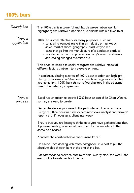 100% bars Description Typical application The 100% bar is a powerful and flexible presentation tool for highlighting the relative proportion of elements within a fixed total. 100% bars work effectively for many purposes, such as: - comparing competitors within an industry or market by sales, market share, geography, product type etc. - costs that go into the manufacture of a particular product; - key elements that comprise a company’s revenue streams - addressing changes over time etc. This enables people to easily recognize the relative impact of different factors that go into a process or trend. In particular, placing a series of 100% bars in order can highlight changing patterns in relative terms, over time, region or any other segmentation. 100% bars do not reflect changes in the absolute size of the category in question. Typical process Excel has an option to create 100% bars as part of its Chart Wizard, so they are easy to create. Gather the data appropriate to the particular application you are using the 100% bars for, from expert interviews, analyst and brokers’ reports and, if necessary, client interviews. Ensure that you are happy with the data you have gathered and that, if you are creating a series of bars, the information refers to the same type of data. Annotate the chart and draw conclusions from it. Unless you are dealing with many categories, it is best to put the absolute size of each item at the end of the bar. For comparisons between bars over time, clearly mark the CAGR for each of the key elements of the bar. 5
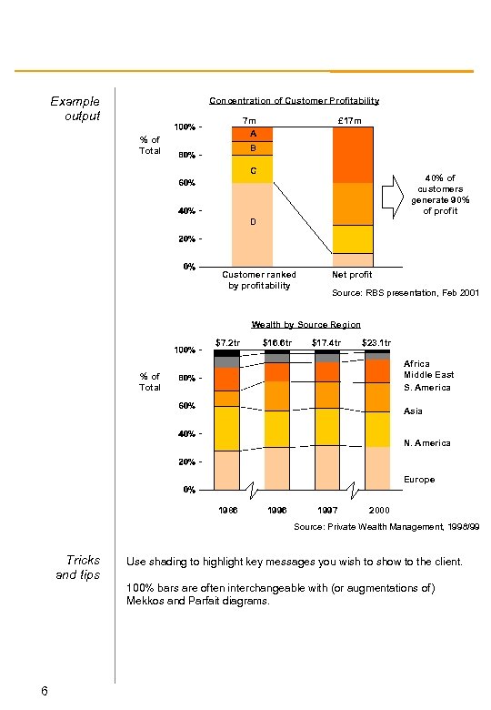 Example output Concentration of Customer Profitability 7 m A % of Total £ 17 m B C 40% of customers generate 90% of profit D Customer ranked by profitability Net profit Source: RBS presentation, Feb 2001 Wealth by Source Region $7. 2 tr $16. 6 tr $17. 4 tr $23. 1 tr Africa Middle East S. America % of Total Asia N. America Europe 1986 1997 2000 Source: Private Wealth Management, 1998/99 Tricks and tips 6 Use shading to highlight key messages you wish to show to the client. 100% bars are often interchangeable with (or augmentations of) Mekkos and Parfait diagrams.
 Activity maps Description An activity map is an easy, visual summary of a company or series of companies and what they do. Typical application Activity maps are a good way of moving from a broad overview of a particular company or industry’s activities to a detailed and comprehensive list of all activities within the value chain. They are designed more to spark discussion than provide an answer to a particular problem, but make good slides for a presentation or a client pack. You can use the activities collated in a number of ways to stimulate thought about the company in question. Try: - Mapping company activities against competitors and discussing differences; - Shading boxes according to relative capability; and - Shading boxes according to desired state and noting discrepancies with ‘as is’ Typical process It is surprisingly difficult to develop activity maps. Take time over the process and make sure you don’t miss out important activities. Start by drawing the value chain in which the client operates, vertically on the left side of your slide. Taking each element of the value chain in turn, try and record all the sub-activities necessary that comprise the element as a whole. Place each activity in a box to the right of the value chain. This exercise can be completed with a client, but if not try and discuss it with a client afterwards to ensure you have captured all activities. 7
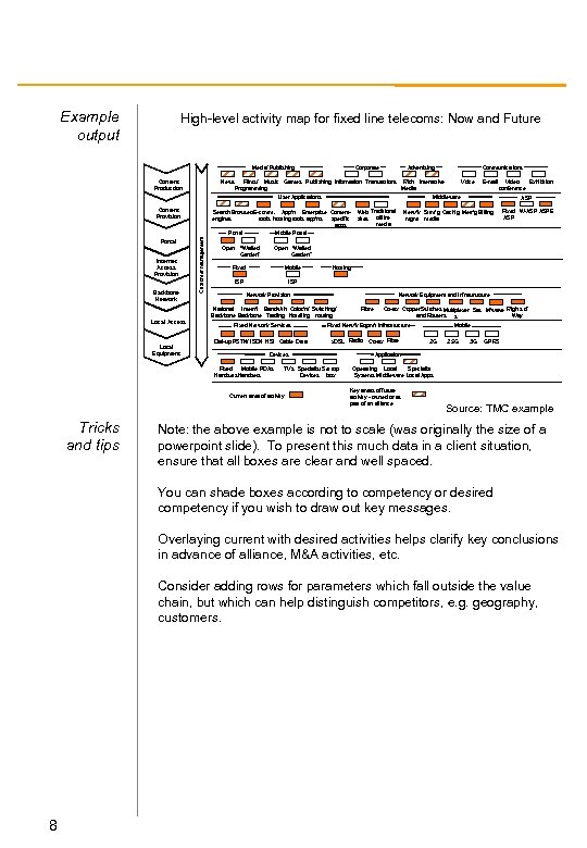 Example output High-level activity map for fixed line telecoms: Now and Future Media/ Publishing Content Production News Films/ Music Programming Corporate Advertising Games Publishing Information Transactions Rich Interactive Media User Applications Content Provision Backbone Network Customer management Internet Access Provision Open Local Equipment Video Exhibition conference Web Traditional sites offline media ASP Netw’k Strm’g Cach’g Metr’g BIlling mgmt media Fixed W-ASP ASPE ASP Open “Walled Garden” Fixed Mobile ISP Hosting ISP Network Provision Fixed Network Services Dial-up PSTN/ ISDN HSI Cable Data Network Equipment and Infrastructure Current area of activity Fibre Co-ax Copper. Switches Multiplexer Sat. M’wave Rights of and Routers Way s Fixed Netw’k Eqpm’t Infrastructure x. DSL Radio Devices Fixed Mobile PDAs Handsets Tricks and tips E-mail Mobile Portal “Walled Garden” National Intern’l Bandw’th Coloc’n/ Switching/ Backbone Trading Hotelling routing Local Access Voice Middleware Search Browsers. E-comm. App’n Enterprise Contentengines tools hosting tools app’ns specific apps Portal Communications TVs Specialist Set top Devices box Co-ax Fibre Mobile 2 G 2. 5 G 3 G GPRS Application s Operating Local Specialist Systems Middleware Local Apps Key areas of future activity - owned or as part of an alliance Source: TMC example Note: the above example is not to scale (was originally the size of a powerpoint slide). To present this much data in a client situation, ensure that all boxes are clear and well spaced. You can shade boxes according to competency or desired competency if you wish to draw out key messages. Overlaying current with desired activities helps clarify key conclusions in advance of alliance, M&A activities, etc. Consider adding rows for parameters which fall outside the value chain, but which can help distinguish competitors, e. g. geography, customers. 8
 Answer first hypothesis Description The hypothesis or logic tree is a key method of thinking used on strategy projects. It provides a framework for a piece of research or analysis to ensure that all factors are suitably accounted for and evaluated, and allows you to apply principles of structured thinking to simplify complex problems. Structured thinking is a key method for approaching - and hopefully answering - a question in a compelling way. It helps you to be clear about the key issues you are tackling, to remember the information you have uncovered and to structure the solution you propose. Typical application The hypothesis tree should be used early on in a project, once a basic understanding of the issues has been established. It should be returned to and changed as your thinking develops. The hypothesis tree can be translated directly into a research tree to structure the activities that need to be performed. Once the key questions have been established it is usually clear which research method is the most appropriate. Typical process The process of creating a hypothesis tree is ideally completed by one person first, then discussed with the team - hypothesis trees cannot be written by committee. Begin by formally stating the situation your client is in. Then write down the key complication. In other words, define your client’s problem. This should lead to a question which will point you towards your tree’s hypothesis or ‘answer’. Write this at the ‘top’ of the tree as a positive statement which directly answers the client’s question. Create sub-branches by splitting the top of the tree into its natural components (this takes practice). Each horizontal level should contain statements of a distinct category or type; vertically, the ideas should support each other. 9
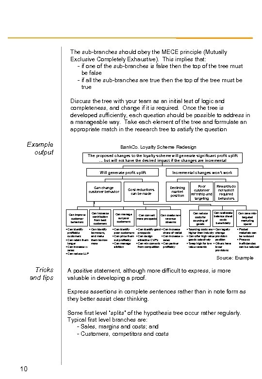 The sub-branches should obey the MECE principle (Mutually Exclusive Completely Exhaustive). This implies that: - if one of the sub-branches is false then the top of the tree must be false - if all the sub-branches are true then the top of the tree must be true Discuss the tree with your team as an initial test of logic and completeness, and change if it is required. Once the tree is developed sufficiently, each question should be possible to address in a manageable way. Take each element of the tree and formulate an appropriate match in the research tree to satisfy the question Example output Bank. Co. Loyalty Scheme Redesign The proposed changes to the loyalty scheme will generate significant profit uplift … but will not have the desired impact if the changes are incremental Will generate profit uplift Can change customer behavior Can improve customer behaviors • Can identify profitable customers • Can retain them longer • Can increase xsales • Can reduce LLP Tricks and tips Can increase contribution from best customers • Can identify borrowers, and make them borrow more Cost reductions can be made Can manage out poor customers • Can identify Can convert more prospects Incremental changes won’t work Declining market position Can create new revenue streams • Can identify good • Can increase poor customers prospects share of wallet • Can price them • Can design • Can increase xout profitably attractive CVPs sales • Can manage • Can win converts • Can partner attrition from competition profitably Poor customer rel’nship and targeting Can reduce costs for sourcing of goods Rewards do not solicit required behaviors Can reallocate balance sheet costs beneficially • Sourcing costs are • Can legally higher than industry change • Can offer high value provision goods selectively position • Swap high for low • Others have value rewards lower provisions Can save mistargeted marketing spend • Posted materials can be reduced • Process inefficiencies can be reduced Source: Example A positive statement, although more difficult to express, is more valuable in developing a proof. Express assertions in complete sentences rather than in note form as they better assist clear thinking. Some first level “splits” of the hypothesis tree occur rather regularly. Typical first level branches are: - Sales, margins and costs; and - Customers, competitors and costs 10
 Asset extension modelling Description Asset extension modeling is a simple too (or technique) for identifying new business opportunities, based upon a company’s existing strategic assets. It is all too common in the new economy to define potential business opportunities which are simply not realizable given the starting position of a particular company. This techniques avoids those pitfalls by isolating core, near and far opportunities based on the structuring of existing assets such as brand, market reach, capital, IP, etc. By defining the “distance” of a business opportunity it is much more likely that you will identify the likelihood of achieving stretch opportunities without straying into the realms of fantasy. Typical application Typical process Typical applications for asset extension modeling might include: - e-commerce brainstorming; - identifying regeneration targets; - skills gap analysis; - re-engineering; and - portfolio investment planning and divestment analysis Complete a skills audit, ensuring that all asset classes are captured (from soft assets through to hard assets). Typical asset classes might include: free cash, debt availability, skills, scale of workforce, IP (knowledge, patents), customer base, products, brand, access to industry influences, etc. Rank the strength of each assets, and then cluster into 2 -6 groups. One or two teams members should then develop an asset extension map, which can then be tested internally with the rest of the project team. Run this past the primary client contact and incorporate his or her feedback. Plan and organize a workshop, paying specific attention to the “stretch questions” you will ask. During the workshop, treat the exercise like a brainstorming session, but keep drawing the threads back to the defining assets. Conclude the workshop by gaining agreement on which opportunities are most likely to be successful. 11
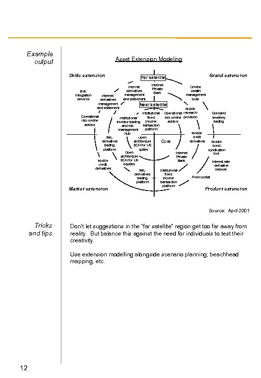 Example output Asset Extension Modeling Skills extension B-B integration services Internet derivatives management and settlement Brand extension Far satellite Internet derivatives management and settlement Internet Private Bank On-line wealth management tools Near satellite Mobile Institutional Operational research Gold and Operational fixed risk on-line provision jewellery Institutional risk on-line income advisor trading investor trading advisor transaction and risk platform management Mobile hub credit XML Open derivatives architecture Core Mobile trading ECN for US bond platform equities syndication Open Internet tool architecture Private ECN for UK Mobile Bank Interest rate equities credit derivatives network XML Institutional derivatives fixed Forex portal trading income platform transaction platform Market extension Product extension Source: April 2001 Tricks and tips Don’t let suggestions in the “far satellite” region get too far away from reality. But balance this against the need for individuals to test their creativity. Use extension modelling alongside scenario planning, beachhead mapping, etc. 12
 Business definition Description A framework to help clients understand how they might best manage their business as unified or separated entities. It also forms a basis for identifying new business opportunities and for estimating the potential of markets. Business definition is based on the logic that “shared customers plus shared costs constitutes a single business”. Alternatively, if a business shares neither customers or costs they are distinct. This has significant implications on how to structure businesses in a manner which can leverage scale and reach customers to maximize cross selling and minimize channel costs. Typical application Typical process There are many uses for business definition, but key applications include: - establishing the boundaries of new e-business; - deciding how to manage a portfolio of opportunities; - as a basis for market entry studies; - to support new business start-ups; and - value proposition development Begin by getting a contextual understanding through background reading. Use this knowledge to identify discrete business activities in the area your client is working (as is). For example, food manufacture, pet food brand management, wheat milling, food distribution (US), food distribution (France). Determine the cost structure (i. e. the key components) for each activity. Use the 80: 20 approach, but dig down as quickly as possible into existing management accounts. Plot 100% bars for costs against each other, and identify through shading where cost sharing occurs (or could occur). Map the channel processes at a high level, which serve the customers for each business activity. Plot this as a value chain, each against the others and identify areas of channel/customer sharing. Plot each business activity on the “cost sharing vs. customer sharing” matrix. 13
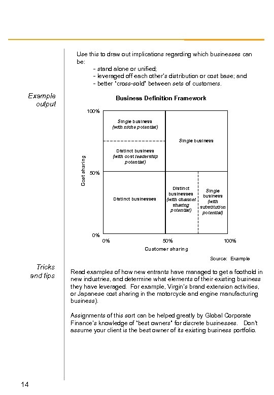 Use this to draw out implications regarding which businesses can be: - stand alone or unified; - leveraged off each other’s distribution or cost base; and - better “cross-sold” between sets of customers. Example output Business Definition Framework 100% Single business (with niche potential) Cost sharing Single business Distinct business (with cost leadership potential) 50% Distinct businesses Distinct Single businesses business (with channel (with sharing substitution potential) 0% 0% 50% 100% Customer sharing Source: Example Tricks and tips Read examples of how new entrants have managed to get a foothold in new industries, and determine what elements of their existing business they have leveraged. For example, Virgin’s brand extension activities, or Japanese cost sharing in the motorcycle and engine manufacturing business). Assignments of this sort can be helped greatly by Global Corporate Finance’s knowledge of “best owners” for discrete businesses. Don’t assume your client is the best owner of its existing business portfolio. 14
 Capability assessment Description Typical application Capability assessment encompasses a number of tools designed to focus a client on specific skills that the client or competitor’s company may have or lack, and that therefore may act as a basis for a sustained source of competitive advantage. Capability assessment is an important activity for isolating and ranking capabilities in a particular company, business unit or department. It can be used either to rank capabilities as seen within a company, or as perceived by customers or clients externally. By using tools such as the spider chart in displaying the results, characteristic patterns can be isolated, and the cumulative impact of over- or underperformance in a number of fields can be highlighted. See also: Value disciplines Typical process Determine the key capabilities you wish to assess the company by. These may be three core capabilities from the ‘value disciplines’ model, or other categories (agreed with the client in advance), indeed almost anything that can be broadly termed a ‘capability’. This might include: - superior skills in producing high quality products; - superior system for delivering customer orders accurately and swiftly; - better after-sale service capability; - more skill in achieving low operating costs; - unique formula for selecting good retail locations; - unusual innovativeness in developing new products; - better merchandising and product display skills; and - superior mastery of an important technology Conduct a comprehensive survey of a predetermined target audience (customers, employees, etc. ) based on ranking each capability. Average the results for each category to get a single score for each capability. Plot the results of the survey on a spider chart so that each capability runs along its own axis. Join the points on each axis together to form a complete shape. You may wish to shade the area enclosed by the lines to indicate a rough ‘overall’ performance. Annotate your results carefully so as to highlight the conclusions you have drawn. 15
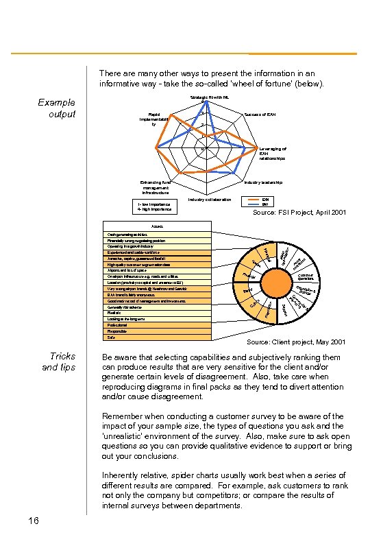 There are many other ways to present the information in an informative way - take the so-called ‘wheel of fortune’ (below). Strategic fit with ML 4 Example output Rapid implementabili ty 3 Success of EXN 2 1 0 Enhancing fund management infrastructure Leveraging of EXN relationships Industry leadership Industry collaboration EXN BW 1 - low importance 4 - high importance Source: FSI Project, April 2001 Assets Cash generating activities Fina Experienced and stable workforce Hu On airport infrastructure e. g. roads and utilities l m High quality customer segmentation data Airports and lots of space ncia Attractive, captive, guaranteed footfall an A optimsset isatio Operating in a growth industry n Financially strong negotiating position Phys t s se ion As rat e op Customer operations ical Location (proximity to capital and entrance to EU) d Bran re Good track record of management and investments Looking at the long term Rep Realistic tu ul C ort Supp Generally risk adverse on BAA brand is fairly anonymous utati Very strong airport brands @ Heathrow and Gatwick Regu lati politic on & al C M om ar m ke e rc tin i g al & Professional Responsible Safe Tricks and tips Source: Client project, May 2001 Be aware that selecting capabilities and subjectively ranking them can produce results that are very sensitive for the client and/or generate certain levels of disagreement. Also, take care when reproducing diagrams in final packs as they tend to divert attention and/or cause disagreement. Remember when conducting a customer survey to be aware of the impact of your sample size, the types of questions you ask and the ‘unrealistic’ environment of the survey. Also, make sure to ask open questions so you can provide qualitative evidence to support or bring out your conclusions. Inherently relative, spider charts usually work best when a series of different results are compared. For example, ask customers to rank not only the company but competitors; or compare the results of internal surveys between departments. 16
 Competitor analysis template Description Typical application A template which aids direct comparison between industry competitors, based around strategically important differentiating factors. This template is not uniform, but is typically structured. Wherever a rigorous comparison between market players has to be made. To address a company’s structure, strategic conduct and performance. There is no “magic” to this particular template, but something similar should be employee in order to avoid uncomparative or non-focused analysis. Typical process Review the hypothesis for your current client assignment and agree the key parameters which capture the behaviors of each competitor related to your specific issue. Try the template on one or two competitors. Then simplify and modify it on the back of the experiences you find. Feed the information into the strategic decision making steps in the assignment. Tricks and tips 17 If you cannot fit all of your summary onto a single page you have not understood the issue or the competitor well enough. Revise.
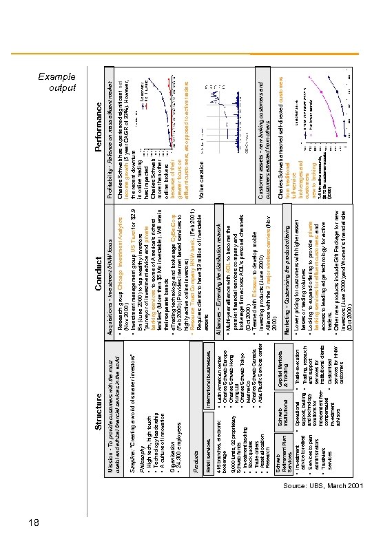 18 International businesses services • Trust. Mark administrators • Services to plan advice to retired • Investment Schwab Retirement Plan Services Capital Markets & Trading Customised services for HNW customers Trading, research and support services for institutional clients • Trade execution support, trading • and technology solutions for independent feecompensated • investment advisors • Operational Schwab Institutional Kong Ltd • Charles Schwab Tokyo Marine Co • Charles Schwab Canada • Asia Pacific Services center 415 branches, electronic brokerage 3, 000 funds, 32 proprietary Schwab funds • Investment tracking • Stock quotes • Trade orders • Asset allocation • Research • Latin American center • Charles Schwab Europe • Charles Schwab Hong Retail services Products Organisation • 24, 300 employees Philosophy • High tech, high touch • Technology leadership • A culture of innovation Strapline: “Creating a world of smarter investors“ Mission - To provide customers with the most useful and ethical financial services in the world Structure banking services for affluent customers and access to leading edge technology for active traders. • Other new products include Gift Package for new investors (June 2000); and Women’s financial site (Oct 2000) • Looking to expand offering to provide private bases or trading volumes • Lower pricing for customers with higher asset Marketing - Customising the product offering premier financial services company and brokerage firm across AOL’s personal channels (Oct 2000) • Teamed with Ericsson to develop mobile investing products (June 2000) • Alliance with the 3 major wireless carriers (Nov 2000) • Multi-year alliance with AOL to become the Alliances - Extending the distribution network 7. 5 Mn active accounts, $872 Bn customer assets (2000) Charles Schwab attracted self-directed customers from traditional full-service brokerages and customers new to broking Customer assets - new broking customers and customers attracted from others Value creation Charles Schwab has experienced significant net income growth (5 year CAGR of 33%). However, the recent downturn in online trading has impacted Charles Schwab more than other online brokers because of their greater focus on affluent customers, as opposed to active traders • Research group Chicago Investment Analytics (Nov 2000) • Investment management group US Trust for $2. 9 Bn (June 2000) to tap wealthy investors “purveyor of investment advice and private banking services to some of America's richest families” (More than $5 Mn investable). Will retain their separate brands • e. Trading technology and brokerage Cy. Ber. Corp (Feb 2000) (Provides internet based services to highly active online investors) • Resource Trust Company HNW bank. (Feb 2001) Requires clients to have $3 million of investable assets Profitability - Reliance on mass affluent market Performance Acquisitions - Investment /HNW focus Conduct Example output Source: UBS, March 2001
 Conversion waterfall Description The conversion waterfall is a tool that helps identify areas of relative competitive weakness and strength, whether between internal factors (e. g. different locations or products) or relative to competitors. The waterfall is a simple way of representing the findings of a customer interview programme targeting six major measures. The conversion waterfall illustrates the attitude and/or behaviour patterns of a company’s customer base. It provides insight into where a company is losing or gaining customer interest. By focusing attention towards the strongest relationships, conversion waterfalls can be used to direct a company’s efforts into retaining customers. See also: Customer Segmentation, Customer Lifecycle Typical application Typical process Understanding customer behaviour is a very important part of strategic business analysis. By examining customer attitudes and behaviour, a business can identify where their strengths and weaknesses lie and begin filling the competitive gap or maximising a competitive opportunity. Begin by carefully planning your activities. This includes defining the hypothesis to be tested in your interview programme, and determining the interview target population. When setting up the interview programme, ensure the sample size is large enough. As a rule of thumb, interview more than 30 customers. Design your questions to ensure you answer the questions required for the planned output, and include redundancy to check customer consistency. Clearly define each category in the interview plan/questionnaire. If you don’t understand the differences between the factors you are evaluating, the customer never will. Where possible conduct research in more than one market. A variance of results may just show cultural differences, but in some cases it might give an insight into the way different markets operate. Spend some time thinking about the results. Average the quantifiable scores, then seek to explain through reference to what you know of an organization's brand, image, store, location or product feature. 19
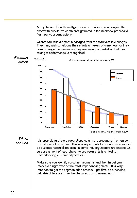 Apply the results with intelligence and consider accompanying the chart with qualitative comments gathered in the interview process to flesh out your conclusions. Clients can take different messages from the results of this analysis. They may wish to refocus their efforts on areas of weakness; or they could change the messages they are taking to market so that their stronger performance is recognized. Example output % of population Conversion waterfall, combine harvesters, 2001 100% 90% New Holland 80% Competitor 70% 60% 50% 40% 30% 20% 10% 0% Awareness Knowledge Liking Preference Tested Purchase Source: TMC Project, March 2001 Tricks and tips It is possible to show a repurchase column, representing the number of customers that return. This is a key output of customer satisfaction as customer acquisition costs in some industry sectors are enormous, so assessment of repurchase across segments is critical to understanding customer dynamics. Make sure you identify customer segments and then target your interview programme at the most important segments. It is very important to get the segmentation process right first, as otherwise valuable differences may be obscured during averaging. 20
 Customer experience analysis Description Customer Experience Analysis is a mechanism for identifying the critical decisions, events and actions a customer undertakes during the full purchase process. It helps identify the customer contact points and the key criteria for success at each one. This analysis is sometimes labeled Customer Value Exchange. Typical application Useful for any company which has to compete for and retain customers (i. e. all of them). The concept is easily extendable to employees (internal customers), suppliers, partners and other shareholders. Improving customer profitability is only possible if you change the customers’ behavior (e. g. buy more, use lower cost channels, recommend to friends etc. ) Measuring customer behaviour at every interaction point with the company allows you to advise on where your client must invest (i. e. change things) in order to bridge the gap between customer expectations and delivery against them. Many other tools can contribute to this analysis, including CVP definition, root cause analysis, customer satisfaction surveys, product prioritisation, financial return modeling, customer segmentation etc. Typical Process The full process for undertaking this analysis can be extremely comprehensive. Below is described a number key steps which are typically undertaken. - define and agree customer segments (need-based) - develop insight into customer behaviours (e. g. understand customer promise, rank needs, define perception gap etc. ) - develop hypothesis of how to fill ‘gap’ and estimate $potential - identify all customer contact points (high level, then detailed) - develop detailed gap analysis at each contact point – using existing client and public domain data, interviews etc. - prioritise areas for investment which will solicit maximum change - determine root cause - financially model benefit returns - design processes for achieving changes in customer behaviour - develop transition plan and measuring/monitoring system Clearly, the full end-to-end analysis requires multiple tools and techniques, but the fundamental framework of identifying and prioritising customer contact points can be very powerful. 21
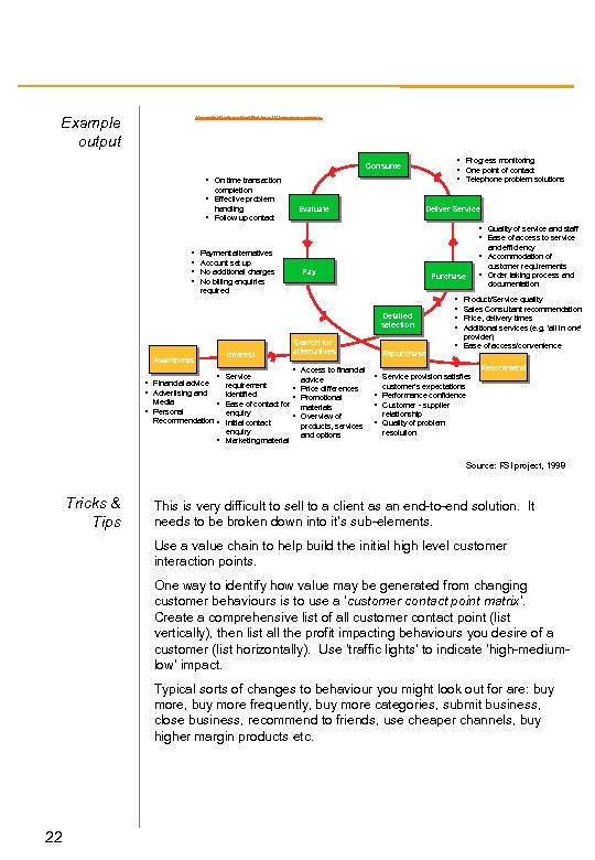 Example output Key contact features identified for a UK insurance company • Progress monitoring • One point of contact • Telephone problem solutions Consume • On time transaction completion • Effective problem handling • Follow up contact Evaluate Deliver Service • Quality of service and staff • Ease of access to service • • Payment alternatives Account set up No additional charges No billing enquiries required and efficiency • Accommodation of customer requirements Pay Purchase documentation Detailed selection Awareness Interest • Service • Order taking process and Search for alternatives • Access to financial advice • Financial advice requirement • Price differences • Advertising and identified • Promotional Media • Ease of contact for materials • Personal enquiry • Overview of Recommendation • Initial contact products, services enquiry and options • Marketing material Repurchase • • Product/Service quality Sales Consultant recommendation Price, delivery times Additional services (e. g. ‘all in one’ provider) • Ease of access/convenience Recommend • Service provision satisfies customer’s expectations • Performance confidence • Customer - supplier relationship • Quality of problem resolution Source: FSI project, 1998 Tricks & Tips This is very difficult to sell to a client as an end-to-end solution. It needs to be broken down into it’s sub-elements. Use a value chain to help build the initial high level customer interaction points. One way to identify how value may be generated from changing customer behaviours is to use a ‘customer contact point matrix’. Create a comprehensive list of all customer contact point (list vertically), then list all the profit impacting behaviours you desire of a customer (list horizontally). Use ‘traffic lights’ to indicate ‘high-mediumlow’ impact. Typical sorts of changes to behaviour you might look out for are: buy more, buy more frequently, buy more categories, submit business, close business, recommend to friends, use cheaper channels, buy higher margin products etc. 22
 Customer segmentation Description Typical process The key to operating successfully in a competitive market is understanding customers needs, values and behaviors and being able to take action. Segmentation identifies groups of customers with homogeneous needs, who can be served by a tailored proposition. From what you know about the client’s customer database, industry analysis, client or expert interviews, and focus groups, begin by developing a number of hypotheses about likely segmentation schema. Segmentation seeks to group customers according to similar purchase behaviors, attitudes and profiles. The outputs of a segmentation schema must be: - identifiable/recognizable: you must be able to identify which segment a customer is likely to be in so that marketing programmes can be actioned; - actionable: you must present strategic options for each segment which are achievable; - measurable: it must be possible to measure segments by key dimensions and assess them for market potential; and - stable: there must be an assessment of a segments short, medium and long term viability. Segments rarely remain the same over time When you are happy with your hypotheses develop a questionnaire to test them/validate them. Keep the questioning as short as possible and only focus on the things you really need to know. “Pilot” the questionnaire with a small group of customers to test that it works. The sample size for the actual programme should be a minimum of 50 to be useful, or 30 per customer segment identified. This can be a large task and it may be more economical to subcontract the work out. Analyze your results. Perform factor analysis to group customers and identify trends and similar responses, and be prepared to re-formulate your hypotheses if necessary. Look at the groups to identify the characteristics that can be used to describe them and their purchasing criteria, remembering the objective is to identify a MINIMAL number of groupings. Draw out the implications of your findings as they may require the client to readdress its marketing strategy and/or business model. 23
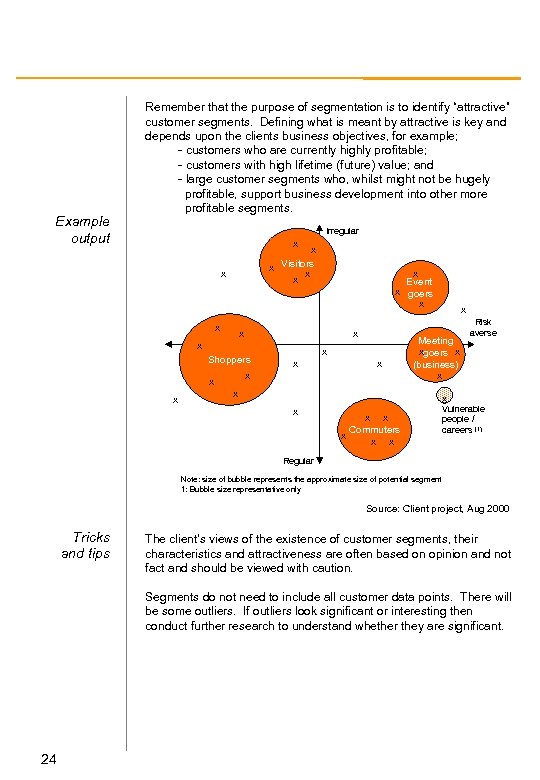 Example output Remember that the purpose of segmentation is to identify “attractive” customer segments. Defining what is meant by attractive is key and depends upon the clients business objectives, for example; - customers who are currently highly profitable; - customers with high lifetime (future) value; and - large customer segments who, whilst might not be hugely profitable, support business development into other more profitable segments. Irregular x x Visitors x x x x Shoppers x x x x Event x goers x x x Meeting xgoers x (business) x Risk averse x x Commuters x x x Vulnerable people / careers (1) Regular Note: size of bubble represents the approximate size of potential segment 1: Bubble size representative only Source: Client project, Aug 2000 Tricks and tips The client’s views of the existence of customer segments, their characteristics and attractiveness are often based on opinion and not fact and should be viewed with caution. Segments do not need to include all customer data points. There will be some outliers. If outliers look significant or interesting then conduct further research to understand whether they are significant. 24
 Customer segmentation analysis Description Customer segmentation is the subdivision of a market into discrete customer groups that share similar characteristics. Any product or service potentially appeals to a universal audience. In reality, a company will sell to only a small segment of the population, and may derive value from a sub-segment of that. Typical application Customer segmentation can be a powerful means to identify unmet customer needs. It allows you determine a client’s customer base and its characteristics in a meaningful way, splitting customers up into groups and ultimately making operational decisions about the allocation of resources for such activities as product development, marketing, selling methods, distribution strategies and pricing. This allows a company to compete only where it is strong and likely to prosper. For example, companies that identify underserved segments can achieve a leadership position by being the first to serve them. Customer segmentation is most effective when a company tailors offerings to segments that are the most profitable and targets them where the company has a distinct competitive advantage. Typical process Divide the market into meaningful and measurable segments according to customers’ needs, their past behaviors or their demographic profiles. In many ways, this is the most difficult part of the process. Determining the most insightful segmentation variables can be done through research, customer surveys, or focus groups (see customer segmentation section for details). Determine the attractiveness of each segment by analyzing, for example, the revenue and cost impacts of serving each segment or client retention rates. Use shading and annotation to draw out the key market segments the company should be targeting. Try and identify ways the client can invest resources to tailor the product, service or its marketing or distribution programmes to match the needs of the key target segments. 25
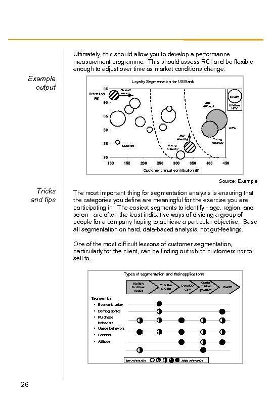 Ultimately, this should allow you to develop a performance measurement programme. This should assess ROI and be flexible enough to adjust over time as market conditions change. Example output Loyalty Segmentation for US Bank Retention (%) Retired savers £ 100 m Mid. Affluent Lifetime NPV 4. 8% Mid. Wealthy Young Affluent Young Wealthy Students Customer annual contribution ($) Source: Example Tricks and tips The most important thing for segmentation analysis is ensuring that the categories you define are meaningful for the exercise you are participating in. The easiest segments to identify - age, region, and so on - are often the least indicative ways of dividing a group of people for a company hoping to achieve a particular objective. Base all segmentation on hard, data-based analysis, not gut-feelings. One of the most difficult lessons of customer segmentation, particularly for the client, can be finding out which customers not to sell to. Types of segmentation and their applications Identify customer needs Priorities targets Develop CVP Create market position Segment by: • Economic value • Demographics • Purchase behaviors • Usage behaviors • Channel • Attitude low relevance 26 high relevance Reach
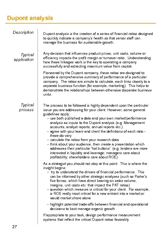 Dupont analysis Description Dupont analysis is the creation of a series of financial ratios designed to quickly indicate a company’s health so that senior staff can manage the business for sustainable growth. Typical application Any decision that influences product prices, unit costs, volume or efficiency impacts the profit margin or turnover ratio. Understanding how these linkages work is the key to operating a company successfully and extracting maximum value from capital. Pioneered by the Dupont company, these ratios are designed to provide a comprehensive summary of performance of a particular company. The ratios are simple to calculate, each links closely to a separate business function (for example, marketing). This helps to demonstrate the relationships between otherwise disparate business units. Typical process The process to be followed is highly dependent upon the particular issue you are addressing for your client. However, some general guidelines apply: - use both published a data and your own market/performance analysis as inputs to the Dupont analysis (e. g. Management accounts, analyst reports, annual reports etc. ) - agree with your team and client the definitions of each ratio these do vary - calculate the ratios from your research data - think about your audience, then create a presentation which addresses their particular ‘hot buttons’ (e. g. lenders are more interested in liquidity and leverage; managers care about profitability; shareholders care about ROE) As a strategist you should not stop at this point. This is where the insight begins: - try to understand the drivers of financial performance. This can be informed by other strategic analyses (such as Porter’s five forces, which have direct bearing on sales volume, margins, unit costs etc. that impact the PAT ratios) - question which measure is critical for your client. For example, is ROE really most critical for a new entrant into a market or would market share alone - highlight potential trade-offs between financial and operational decisions to best manage organic growth If appropriate to your task, design performance measurement systems that reflect the critical Dupont ratios favorably 27
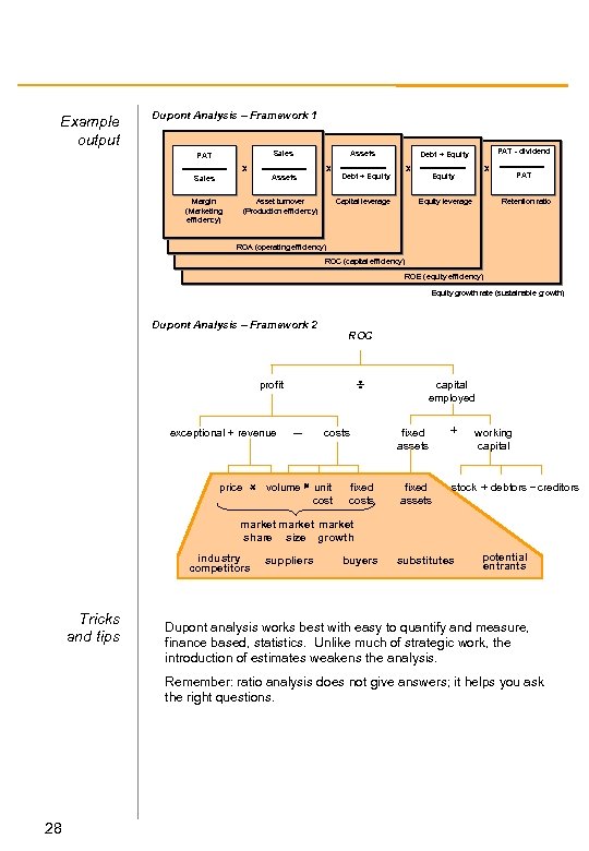 Example output Dupont Analysis – Framework 1 Sales PAT Assets X X Assets Sales Margin (Marketing efficiency) Asset turnover (Production efficiency) PAT - dividend Debt + Equity X Debt + Equity Capital leverage X Equity leverage PAT Retention ratio ROA (operating efficiency) ROC (capital efficiency) ROE (equity efficiency) Equity growth rate (sustainable growth) Dupont Analysis – Framework 2 ROC profit exceptional capital employed revenue price volume costs unit cost fixed costs fixed assets working capital stock debtors creditors market share size growth industry competitors Tricks and tips suppliers buyers substitutes potential entrants Dupont analysis works best with easy to quantify and measure, finance based, statistics. Unlike much of strategic work, the introduction of estimates weakens the analysis. Remember: ratio analysis does not give answers; it helps you ask the right questions. 28
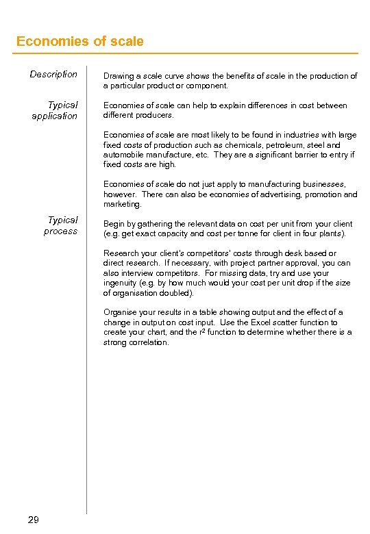 Economies of scale Description Drawing a scale curve shows the benefits of scale in the production of a particular product or component. Typical application Economies of scale can help to explain differences in cost between different producers. Economies of scale are most likely to be found in industries with large fixed costs of production such as chemicals, petroleum, steel and automobile manufacture, etc. They are a significant barrier to entry if fixed costs are high. Economies of scale do not just apply to manufacturing businesses, however. There can also be economies of advertising, promotion and marketing. Typical process Begin by gathering the relevant data on cost per unit from your client (e. g. get exact capacity and cost per tonne for client in four plants). Research your client’s competitors’ costs through desk based or direct research. If necessary, with project partner approval, you can also interview competitors. For missing data, try and use your ingenuity (e. g. by how much would your cost per unit drop if the size of organisation doubled). Organise your results in a table showing output and the effect of a change in output on cost input. Use the Excel scatter function to create your chart, and the r 2 function to determine whethere is a strong correlation. 29
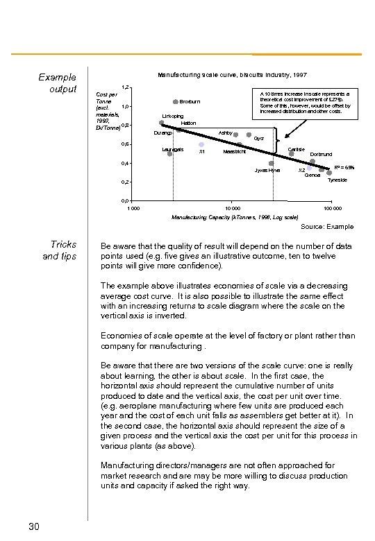 Example output Manufacturing scale curve, biscuits industry, 1997 1, 2 Cost per Tonne 1, 0 (excl. materials, 1993, 0, 8 £k/Tonne) A 10 times increase in scale represents a theoretical cost improvement of £ 275 p. Some of this, however, would be offset by increased distribution and other costs. Broxburn Linkoping Hatton Durango Ashby Gyor 0, 6 Lauragais X 1 Carlisle Maastricht Dortmund 0, 4 Jyvas Hyva X 2 0, 2 R 2 = 65% Genoa Tyneside 0, 0 1 000 100 000 Manufacturing Capacity (k. Tonnes, 1996, Log scale) Source: Example Tricks and tips Be aware that the quality of result will depend on the number of data points used (e. g. five gives an illustrative outcome, ten to twelve points will give more confidence). The example above illustrates economies of scale via a decreasing average cost curve. It is also possible to illustrate the same effect with an increasing returns to scale diagram where the scale on the vertical axis is inverted. Economies of scale operate at the level of factory or plant rather than company for manufacturing. Be aware that there are two versions of the scale curve: one is really about learning, the other is about scale. In the first case, the horizontal axis should represent the cumulative number of units produced to date and the vertical axis, the cost per unit over time. (e. g. aeroplane manufacturing where few units are produced each year and the cost of each unit falls as assemblers get better at it). In the second case, the horizontal axis should represent the size of a given process and the vertical axis the cost per unit for this process in various plants (as above). Manufacturing directors/managers are not often approached for market research and are may be more willing to discuss production units and capacity if asked the right way. 30
 Executive dashboard Description Typical application The executive dashboard is a tool designed to give a one-page overview of the performance of a company that goes beyond simple measures of financial performance. It provides a framework to translate strategic objectives into measurable performance indicators, giving the CEO/COO full and timely control over business performance and/or business change The dashboard comprises a series of key performance indicators (KPIs) that look beyond financial performance alone and can address a very wide range of issues. The most common applications are - monitoring the performance of a business in a dynamic industry - monitoring the progress of business process reengineering - monitoring organisational change initiatives Some typical example KPIs include: financial performance (turnover, profit, working capital); employee measures (satisfaction levels, utilisation); customer measures (churn, delivery time, satisfaction) Most successful applications of the dashboard have supporting “exception reporting” pages which identify individuals responsible for outstanding or poor performance against targets or milestones. Typical Process Dashboards are typically constructed as the final output of an earlier study of the business fundamentals, so the first step is always to review earlier work and interview team members and the client. KPIs may be determined through a number of mechanism, including analysis of management accounts, benchmarking, consultation with industry experts. However, do not be surprised if a business is seeking to build a dashboard with no clear view of the critical KPIs (it is certainly not unknown). In this instance determination of the critical KPIs may be long exercise including multiple client interviews, customer interview programmes etc. Whatever, make sure you agree the definition of each KPI and the most critical ones which will populate the dashboard. After the critical KPIs are determined it will be necessary to derive a hierarchical logic tree of sub-KPIs which feed the critical measures. It is common that the desired measures will not be (easily) available within the business. In this instance it will be necessary to put interim (manual) measures in place to capture the data. The hierarchy of KPIs should stop when an individual’s name can be placed against each measure and hence be held accountable.
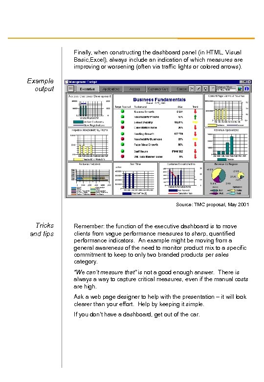 Finally, when constructing the dashboard panel (in HTML, Visual Basic, Excel), always include an indication of which measures are improving or worsening (often via traffic lights or colored arrows). Example output Source: TMC proposal, May 2001 Tricks and tips Remember: the function of the executive dashboard is to move clients from vague performance measures to sharp, quantified performance indicators. An example might be moving from a general awareness of the need to monitor product mix to a specific commitment to keep to only two branded products per sales category. “We can’t measure that” is not a good enough answer. There is always a way to capture critical measures, even if the manual costs are high. Ask a web page designer to help with the presentation – it will look clearer than your effort. Help by keeping it simple. If you don’t have a dashboard, get out of the car.
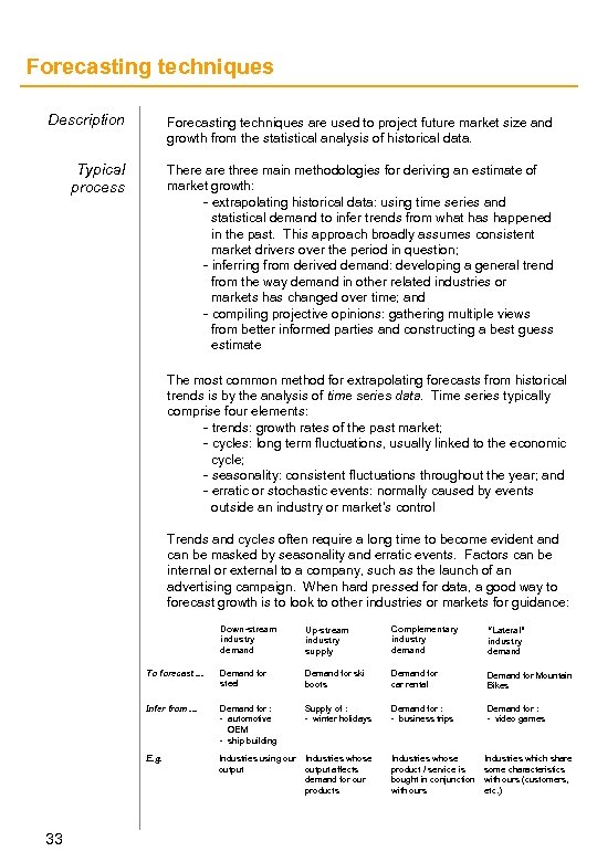 Forecasting techniques Description Forecasting techniques are used to project future market size and growth from the statistical analysis of historical data. Typical process There are three main methodologies for deriving an estimate of market growth: - extrapolating historical data: using time series and statistical demand to infer trends from what has happened in the past. This approach broadly assumes consistent market drivers over the period in question; - inferring from derived demand: developing a general trend from the way demand in other related industries or markets has changed over time; and - compiling projective opinions: gathering multiple views from better informed parties and constructing a best guess estimate The most common method for extrapolating forecasts from historical trends is by the analysis of time series data. Time series typically comprise four elements: - trends: growth rates of the past market; - cycles: long term fluctuations, usually linked to the economic cycle; - seasonality: consistent fluctuations throughout the year; and - erratic or stochastic events: normally caused by events outside an industry or market’s control Trends and cycles often require a long time to become evident and can be masked by seasonality and erratic events. Factors can be internal or external to a company, such as the launch of an advertising campaign. When hard pressed for data, a good way to forecast growth is to look to other industries or markets for guidance: Down-stream industry demand Complementary industry demand “Lateral” industry demand To forecast. . . Demand for steel Demand for ski boots Demand for car rental Demand for Mountain Bikes Infer from. . . Demand for : - automotive OEM - ship building Supply of : - winter holidays Demand for : - business trips Demand for : - video games E. g. 33 Up-stream industry supply Industries using our output Industries whose output affects demand for our products Industries whose product / service is bought in conjunction with ours Industries which share some characteristics with ours (customers, etc. )
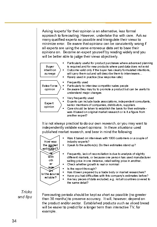 Asking ‘experts’ for their opinion is an alternative, less formal approach to forecasting. However, undertake this with care. Ask as many qualified experts as possible and triangulate their views to minimize error. Be aware that opinions can be consistently wrong if all experts are using the same erroneous data set to base their opinions on. Become an expert yourself by reading widely and you will be better able to judge their views objectively. • Buyer intention surveys • • Sales force opinion Expert opinion Particularly useful for product purchases where advanced planning is required and for new products where past data does not exist Outcome valid only if the buyer has clearly formulated intentions, will carry them out and will describe them to interviewers. . . Rarely used in practice (low response rate) • • • Frequently used Particularly to interview competitor sales people Be aware they may try to promote a product but can be useful to understand major changes • • Very frequently used Experts can include trade associations, independent consultants, senior members of companies, distributors, suppliers Care should be taken to establish the basis for their estimate was it based on original market research or is it a figure from another expert? • It is not always practical to do our own research, or you may want to independently validate expert opinions. In these situations used published market research, and bear in mind the following: • How was the market Rec estimated? onc ile with oth er rese arc Is the source h reliable? Tricks and tips 34 • • Was it based on interviews with 1000 customers or a couple of industry experts? Speak to the authors(s). Do their estimates stand up? Frequently, lack of reconciliation is due to analysis of slightly different markets, or because one person has used manufacturer selling price in one instance, retail selling price in another. Check whether growth is real or nominal Is the report thorough? Has it been prepared by a trade body or market researchers? Have you had difficulties with this company's estimates before? Are key pieces of data excluded, e. g. not all countries covered to the same detail? Forecasting periods should be kept as short as possible (no greater than 36 months) to preserve accuracy. It will, however, depend on the product and/or sector. Established products such as sliced bread will be easier to predict for a longer term than interactive TV, for example.
 Free cashflow diagram Description The free cashflow diagram is an excellent format for displaying the results of a cash flow analysis over time. Its strength lies in the fact that it displays all of the key business indicators looked for by a senior executive. These include: sources of value; fixed and variable investment costs; break-even; net and cumulative cash position; net present value. Typical application Free cashflow represents the net cash flow that a firm or project expects to generate. Unlike a cashflow statement, which attempts to reconcile sources/uses of cash with starting/ending cash (accounting perspective), free cash flow focuses on the key strategic component of the generating/financing equation. Given this, the free cashflow diagram can be used in almost all circumstances where you need to display the commercial outcome of any strategic business investment. It is one of the most frequently used tools in the strategy consultants armoury. Typical process The diagram should be drawn from an earlier Excel spreadsheet analysis. The following steps outline the main features: - Identify main sources of cash in and cash spend. (Be aware that more than 5 -6 sources makes the chart look cluttered and detracts from the key messages. Consider grouping small and non-critical sources together as ‘other’. ) - Put cash flow on the x-axis, time on the y-axis. - Create column chart, showing cash above the line (use +ve numbers) and cash costs below the line (use -ve numbers) - Hand draw the net cashflow and cumulative cashflow lines. - Highlight the breakeven point and the point of maximum exposure (highest negative cashflow). - Name cashflow sources. - Insert figures for net cashflow for the year and cumulative year on year cashflow figures. This should lead to break even analysis and an analysis of profitability. - The key ratio for analysis is that of risk exposure - the difference between maximum risk exposed point (worst NPV) and best possible NPV. There is a clear link between the cash flow diagram and the sources of value waterfall. Both show the individual components of an overall financial flow. Draw this picture early (in combination with your sources of value waterfall diagram). It can form the bedrock of common sense decisions and is a very useful communication tool with your team and the client 35
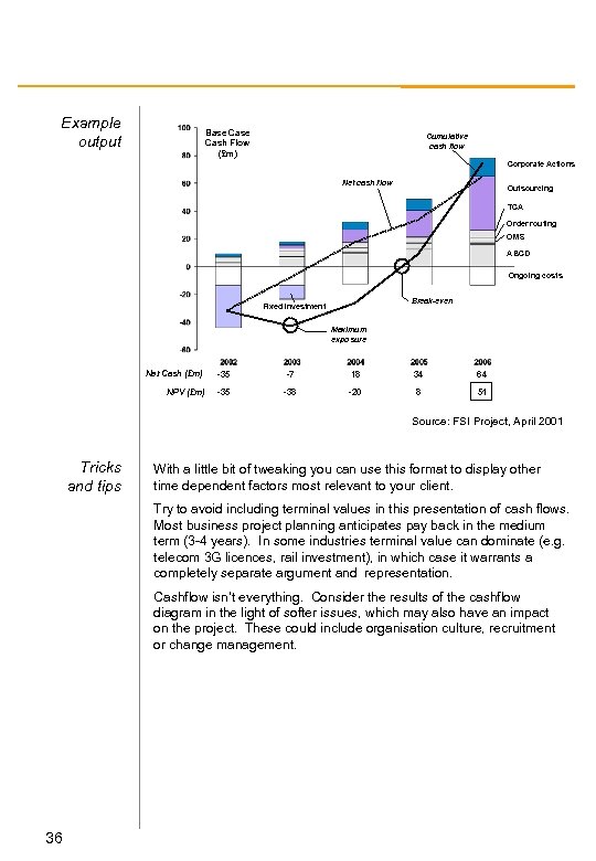 Example output Base Cash Flow (£m) Cumulative cash flow Corporate Actions Net cash flow Outsourcing TCA Order routing OMS ABCD Ongoing costs Break-even Fixed Investment Maximum exposure Net Cash (£m) -35 -7 18 34 64 NPV (£m) -35 -38 -20 8 51 Source: FSI Project, April 2001 Tricks and tips With a little bit of tweaking you can use this format to display other time dependent factors most relevant to your client. Try to avoid including terminal values in this presentation of cash flows. Most business project planning anticipates pay back in the medium term (3 -4 years). In some industries terminal value can dominate (e. g. telecom 3 G licences, rail investment), in which case it warrants a completely separate argument and representation. Cashflow isn’t everything. Consider the results of the cashflow diagram in the light of softer issues, which may also have an impact on the project. These could include organisation culture, recruitment or change management. 36
 Gantt chart Description Typical application Typical process A Gannt chart is a graphical timetable of project activities and milestones. As well as showing the planned duration of activities, it can also be used to show responsibilities for workstreams, interdependencies between workstreams, and critical paths. Gannt charts are used to help plan and manage projects. They should be used in almost any proposal to help explain how we would carry out the engagement. They should also be updated regularly during projects to aid project management. Whilst Gannt charts are rarely used in final client presentations, they can be very useful in intermediate presentations to show progress and future plans, and to highlight project constraints. The information to be plotted on a Gannt chart should be obtained during the course of project planing and ongoing management. This should include: • Project phases • Project workstreams • Activities within each workstream • Project milestones • Planned duration of activities • Effort required for each activity • Availability of resources Gannt charts can be drawn directly in Powerpoint or developed using a project management application such as Microsoft Project. Involve the project team members and the client in the development of Gannt charts. 37
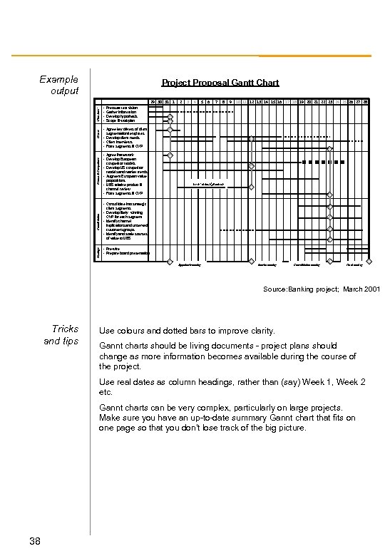 Example output Project Proposal Gantt Chart Market & Competitors Clients ‘Kick Start’ 29 30 31 1 • • Pressure test vision Gather information Develop hypothesis Scope & workplan 2 3 4 5 Proposal 12 13 14 Chart Project 6 7 8 9 10 11 Gantt 15 16 17 18 19 20 21 22 23 24 25 26 27 28 • Agree key drivers of client segmentation/templates • Develop client needs • Client interviews • Form segments & CVP • Agree framework • Develop European competitor models • Develop US competitor models and market trends • Augment European value propositions • UBS relative product & ‘as is’ client /products channel review • Form segments & CVP • Consolidate into strategic Consolidation client segments • Develop likely winning CVP for each segment • Identify channel implications and unserved customers groups • Identify and scale sources Meetings of value to UBS • Pre-wire • Prepare board presentation Hypothesis meeting Interim meeting Consolidation meeting Final meeting Source: Banking project; March 2001 Tricks and tips Use colours and dotted bars to improve clarity. Gannt charts should be living documents - project plans should change as more information becomes available during the course of the project. Use real dates as column headings, rather than (say) Week 1, Week 2 etc. Gannt charts can be very complex, particularly on large projects. Make sure you have an up-to-date summary Gannt chart that fits on one page so that you don’t lose track of the big picture. 38
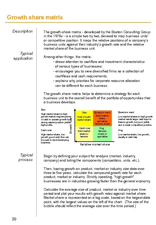 Growth share matrix Description Typical application The growth-share matrix - developed by the Boston Consulting Group in the 1970 s - is a simple two by two, devised to map business units’ or competitive position. It maps the relative positions of a company’s business units against their industry’s growth rate and the relative market share of the business unit. Among other things, the matrix: - draws attention to cashflow and investment characteristics of various types of businesses; - encourages you to view diversified firms as a collection of cashflows and cash requirements; - explains why priorities for corporate resource allocation can be different for each business. The growth share matrix helps to determine a strategy for each business unit to the overall benefit of the portfolio of opportunities that a business develops. Star Cash cow Growth rate High market share in high growth market requires plenty of cash to sustain growth but strong market position yields high profits High market share, low growth, good cash flow can be used to fund developing business Typical process Star Hold or build market share Question mark Build market share, specialise, harvest, divest Cash cow Hold market share or harvest Dog Harvest, divest or specialise Question mark Low market shares in high growth market needs large cash input to finance growth, but poor yields due to weak competitive position. Dog Low market share, low growth, usually a cash trap Relative market share Begin by defining your subject for analysis (market, industry, company) and listing the components (competitors, units, etc. ). Then, basing growth on product, market or industry size data over three to five years, calculate the compound growth rate for each product, market or industry. Strictly speaking, “high growth” businesses are in industries growing faster than the general economy. Calculate the average size of product, market or industry over time period and plot your results with growth rates against market share. Market share is represented on a log scale, based on the largest data point, with the largest values on the left of the chart. (The size of the bubble should reflect the average size over the time period. ) 39
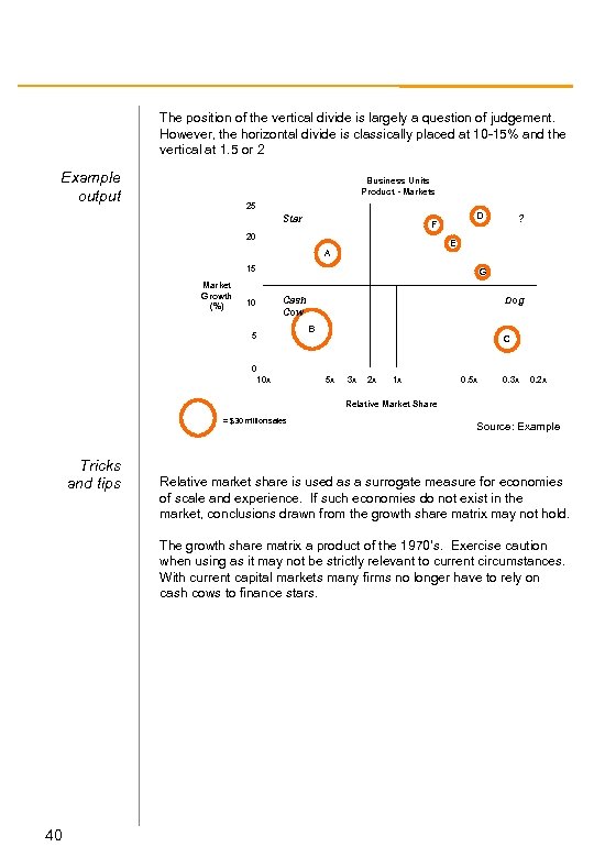 The position of the vertical divide is largely a question of judgement. However, the horizontal divide is classically placed at 10 -15% and the vertical at 1. 5 or 2 Example output Business Units Product - Markets 25 Star D F 20 E A 15 Market Growth (%) ? G Dog Cash Cow 10 B 5 C 0 10 x 5 x 3 x 2 x 1 x 0. 5 x 0. 3 x 0. 2 x Relative Market Share = $30 million sales Tricks and tips Source: Example Relative market share is used as a surrogate measure for economies of scale and experience. If such economies do not exist in the market, conclusions drawn from the growth share matrix may not hold. The growth share matrix a product of the 1970’s. Exercise caution when using as it may not be strictly relevant to current circumstances. With current capital markets many firms no longer have to rely on cash cows to finance stars. 40
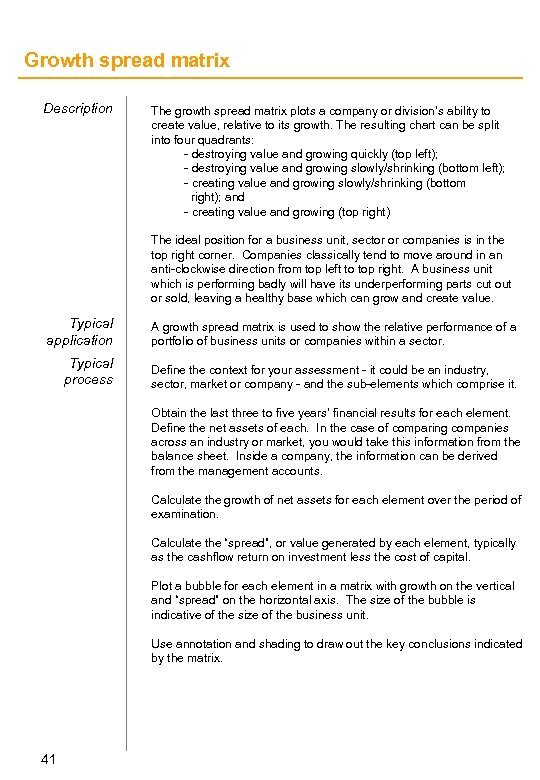 Growth spread matrix Description The growth spread matrix plots a company or division’s ability to create value, relative to its growth. The resulting chart can be split into four quadrants: - destroying value and growing quickly (top left); - destroying value and growing slowly/shrinking (bottom left); - creating value and growing slowly/shrinking (bottom right); and - creating value and growing (top right) The ideal position for a business unit, sector or companies is in the top right corner. Companies classically tend to move around in an anti-clockwise direction from top left to top right. A business unit which is performing badly will have its underperforming parts cut or sold, leaving a healthy base which can grow and create value. Typical application A growth spread matrix is used to show the relative performance of a portfolio of business units or companies within a sector. Typical process Define the context for your assessment - it could be an industry, sector, market or company - and the sub-elements which comprise it. Obtain the last three to five years’ financial results for each element. Define the net assets of each. In the case of comparing companies across an industry or market, you would take this information from the balance sheet. Inside a company, the information can be derived from the management accounts. Calculate the growth of net assets for each element over the period of examination. Calculate the “spread”, or value generated by each element, typically as the cashflow return on investment less the cost of capital. Plot a bubble for each element in a matrix with growth on the vertical and “spread” on the horizontal axis. The size of the bubble is indicative of the size of the business unit. Use annotation and shading to draw out the key conclusions indicated by the matrix. 41
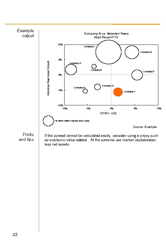 Example output Company A vs. Selected Peers Most Recent FYE 10% Company C Historical Real Asset Growth Company B 5% Company D Company E Company F 0% Company G Company H -5% -10% Company A -5% 0% 5% 10% CFROI - Co. C = $1 Billion Inflation Adjusted Gross Assets Source: Example Tricks and tips 42 If the spread cannot be calculated easily, consider using a proxy such as economic value added. At the extreme use market capitalisation less net assets.
 KPC comb charts Description The reasons that customers purchase products are central to a company’s competitive positioning. KPC (key purchase criteria) comb charts are a way of representing these criteria in a visually arresting manner. They allow you to: - evaluate the comparative importance of different purchasing criteria, and which aspects of a client’s product are really valued; - rank your client’s performance against the results of customer research; and - rank your client against competitors. They are similar to ‘Happy Line’ analysis that assesses how well a company performs against the product characteristics that are really valued by its customers. Typical application KPC comb charts form part of gap analysis and have implications for resource allocation. As such, they are a core part of any market segmentation analysis exercise. Understanding the importance of specific criteria to customers allows a company to align its products and services more closely to those customers and deliver greater value. Typical process The data for KPC comb analysis comes from a structured customer survey programme. Any interview programme is a major exercise and should be carefully planned. Take particular care to separate ‘wish list’ needs from preferences that apply in reality: ultimately, every consumer would like the product to overperform, arrive immediately and be free! The survey should be structured so to rank each criteria for each competitor in the market. Create an Excel table with the results and calculate an average score for each competitor on each category. Plot the results on a Bar + Line chart. 43
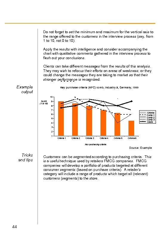 Do not forget to set the minimum and maximum for the vertical axis to the range offered to the customers in the interview process (say, from 1 to 10, not 0 to 10). Apply the results with intelligence and consider accompanying the chart with qualitative comments gathered in the interview process to flesh out your conclusions. Clients can take different messages from the results of this analysis. They may wish to refocus their efforts on areas of weakness; or they could change the messages they are taking to market so that their stronger performance is recognized. Example output Key purchase criteria (KPC) comb, Industry X, Germany, 1999 10 Score (1 to 10) 9 8 7 Criteria Comp 1 Comp 2 Comp 3 Client 6 5 4 3 2 1 Criteria 2 Criteria 3 Criteria 4 Criteria 5 Criteria 6 Key purchasing criteria Source: Example Tricks and tips 44 Customers can be segmented according to purchasing criteria. This is a useful technique used by retailers FMCG companies will develop a portfolio of products targeted at different consumer segments (based on purchase criteria). A retailer’s category will include a range of products which target all (relevant) customers (segments) to the store.
 Marimekko charts Description Mekkos are one of the simplest ways of displaying data with a high level of visual impact to develop strategic insight. Typical application Mekkos are typically used to display information about competitors in an industry, but can be used for a wide variety of other applications. They present subsets of a wider data set in a simple picture. They can be used for almost any set of data, including: – Market/industry maps, e. g. geography and product – Cost reduction prioritisation, e. g. by process, by business group – Customer analysis, e. g. customers by company Typical process To create Mekkos, you will need to use the Magic Mekko Macro. Gather your research data from appropriate sources. Divide the data into the segments and sub-segments you wish to analyze. If there is insufficient data for small areas, use estimates or assumptions and document what you have done. Create a table of the results, with one segment per column, ranked by decreasing size. Each sub-segment of a given segment is placed in the successive rows of the relevant column. Copy your table into the macro tool. Format your Mekko: state the values at the top of each bar and state the total at top right. Shade to highlight key messages. Note that it is possible to make a mekko without using the mekko maker. Use the following (Agarwal) process, by developing a set of of stacked bar charts and then stretching them in Powerpoint to the appropriate width. 45
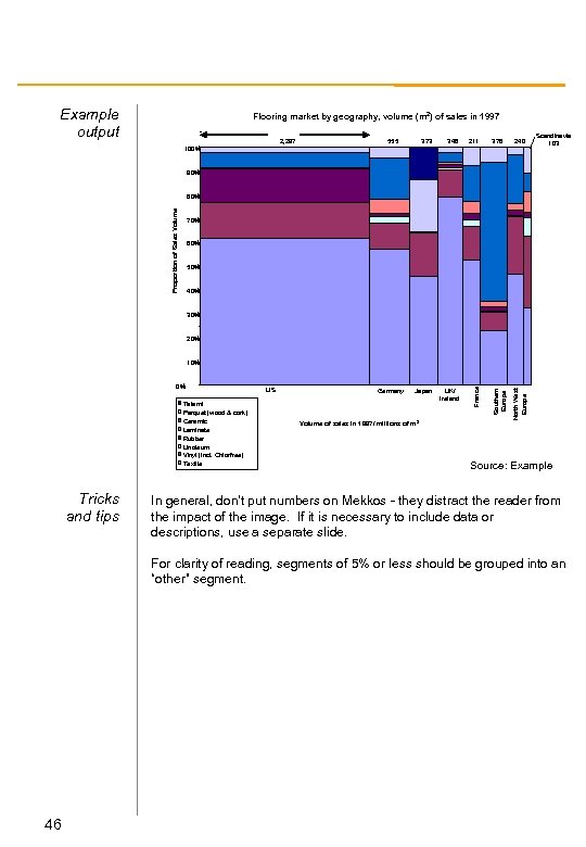 Example output Flooring market by geography, volume (m 2) of sales in 1997 2, 297 555 373 348 Japan UK/ Ireland 211 378 240 100% Scandinavia 103 90% Proportion of Sales Volume 80% 70% 60% 50% 40% 30% 20% Tricks and tips US Germany Volume of sales in 1997/ millions of m 2 North West Europe Tatami Parquet (wood & cork) Ceramic Laminate Rubber Linoleum Vinyl (incl. Chlorfree) Textile Southern Europe 0% France 10% Source: Example In general, don’t put numbers on Mekkos - they distract the reader from the impact of the image. If it is necessary to include data or descriptions, use a separate slide. For clarity of reading, segments of 5% or less should be grouped into an “other” segment. 46
 Market definition Description A market is a place, either conceptually or physically, where a series of different products compete against each other. However, it is not always easy to determine which products compete significantly enough to be considered to be within the same market. Markets are characterised by the sale and purchase of specific goods or services that have a certain purpose or meet a certain need. Because needs (and purposes) are subjective and difficult to define, however, we have to abstract a little to arrive at a workable ‘test’ for what a market is not, rather than a neat definition. Typical application Typical process Successful market analysis requires a robustly defined market. An incorrectly defined market will lead to inaccurate assessments of market growth, competition and customers. Begin by creating a realistic definition of the market based on your current knowledge. Based on your hypothesis, define the boundaries of your market by listing ways in which customers can be segmented; and by ways in which it can be differentiated from contiguous markets. Consider whether the market needs to be subdivided to account for differences between, for example: - Geography: the UK apple market is different to and distinct from the Australian market; or - Time: the market for morning newspapers is different from the market for evening newspapers Identify a close product or supplier - one you think is in the market or on the market boundary. A strict test to define a market rigorously includes principles of substitution. Two companies are in the same market if a change in one company’s pricing of its product leads to a significant switch of customer to the other company. A ‘significant’ switch is one that materially impacts a company’s profit margin (use expert advice if necessary). Repeat this process for each potential competitor until the switch proves to be insignificant. 47
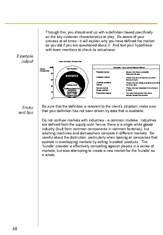 Through this, you should end up with a definition based specifically on the key customer characteristics at play. Be aware of your process at all times - it will explain why you have defined the market as you did if you are questioned about it. And test your hypothesis with team members to check its robustness. Example output Levels of market - Demand side Percent UK population 100% Example - New Covent Garden Market Total Population Potential market 80 Potential market - Buyers who have a potential interest in flowers Available market - Those who have a need to buy fresh flowers in bulk Qualified available market - Those who are willing and able to travel to NCG for 5 am Served market (target market) - Those who are interested in the flowers in stock Penetrated market - The set of consumers who have already bought the product 60 40 Available market Qualified available market 20 Served market Penetrated market 0 Tricks and tips Be sure that the definition is relevant to the client’s situation; make sure that your definition has not been driven by data that is available. Do not confuse markets with industries - a common mistake. Industries are defined from the supply-side: hence, there is a single white goods industry (built from common components in common factories), but washing machines and dishwashers compete in different markets. Be careful about the distinction: particularly when looking at companies that operate in overlapping markets by selling ‘bundled’ products. The ‘bundle’ provider is effectively competing against players in a series of markets, but also attempting to create a new market for the ‘bundle’ as a whole. 48
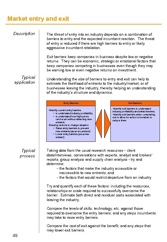 Market entry and exit Description The threat of entry into an industry depends on a combination of barriers to entry and the expected incumbent reaction. The threat of entry is reduced if there are high barriers to entry or likely aggressive incumbent retaliation. Exit barriers keep companies in business despite low or negative returns. They can be economic, strategic or emotional factors that keep companies competing in businesses even though they may be earning low or even negative returns on investment. Typical application Understanding the size of barriers to entry and exit can help to estimate the likelihood of entrants to the industry/market, or of businesses leaving the industry, thereby helping an understanding of the industry’s structure and dynamics. Entry Barriers • Identify current entry barriers • to understand industry profitability • to understand how high prices can be set without attracting new entrants • Develop actions to change situation • Raise entry barriers to prevent new entrants (as an incumbent) • Lower entry barriers (as a new entrant) Typical process Exit Barriers • Identify exit barriers to understand industry profitability and attractiveness • Identify exit barriers when considering exit to allow for action to be taken to reduce them Taking data from the usual research resources - client data/interviews, conversations with experts, analyst and brokers’ reports, group analysis and supply chain analysis - try and determine: - the factors that make the industry accessible or inaccessible to new entrants; and - the factors that would restrict departure from an industry Try and quantify each of these factors: including the resources, relationships or scale required to successfully overcome the barrier. Estimate both direct and residual costs associated with leaving the industry. Compare the levels of skills, technology, etc. against those required to overcome the entry barriers; and any steps incumbents may take to raise entry barriers. Compare the cost of exit against the benefit; and any steps that may lower exit barriers. 49
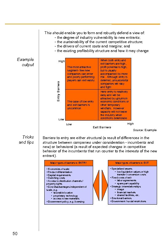 This should enable you to form and robustly defend a view of: - the degree of industry vulnerability to new entrants; - the sustainability of the current competitive structure; - the drivers of current costs and margins; and - the existing profitability structure and how it may change The most attractive segment- few new companies can enter and poorly performing players can exit easily When both entry and exit barriers are high, profit potential is high, but is usually accompanied by more risk. Although entry is deterred, unsuccessful companies will stay and fight The case of low entry and exit barriers is uncommon Here entry is relatively easy and will be attracted by upturns in economic conditions or other temporary windfalls. However capacity will not leave the industry when conditions deteriorate High Entry Barriers Example output Low Tricks and tips Source: Example Barriers to entry are either structural (a result of differences in the structure between companies under consideration - incumbents and new) or behavioral (a result of expected changes in competitive behavior of the incumbents that run counter to the interests of the new entrant). Major types of barriers to ENTRY • Economies of scale • Product differentiation • Capital requirements • Switching costs • Access to distribution channels / property rights • Cost disadvantages independent of scale, e. g. • favorable location • proprietary technology • access to raw materials • Government policy, e. g. licensing 50 High Exit Barriers Major types of barriers to EXIT • Specialized assets • low liquidation values or high transfer / conversion costs • Fixed costs of exit • labor agreements • spare part capability • Strategic interrelationships • image • financial markets • shared facilities, etc. • Emotional barriers • Government / social restrictions
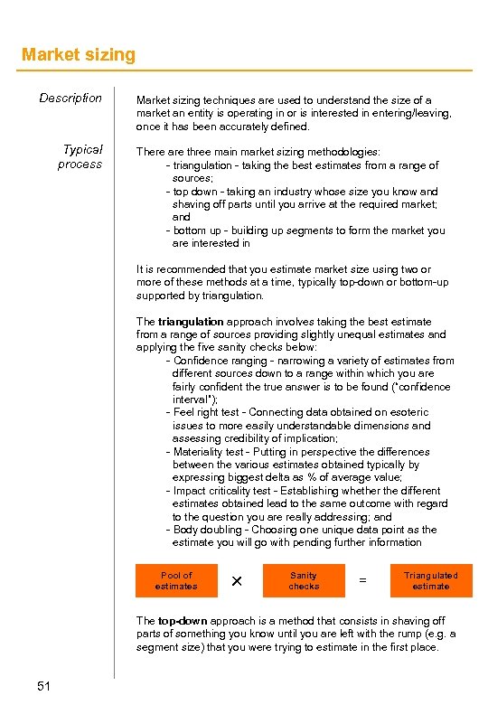 Market sizing Description Typical process Market sizing techniques are used to understand the size of a market an entity is operating in or is interested in entering/leaving, once it has been accurately defined. There are three main market sizing methodologies: - triangulation - taking the best estimates from a range of sources; - top down - taking an industry whose size you know and shaving off parts until you arrive at the required market; and - bottom up - building up segments to form the market you are interested in It is recommended that you estimate market size using two or more of these methods at a time, typically top-down or bottom-up supported by triangulation. The triangulation approach involves taking the best estimate from a range of sources providing slightly unequal estimates and applying the five sanity checks below: - Confidence ranging - narrowing a variety of estimates from different sources down to a range within which you are fairly confident the true answer is to be found (“confidence interval”); - Feel right test - Connecting data obtained on esoteric issues to more easily understandable dimensions and assessing credibility of implication; - Materiality test - Putting in perspective the differences between the various estimates obtained typically by expressing biggest delta as % of average value; - Impact criticality test - Establishing whether the different estimates obtained lead to the same outcome with regard to the question you are really addressing; and - Body doubling - Choosing one unique data point as the estimate you will go with pending further information Pool of estimates r Sanity checks = Triangulated estimate The top-down approach is a method that consists in shaving off parts of something you know until you are left with the rump (e. g. a segment size) that you were trying to estimate in the first place. 51
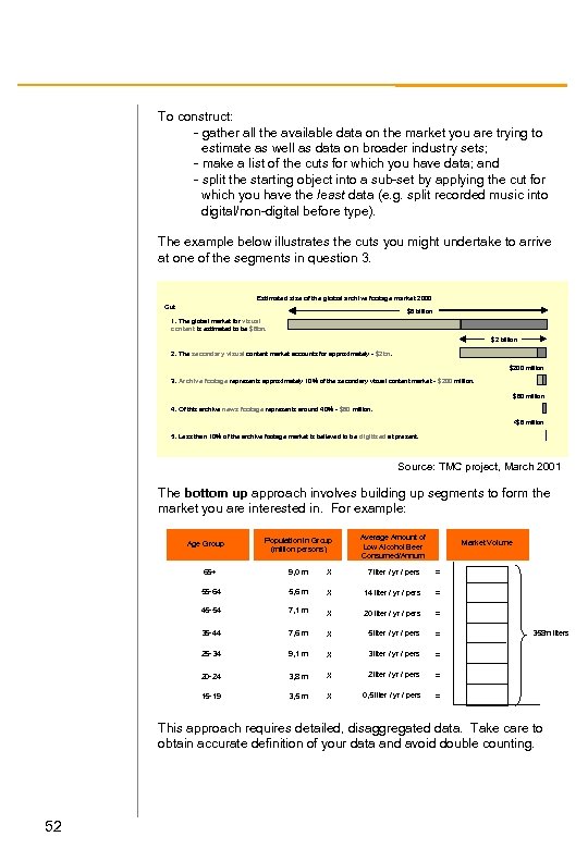 To construct: - gather all the available data on the market you are trying to estimate as well as data on broader industry sets; - make a list of the cuts for which you have data; and - split the starting object into a sub-set by applying the cut for which you have the least data (e. g. split recorded music into digital/non-digital before type). The example below illustrates the cuts you might undertake to arrive at one of the segments in question 3. Estimated size of the global archive footage market 2000 Cut $6 billion 1. The global market for visual content is estimated to be $6 bn. $2 billion 2. The secondary visual content market accounts for approximately - $2 bn. $200 million 3. Archive footage represents approximately 10% of the secondary visual content market - $200 million. $80 million 4. Of this archive news footage represents around 40% - $80 million. <$8 million 5. Less than 10% of the archive footage market is believed to be digitised at present. Source: TMC project, March 2001 The bottom up approach involves building up segments to form the market you are interested in. For example: Population in Group (million persons) Average Amount of Low Alcohol Beer Consumed/Annum 65+ 9, 0 m X 7 liter / yr / pers = 55 -64 5, 6 m X 14 liter / yr / pers = 45 -54 7, 1 m X 20 liter / yr / pers = 35 -44 7, 6 m X 5 liter / yr / pers = 25 -34 9, 1 m X 3 liter / yr / pers = 20 -24 3, 8 m X 2 liter / yr / pers = 15 -19 3, 5 m X 0, 5 liter / yr / pers = Age Group Market Volume 358 m liters This approach requires detailed, disaggregated data. Take care to obtain accurate definition of your data and avoid double counting. 52
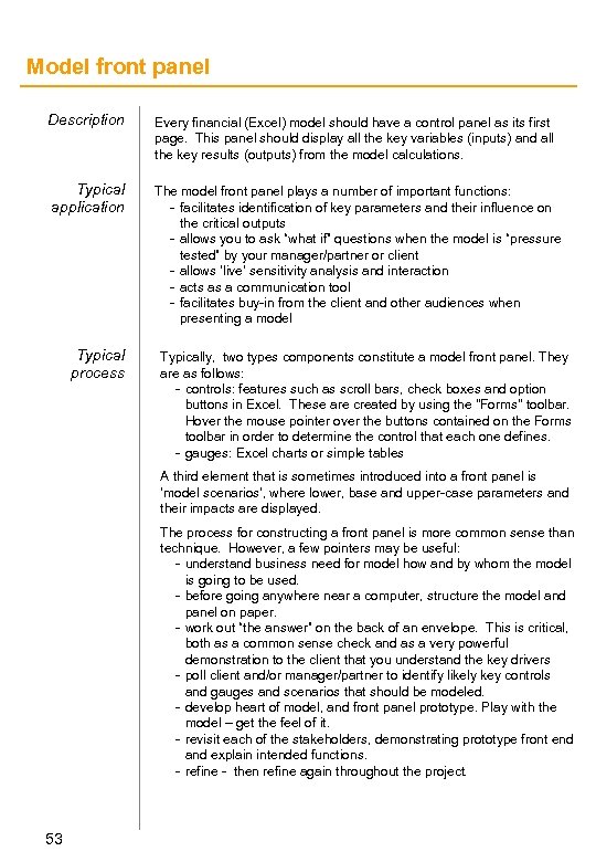 Model front panel Description Every financial (Excel) model should have a control panel as its first page. This panel should display all the key variables (inputs) and all the key results (outputs) from the model calculations. Typical application The model front panel plays a number of important functions: - facilitates identification of key parameters and their influence on the critical outputs - allows you to ask “what if” questions when the model is “pressure tested” by your manager/partner or client - allows ‘live’ sensitivity analysis and interaction - acts as a communication tool - facilitates buy-in from the client and other audiences when presenting a model Typical process Typically, two types components constitute a model front panel. They are as follows: - controls: features such as scroll bars, check boxes and option buttons in Excel. These are created by using the "Forms" toolbar. Hover the mouse pointer over the buttons contained on the Forms toolbar in order to determine the control that each one defines. - gauges: Excel charts or simple tables A third element that is sometimes introduced into a front panel is ‘model scenarios’, where lower, base and upper-case parameters and their impacts are displayed. The process for constructing a front panel is more common sense than technique. However, a few pointers may be useful: - understand business need for model how and by whom the model is going to be used. - before going anywhere near a computer, structure the model and panel on paper. - work out “the answer” on the back of an envelope. This is critical, both as a common sense check and as a very powerful demonstration to the client that you understand the key drivers - poll client and/or manager/partner to identify likely key controls and gauges and scenarios that should be modeled. - develop heart of model, and front panel prototype. Play with the model – get the feel of it. - revisit each of the stakeholders, demonstrating prototype front end and explain intended functions. - refine - then refine again throughout the project. 53
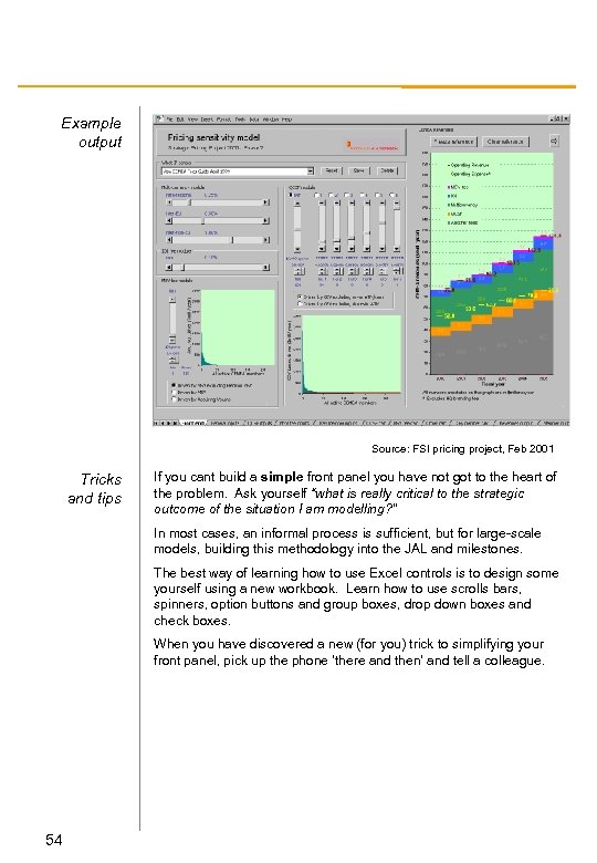 Example output Source: FSI pricing project, Feb 2001 Tricks and tips If you cant build a simple front panel you have not got to the heart of the problem. Ask yourself “what is really critical to the strategic outcome of the situation I am modelling? ” In most cases, an informal process is sufficient, but for large-scale models, building this methodology into the JAL and milestones. The best way of learning how to use Excel controls is to design some yourself using a new workbook. Learn how to use scrolls bars, spinners, option buttons and group boxes, drop down boxes and check boxes. When you have discovered a new (for you) trick to simplifying your front panel, pick up the phone ‘there and then’ and tell a colleague. 54
 Parfait charts Description A Parfait chart is a simple way of displaying the absolute size of market segments and their relative growth over a given time period. Typical application A Parfait chart is used when analyzing an industry or market to help understand historical growth and its drivers. It is also used to locate your client’s performance in relation to market growth, to understand its current position and future direction. Typical process Plotting a Parfait chart requires an Excel table and the Area function in the Chart menu. Begin by defining the market you are assessing and obtain figures, typically of sales, for each competitor. Gather your data from analyst, company or brokers’ reports. Take care to account for the reliability of the information - examine how the market was estimated, how it compares to other estimates, and so on. If no data is available you may need to infer from contiguous industries (suppliers or buyers). Plot the chart with time on the horizontal axis and sales on the vertical. Reorder your chart to put the largest data group at the bottom and changes that only occur later in the period at the top. In addition, calculate CAGRs for the period of examination. Once you have completed the construction of a chart, take time to look and think about its meaning. You should be able to begin to make general assertions about the drivers of change - increasing revenues may be derived from growing volumes or rising prices, for example. 55
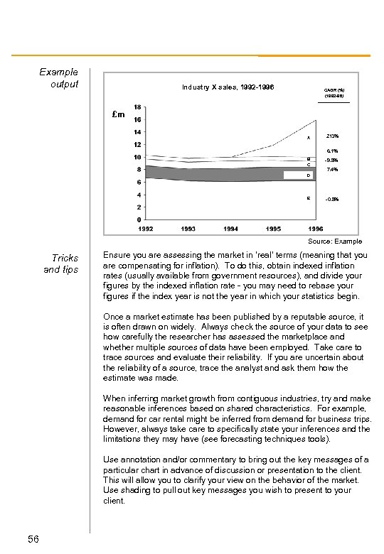 Example output Industry X sales, 1992 -1996 CAGR (%) (1992 -96) £m A 213% B C -9. 8% 6. 1% 7. 4% D E -0. 8% Source: Example Tricks and tips Ensure you are assessing the market in ‘real’ terms (meaning that you are compensating for inflation). To do this, obtain indexed inflation rates (usually available from government resources), and divide your figures by the indexed inflation rate - you may need to rebase your figures if the index year is not the year in which your statistics begin. Once a market estimate has been published by a reputable source, it is often drawn on widely. Always check the source of your data to see how carefully the researcher has assessed the marketplace and whether multiple sources of data have been employed. Take care to trace sources and evaluate their reliability. If you are uncertain about the reliability of a source, trace the analyst and ask them how the estimate was made. When inferring market growth from contiguous industries, try and make reasonable inferences based on shared characteristics. For example, demand for car rental might be inferred from demand for business trips. However, always take care to specifically state your inferences and the limitations they may have (see forecasting techniques tools). Use annotation and/or commentary to bring out the key messages of a particular chart in advance of discussion or presentation to the client. This will allow you to clarify your view on the behavior of the market. Use shading to pull out key messages you wish to present to your client. 56
 Partnering maps Description Producing a partnering map is a way of simultaneously mapping out all the activities a particular company performs, and attaching a relative importance to each of those categories. By ranking each activity on two scales, a client can quickly see where the company falls short and how easy or difficult it would prove to rectify this. Typical application Partnering maps are a very quick tool for business planning, negotiations or business restructuring exercises, that allows you to focus on which elements of a particular business are crucial to the company, and which are less important or damaging to overall performance. Partnering maps can be used for: - planning for strategic acquisitions or divestments; - preparing for negotiations over mergers, alliances, partnerships or outsourcing agreements; - realigning corporate structure; - planning future strategic direction; and - build vs. buy decisions As an exercise, it is most effective if it takes place in discussion with a group of representatives, where the Andersen personnel facilitate a discussion of relative performance. This way, the exercise reinforces the critical elements of a discussion that would have to take place anyway. Typical process Well in advance, decide as a team what the critical value driver is. Typically, this might be ‘potential to generate customer intimacy’; an alternative axis may be ‘relative capacity to differentiate’, or something quantitative such as NPV. Ensure you have a complete list of relevant activites. Try to have a ‘dry-run’ of the exercise with the project team at least once before the actual client meeting. List all the key challenges that are likely to arrive when the exercise is repeated with the client. In discussion with the client, place each activity on the map - with relative capability on the horizontal axis, and the key criteria on the vertical. Remember, this is a rough and ready exercise, designed to separate activities into three broad categories. The exact position isn’t crucial. Challenge the client vigorously, but not dogmatically. 57
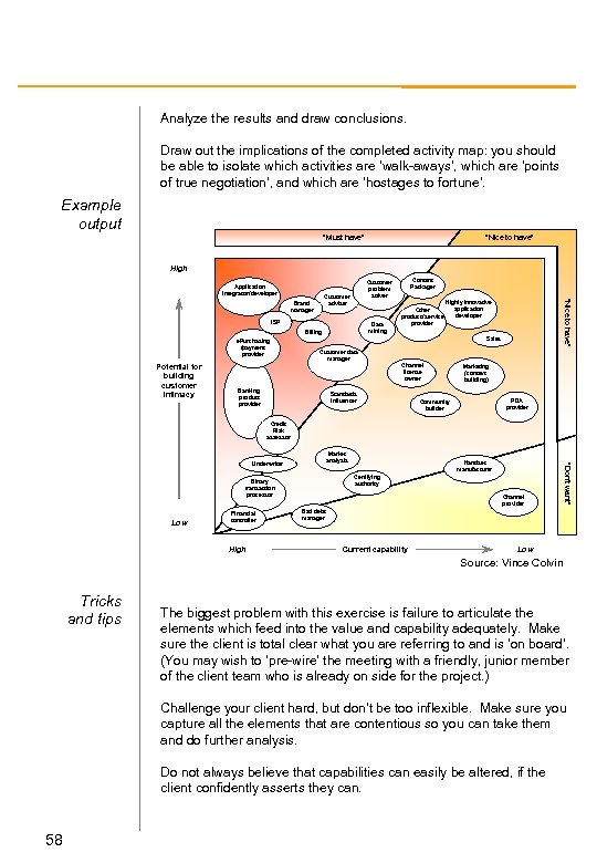 Analyze the results and draw conclusions. Draw out the implications of the completed activity map: you should be able to isolate which activities are ‘walk-aways’, which are ‘points of true negotiation’, and which are ‘hostages to fortune’. Example output “Must have” “Nice to have” High Application integrator/ developer ISP Data mining Billing e. Purchasing /payment provider Potential for building customer intimacy Other product/ service provider “Nice to have” Customer adviser Brand manager Content Packager Customer problem solver Highly innovative application developer Sales Customer data manager Channel license owner Banking product provider Standards influencer Marketing (context building) PDA provider Community builder Credit Risk assessor Certifying authority Binary transaction processor Low Financial controller High Handset manufacturer Channel provider “Don’t want” Market analysis Underwriter Bad debt manager Current capability Low Source: Vince Colvin Tricks and tips The biggest problem with this exercise is failure to articulate the elements which feed into the value and capability adequately. Make sure the client is total clear what you are referring to and is ‘on board’. (You may wish to ‘pre-wire’ the meeting with a friendly, junior member of the client team who is already on side for the project. ) Challenge your client hard, but don’t be too inflexible. Make sure you capture all the elements that are contentious so you can take them and do further analysis. Do not always believe that capabilities can easily be altered, if the client confidently asserts they can. 58
 PEST analysis Description PEST is an acronym for Political, Economic, Sociocultural and Technological. The tool is an aide memoir to ensure you cover all the external forces/risks that may have an impact on the company, market or industry under consideration. PEST analysis should be performed early on in an project as it helps identify and priorities research efforts. Typical application PEST analysis is a simple framework to structure an informal analysis of the EXTERNAL forces acting on a market. It is universally applicable and simple and can provide insight early on in a project Typical process PEST is essentially a framework to assist thinking and as such there is no process to work through. Below is a categorised list of the issues, that may be relevant to each case. From the long list of issues prioritise the most important by size of impact on the client and probability of occurrence. (Consider both current and emerging issues). Assessing the size of the impact and probability of occurrence will relate to the type of risk identified. Political Factors The political arena has a huge influence upon the regulation of businesses, and the spending power of consumers and other businesses. You must consider issues such as: - the stability of the political environment - will government policy influence laws that regulate or tax your business (Employment/Health & Safety/Environmental/Industry specific legislation)? - potential changes in Government/Government policy Economic Factors You will need to consider the state of a trading economy in the short and long-terms. This is especially true when performing analysis for clients with an international focus. You need to look at: Interest rates - the level of inflation - employment/income/asset holding level per capita - long-term prospects for the economy: GDP per capita etc. Sociocultural Factors The social and cultural influences on business vary by geography and must be accounted for. Factors include: - attitudes to foreign products and services - changing consumer tastes/preferences/fashions - how much time consumers have for leisure? - socio-demographic profile of the customer base and its dynamics 59
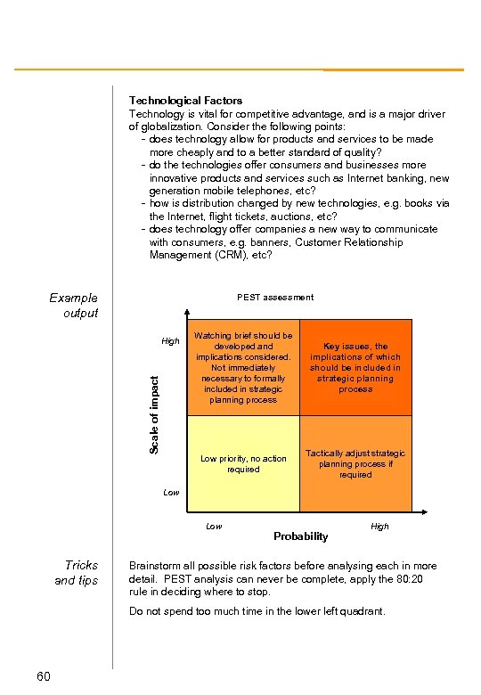 Technological Factors Technology is vital for competitive advantage, and is a major driver of globalization. Consider the following points: - does technology allow for products and services to be made more cheaply and to a better standard of quality? - do the technologies offer consumers and businesses more innovative products and services such as Internet banking, new generation mobile telephones, etc? - how is distribution changed by new technologies, e. g. books via the Internet, flight tickets, auctions, etc? - does technology offer companies a new way to communicate with consumers, e. g. banners, Customer Relationship Management (CRM), etc? Example output PEST assessment Scale of impact Watching brief should be developed and implications considered. Not immediately necessary to formally included in strategic planning process Key issues, the implications of which should be included in strategic planning process Low priority, no action required High Tactically adjust strategic planning process if required Low Tricks and tips Probability High Brainstorm all possible risk factors before analysing each in more detail. PEST analysis can never be complete, apply the 80: 20 rule in deciding where to stop. Do not spend too much time in the lower left quadrant. 60
 Porter’s five forces Description Porter’s Five Forces model is probably the most famous and widely used strategic tool. It is a useful check list of issues that needs to be considered when analyzing and assessing a company’s competitive positioning. The five forces are: rivalry amongst competitors; threat of new entrants; power of suppliers; power of customers; and the threat of substitution The underlying principal is the weaker the competitive forces, the greater an industry’s profitability. By implication, a company whose strategy and market position provides a good defense against the five forces can earn above-average profits. At root, it is a great checklist for describing an industry. It helps you organise your research and provides a good framework in which to present your findings Typical application Typical Process Porter’s Five Forces is most useful: - when you are trying to understand a new industry or market - before building a hypothesis at the beginning of an assignment - structuring and communicating your existing industry knowledge - defining the boundaries of an industry and you client’s role within it Begin by reading widely (broad and shallow to begin), with the framework always in mind. Use analyst reports, annual reports; existing analysis and internal experts. Carefully define your industry. Using this definition rigorously, list the main players in each of the five categories: competitors, suppliers, customers/ buyers, new entrants, and substitutes. Continue by carrying out a search on the names you have compiled, and gather company and brokers’ reports. Pull the relevant articles together and get reading! When you are reading the material, think about themes listed below. Lift the most common comments into a structured Word document. Organize your results into five boxes, summarize and conclude in the light of the purpose of the research as given to you by the client. You should now have a much clearer picture of the market. Where does the work you are doing fit into the picture of the industry you have developed through the model? 61
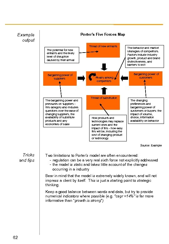 Porter’s Five Forces Map Example output Threat of new entrants The potential for new entrants and the likely level of disruption caused by their arrival Bargaining power of suppliers The bargaining power and pressures on suppliers this category also includes questions over the ease of changing suppliers, the availability of substitute products and any economies of scale Rivalry among competitors Threat of substitution How products and technologies may replace current ones and the impact of this - how easy this will be, including the cost of changing product or technology The behavior and market strategies of competitors. Factors include industry growth, product and brand distinctiveness, and barriers to exit Bargaining power of customers The changing preferences and bargaining power of customers or buyers: the impact of volume, choice, information availability on behavior Source: Example Tricks and tips Two limitations to Porter’s model are often encountered: - regulation can be a very real sixth force not explicitly addressed - the model is static and takes little account of the changes occurring in a industry Bear in mind that the model is extremely widely known, and will not impress a client by itself. This is just a starting point to strategic thinking. Keep a good balance between words and data, but try to provide numerical indicators where possible (e. g. “cagr =14%” is far more informative than “growth is strong”) 62
 Portfolio matrix Description Helping clients prioritise strategic options in an environment of scarce resources is a key element of our work. The portfolio matrix - a simple bubble chart that plots the value of options against the ease with which they can be implemented - is designed to assist in this process. Typically based on NPV and a pre-agreed set of prioritisation criteria, it allows the quick evaluation of which options are the most difficult to put in place and their potential value. Typical application Typical process Portfolio matrices enable businesses to underpin their choices with a clear, data-based framework. Businesses can choose which projects to undertake now, which projects to undertake in the medium term and which projects to put on hold because of insurmountable barriers. They also help businesses quantify the expected benefits from the projects they plan to undertake. Explicitly define each opportunity. Then identify criteria which provide insight into the ease of implementation of each, based on the business context. Standard criteria might include project scale, systems requirements, skills availability and structural obstacles. Review each of the options either through detailed market research or through brainstorming sessions, and score them against preagreed criteria. Meanwhile, isolate the NPV impact of each option. If it is not possible to use NPV for this, you can use cash flow or profit, but accounting techniques and lack of market risk premium mean that these measures will not be as reliable. Remember to use a standard NPV format, for example a five year timescale with nil terminal value. Create the chart and annotate it with key assumptions and a scale bubble; and let the area of each bubble reflect the size of the NPV. Research and brainstorm any softer issues that the options may present (such as the impact on employee’s morale of working away from home). Document the major impacts and present these near the chart. 63
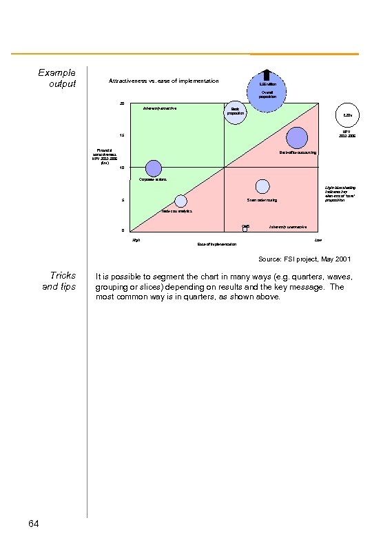 Example output Attractiveness vs. ease of implementation £ 56 million Overall proposition 20 Inherently attractive Basic proposition £ 20 m NPV 2002 -2006 15 Financial attractiveness NPV 2002 -2006 (£m) Back-office outsourcing 10 Corporate actions Light blue shading indicates key elements of ‘core’ proposition Smart order routing 5 Trade cost analytics OMS 0 High Inherently unattractive Low Ease of implementation Source: FSI project, May 2001 Tricks and tips 64 It is possible to segment the chart in many ways (e. g. quarters, waves, grouping or slices) depending on results and the key message. The most common way is in quarters, as shown above.
 RACI analysis Description RACI stands for Responsible-Accountable-Consulted-Informed. RACI analysis is a clear and simple way of mapping and assigning functions between departments or individuals to ensure all activities are managed optimally. The four distinct roles are constructed on a grid allowing you to determine exactly who should be influencing and taking responsibility for each key step in a process – with no conflicting or unaccounted activities Typical application Typical process RACI analysis often forms part of business process reengineering (BPR) or organisational change engagements. However, it can be used very effectively within capability gap assessment exercises, process mapping etc. (or even in constructing assignment roles). The starting point for this analysis is typically a clearly defined set of processes for the business. Form a value chain or process map. In discussion with the client, ensure your value chain is MECE and at a sufficient level to determine activities that may be separable in terms of people skills, technology, physical outputs etc. List each activity along one axis (either vertical or horizontal) Against the other axis list the personnel (or department) who are may be directly related to the process. You should consider existing staff, potentially new staff, and/or outsource agencies. It is also important at this stage to be aware of other processes that may share skills – so don’t look at each process in isolation. It is helpful to place the most senior people on the left, proceeding to the most junior on the right. This will facilitate grouping of activities in the next step. Taking each activity in turn, determine in discussion with your client which individual (only one) should take responsibility for each activity, which individuals are accountable for the deliverables, which should be consulted and which need to be informed. Place the relevant letter in the relevant box. Use the resulting grid to identify clusters of activities, duplication of roles, lack of roles etc. In particular you should be looking for: simple demarcation; one person accountable for an activity; limited consulting; limited informing Derive recommendations for your client. 65
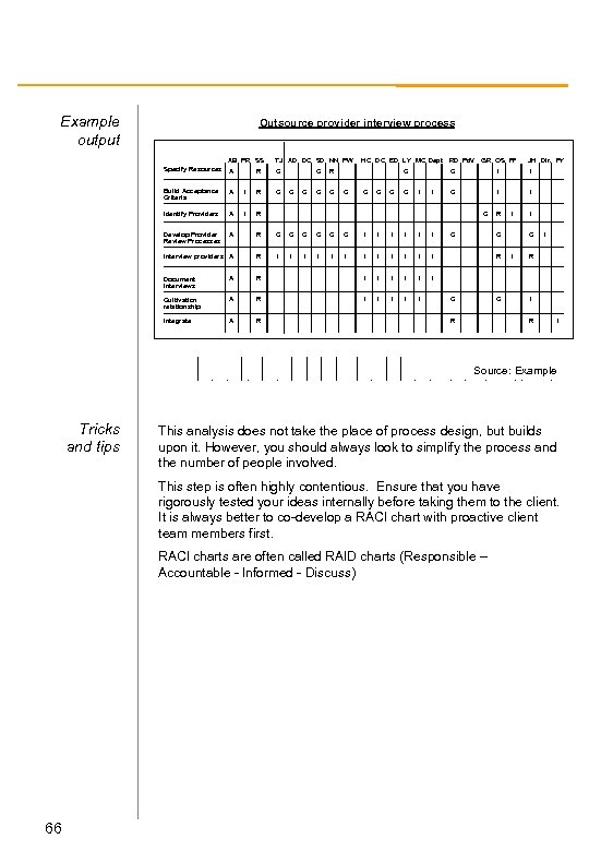 Example output Outsource provider interview process AB PR SS TJ AD DC SD NN PW Specify Resources A R C Build Acceptance Criteria A I R C Identify Providers A I R Develop Provider Review Processes A R C C C I I I Interview providers A R I I I Document Interviews A R I I I Cultivation relationship A R I I Integrate A R C C C HC DC ED LY MC Dept R C C C RD Pd. V GR OS PF JH Dir. PY C I I C C R I C R C C R I C I I R I Source: Example Tricks and tips This analysis does not take the place of process design, but builds upon it. However, you should always look to simplify the process and the number of people involved. This step is often highly contentious. Ensure that you have rigorously tested your ideas internally before taking them to the client. It is always better to co-develop a RACI chart with proactive client team members first. RACI charts are often called RAID charts (Responsible – Accountable - Informed - Discuss) 66
 Reverse costing Description Typical application Typical process Reverse costing compares a business’ cost position relative to key competitors, activity by activity, by inferring cost structures and their drivers. It involves estimating a competitor’s cost structure and comparing it to the client’s to understand areas of relative strength and weakness. By comparing a client’s cost to its competitors’, insights can be found regarding the key drivers of competitiveness. Reverse costing involves taking what you know about a client’s business and comparing to a competitor’s business to identify where competitive disparities lie. Start by taking the client company cost structure (based on activities) and begin to model differences in a competitor’s cost structure by taking into account known or estimated differences such as: - Number of people / shifts; - Specific equipment used; - Plant output volumes; - Product specifications; - Scrap / by-product volumes produced; - Plant size / layout; and - Distribution system Where hard data is unavailable, estimate the effect on the competitor of, for example, scale factors, and by asking client company experts. 67
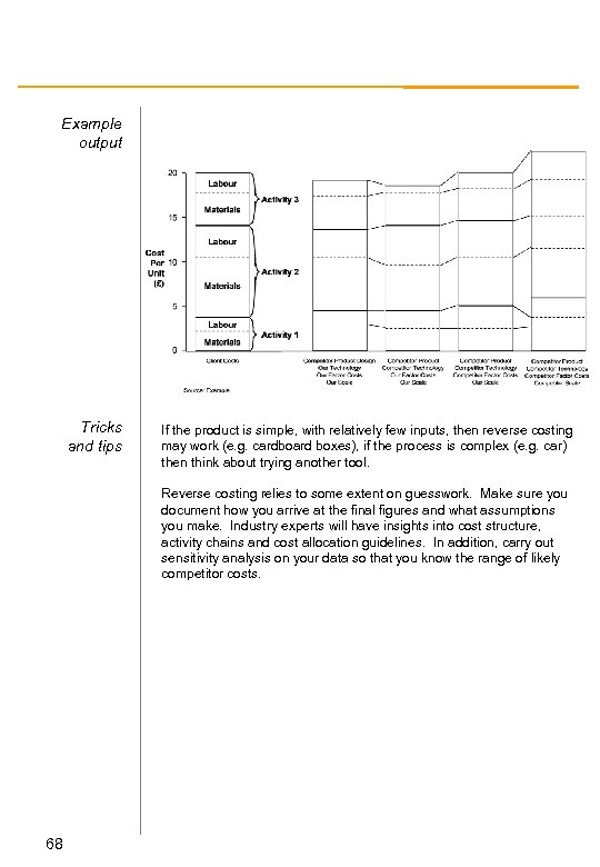 Example output Tricks and tips If the product is simple, with relatively few inputs, then reverse costing may work (e. g. cardboard boxes), if the process is complex (e. g. car) then think about trying another tool. Reverse costing relies to some extent on guesswork. Make sure you document how you arrive at the final figures and what assumptions you make. Industry experts will have insights into cost structure, activity chains and cost allocation guidelines. In addition, carry out sensitivity analysis on your data so that you know the range of likely competitor costs. 68
 Risk matrix Description The risk matrix is a simple structure for identifying the key risks associated with an opportunity, and prioritising the actions necessary to mitigate those risks. There are many possible structures that could be used to achieve this end, however all share the common property of defining both scale and controllability of each risk. Typical application The risk matrix is useful for clarifying decisions around complex, nonindependent risks which arise from almost every business decision. Typically, any individual investment project or portfolio decision would benefit from such an analysis. A very common situation in which this tool is used is when deciding whether to take part in an alliance venture. In this instance it helps answer the questions like: - what is my greatest risk? - how costly will it be if I cannot mitigate it? - what shape of alliance would minimise my risk exposure. - for those risks outside my control (e. g. market risk), what is the potential downside? etc. Typical process Throughout any financial modeling exercise, identify those variables which most heavily effect the desired outcome (e. g. which elements have most influence on NPV). Determine the monetary value of the loss if the key variables change by (say) 5%. This is a hard measure of risk. Additionally, identify non-financial risks, typically in the following classes: operational risk; brand risk; human capital risk; technology risk; and timing risk. Attempt to scale these risks comparatively. Many of these can only be scaled in discussion with your colleagues and the client. These are soft risks, but are equally real. Use a two-by-two to plot all the risks by Significance (high, medium, low) and degree of controllability (manageable, mitigatable, noncontrollable) Use bubble size to accentuate the scale of risk (making area proportional to monetary impact). Additionally, shade bubbles where it adds clarity. This exercise is best performed 2/3 of the way through a modelling exercise. Test your findings with your team and share it with the client – ensuring consistency of logic (especially for soft risks). 69
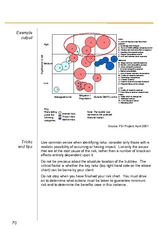 Example output C High F D Significance of risk E P K M Medium O HIGH A. Level of inbound order flows from partners C. Exchange rate changes D. Tie in of OMFS affiliate companies to EA E. Trading role (Sell order-flow or agency) F. Handling of corporate actions K. Partner competence and fit P. DVP and intra-day cash exposure A B G H L I N J Q R Low W U X V Manageable risk Key Risks falling under the following categories: Internal risks Project risks Market risks T S Mitigation / Negotiation Outside OMFS control MEDIUM B. Single currency cost transparency G. Merrill Lynch competitive product H. Jiway competitive product I. E-Cortal competitive product J. Market consolidation L. Lack of clearly defined exit scenarios M. Quality of research delivered N. Technology competence O. Custody systems Q. Need to route all overseas business R. Potential failure of EA network LOW S. Quality of research received T. Free riding on partner research and orders U. Ability of EA to change fee V. Additional finance W. CLSA directors’ power X. Marketing of EA Note: The bubble size represents the potential financial impact Source: FSI Project, April 2001 Tricks and tips Use common sense when identifying risks, consider only those with a realistic possibility of occurring or having impact. List only the issues that are at the root cause of the risk, rather than a number of knock-on effects entirely dependent upon it. Do not be precious about the absolute location of the bubbles. The critical factor is whether the key risks (top right hand side on the above chart) can be borne by your client. Do not stop when you have finished your risk chart. You must drive on to determine what actions must be taken to guarantee minimum risk and to determine the benefits case in this instance. 70
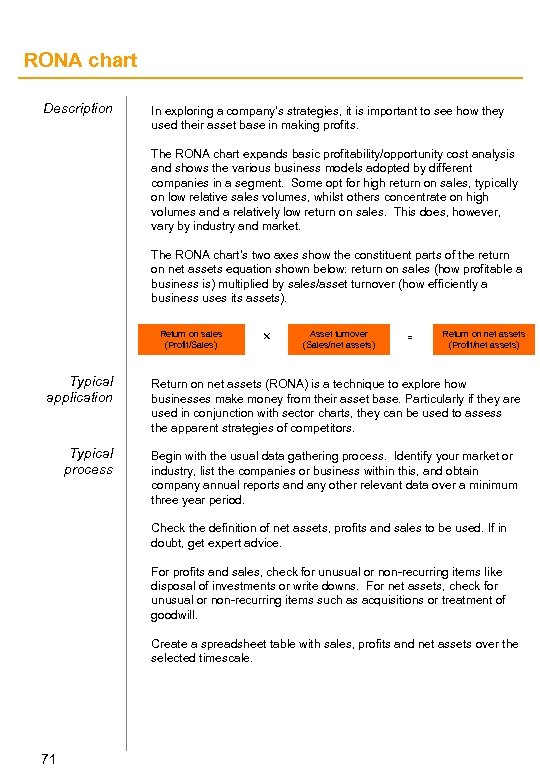 RONA chart Description In exploring a company’s strategies, it is important to see how they used their asset base in making profits. The RONA chart expands basic profitability/opportunity cost analysis and shows the various business models adopted by different companies in a segment. Some opt for high return on sales, typically on low relative sales volumes, whilst others concentrate on high volumes and a relatively low return on sales. This does, however, vary by industry and market. The RONA chart’s two axes show the constituent parts of the return on net assets equation shown below: return on sales (how profitable a business is) multiplied by sales/asset turnover (how efficiently a business uses its assets). Return on sales (Profit/Sales) r Asset turnover (Sales/net assets) = Return on net assets (Profit/net assets) Typical application Return on net assets (RONA) is a technique to explore how businesses make money from their asset base. Particularly if they are used in conjunction with sector charts, they can be used to assess the apparent strategies of competitors. Typical process Begin with the usual data gathering process. Identify your market or industry, list the companies or business within this, and obtain company annual reports and any other relevant data over a minimum three year period. Check the definition of net assets, profits and sales to be used. If in doubt, get expert advice. For profits and sales, check for unusual or non-recurring items like disposal of investments or write downs. For net assets, check for unusual or non-recurring items such as acquisitions or treatment of goodwill. Create a spreadsheet table with sales, profits and net assets over the selected timescale. 71
 Root cause analysis Description When trying to understand why a business phenomenon occurs, it is not enough just to ask a few well chosen questions. Root Cause Analysis is a structured, logic-tree approach to asking the question “why? ” It enables you to get to the heart of an issue, with a high degree of confidence that you have been MECE, and that your conclusions can be numerically supported. Typical application Root Cause Analysis is most commonly used for structuring interview programmes to unearth the reason(s) why individuals display certain behaviors. For example: Why is our customer churn rate almost twice the industry average? ; Why do my staff in Sidney lose fewer working days than those in Munich? The utility of this technique is only realized when you reach a question that is actionable and you have asked a large enough population to get a measure of the scale/importance of the issue. Clearly there are other more detailed and statistically more rigorous methods for unearthing behavioral logic, but as a rapid tool for getting to the heart of an issue, Root Cause Analysis is hard to beat. Typical process As ever, the first step is to contact colleagues to see what similar exercises have been done in the past, and to draw on expert opinion as to the cause of the issue at hand. Industry expertise is invaluable here. Next, draw your own hypothesis (with numerical weightings) to help guide your questionnaire. Draft a questionnaire and try it on team members and manager/partner. Then test it with the client. If you spend the time to make the questionnaire simple and clearly worded it may be possible to outsource the execution to a third party agency. However, always sit on the shoulder of a third-party agent for the first set of interviews. This is essential, as: you are closer to the issue; you can see which questions work better than others; you will be far more tenacious in getting a result. Then improve the questionnaire. Typically, aim for logic to go 4 -6 levels deep, and keep it simple. Use a grading scale of 1 -5 for each question where applicable (or yes/no if necessary). Be sure to ask some open questions, as this captures responses you may not have anticipated and (nearly always) provides powerful quotes. Preferably, use Microsoft Access to analyze the results, but use a hard copy questionnaire whilst interviewing Finally, populate the tree and derive implications for your client. 72
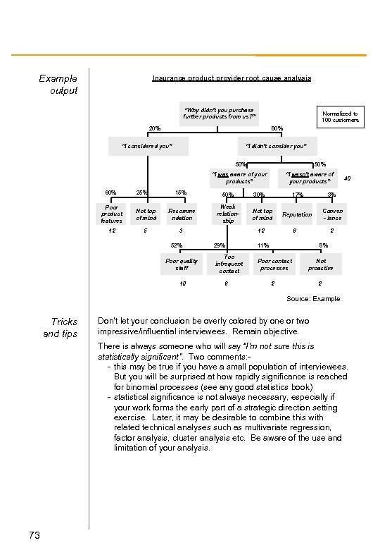 Example output Insurance product provider root cause analysis “Why didn’t you purchase further products from us? ” Normalized to 100 customers 20% 80% “I considered you” “I didn’t consider you” 50% “I was aware of your products” 60% 25% 15% 50% Weak relationship Poor product features Not top of mind Recomme ndation 12 5 3 52% Poor quality staff 10 “I wasn’t aware of your products” 30% 17% Not top of mind 3% Reputation Conven - ience 12 6 29% Too infrequent contact Poor contact processes 2 11% 6 40 8% Not proactive 2 2 Source: Example Tricks and tips Don’t let your conclusion be overly colored by one or two impressive/influential interviewees. Remain objective. There is always someone who will say “I’m not sure this is statistically significant”. Two comments: - this may be true if you have a small population of interviewees. But you will be surprised at how rapidly significance is reached for binomial processes (see any good statistics book) - statistical significance is not always necessary, especially if your work forms the early part of a strategic direction setting exercise. Later, it may be desirable to combine this with related technical analyses such as multivariate regression, factor analysis, cluster analysis etc. Be aware of the use and limitation of your analysis. 73
 ROS/RMS analysis Description ROS/RMS analysis demonstrates the strength of relationship between relative size of companies in an industry and their profitability. It is a quick and visually clear way of demonstrating the significance or otherwise of scale economies. The ROS/RMS chart itself plots average return on sales against relative market share for each competitor in the industry. The result shows whethere is any competitive advantage to be gained from economies of scale, and - more importantly - how significant those economies of scale are. Typical application ROS/RMS charts are a useful tool to employ in any market analysis exercise, and relatively easy to create. Begin by defining the industry you are examining and listing all the players. Check the definition of profits and sales you will be using for consistency. Typical process Obtain annual reports for the last three to five years for each of the competitors you have identified. Strip down competitor sales to the relevant segments and estimate comparative profitability. Make sure you are comparing like with like: watch out for profits on sale of investments, extraordinary write-offs or other unusual items. Create a spreadsheet in Excel with sales and profits over time for each competitor. Plot the table as a bubble chart with the relative market share (at the end of the period of analysis, relative to the largest player) on the horizontal axis and the return on sales on the vertical. Use a log scale for the relative market share (small market shares should be towards the left. You can use the bubbles to represent the size of company. 74
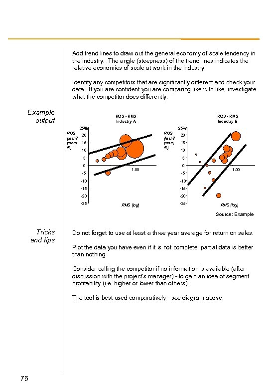 Add trend lines to draw out the general economy of scale tendency in the industry. The angle (steepness) of the trend lines indicates the relative economies of scale at work in the industry. Identify any competitors that are significantly different and check your data. If you are confident you are comparing like with like, investigate what the competitor does differently. Example output ROS - RMS Industry A ROS - RMS Industry B 25% ROS (last 3 years, %) 20 15 10 5 0 -5 20 15 10 5 1. 00 0 1. 00 -5 -10 -15 -20 -25 RMS (log) Source: Example Tricks and tips Do not forget to use at least a three year average for return on sales. Plot the data you have even if it is not complete: partial data is better than nothing. Consider calling the competitor if no information is available (after discussion with the project’s manager) - to gain an idea of segment profitability (i. e. higher or lower than others). The tool is best used comparatively - see diagram above. 75
 Scenario development Description Scenario development is a methodology to help “manage the future”. Where traditional analysis predicts the near future in terms of historic and current trends scenario planning considers large-scale forces that will push the future in different directions. The process is as much a part of the benefit as the outcome, allowing managers to generate and share ideas in a positive environment, leaving a company better placed to react to changing future events. Scenario development suggests a number of distinctively different alternative futures, each of which are possible. These scenarios of the future focus less on predicting outcomes and more on understanding the forces that would eventually compel an outcome; less on figures and more on insight. They are more concerned with understanding the discontinuities in creating alternative futures by recognising that the structure of the environment may change. Typical application Typical process Scenario planning can be applied to any changing environment, but is generally most successful in industries which face major change to underlying fundamentals of environment and competition. Most famously it has been adopted by Shell (oil), the NHS (health service), and ICL (telco supply). There are many variants on how to run a full scenario planning engagement, but all begin with gaining an understanding of the industry via client interviews, industry experts, and micro and macro environment analysis A “decision focused scenario” process will take the following form: - clarify strategic decisions the scenarios seek to address (ie. what would you like to know about the future to improve your decisions? ) - agree key decision factors - determine environmental forces at two levels : market/industry level (micro) and an economic/political/technical level (macro) - develop 3 -6 scenarios - often called logics. (e. g. global giants will dominate, industry will fragment, boundaries will blur, etc. ) - describe the scenarios in enough detail to identify implications on the strategic decisions - Identify strategic implications - feed back into the original strategic decisions This process is done in teams and workshops with the client. 76
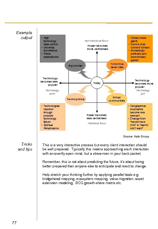 Example output • Global media • High Non-individual focus technology state control • Universal surveillance • Police states/blocks giants • Control of all Power becomes more centralised content/ formats • Increasingly politically and economically guided Tomorrow never dies Big brother Technology becomes less popular Technology becomes more popular Technology pull Today Technology push Virtual communities Technophobia • Technological • Geographical rejection through possible technology failure • Spiritual Renaissance boundaries become less relevant • Change from “haves/ have nots” to “wants/ don’t want” Power becomes less centralised Individual focus Source: Halo Group Tricks and tips This is a very interactive process but every client interaction should be well prepared. Typically this means approaching each interaction with an overtly open mind, but a straw-man in your back pocket. Remember, this is not about predicting the future, it’s about being better prepared than anyone else to anticipate and react to change. Help stretch your thinking further by applying parallel tools e. g: bridgehead mapping, ecosystem mapping, value migration, asset extension modeling, BCG growth-share matrix etc. 77
 Sector charts Description The sector chart is a fairly simple, visually arresting demonstration of relative positions of competitors in a sector or industry. The sector chart tool is similar to a BCG matrix, however the BCG matrix is from the point of view of a particular company rather than the market as a whole. By contrast, sector charts are calculated in reference to the largest market player at the end of a particular period. Typical application This tool should be used to uncover the competitive dynamics with a market or industry. By understanding the relative performance of players by changing market share we can construct a number of strategic implications for the client. (See also: Share Gain Line tool. ) Typical process As usual, begin by carefully defining the market you are looking at. Identify the main players in the market and, through the usual research methods, calculate their size in relation to the market. Now calculate the growth rates for each player. Typically, the values for growth are calculated over a period of three to five years. Simply calculate the size at period start and end, and divide by the number of years. Plot the different companies as bubbles on the graph with the relative market share at the end of the period as the horizontal axis and growth on the vertical. The area (note: not the radius) of the bubbles can be used to represent the absolute size of each of the companies at the end of the period of examination. Always make sure to add a key which shows the scale for the bubbles. Looking at the resulting values can tell you a great deal about the changing face of a particular market. For example, if the smaller players are grouped high up the chart, this suggests a process of market fragmentation is taking place, and by contrast if the growth is focused on the large players, the market is consolidating. If you wish to use an ‘others’ category for a fragmented market, separate the bubble - it is not a large market player. 78
 Copy and paste chart into Powerpoint, then ungroup the chart, deleting all but the stacked column. Group the column, rotate (using flip function) so that largest segment lies on left hand side and adjust re-size to fit in area, ensuring that you have locked the aspect ratio. For each segment follow the previous steps, but instead of flipping, fit the columns to the segment size. Example output ABC Sector, 1996 - 2000 Company E 40% Company C Company I 30% Company D 20% Real Annual Growth (%) Company B Company J 10% Company K Company A 0% Company F -10% -20% 2 X 1. 5 X 1 X 0. 5 X Sector CAGR = 8. 6% Company H 0. 3 X 0. 2 X 0. 1 X Company G 0. 05 X 0. 03 X 0. 02 X 0. 01 X Relative Market Share = $1 billion revenue, 2000 Source: Example Tricks and tips For purposes of clarity when presenting the information, it is wise to calculate the relative market share on a logarithmic scale. If comparing a number of charts, make sure you retain a consistent scale on both axes. Adding a sector average growth line to the chart can be useful. 79
 Sensitivity charts Description Commercial models used to guide strategic decisions nearly always depend upon assumption - about the market, our client’s ability to capture share, the ability to implement etc. A sensitivity chart is a clear mechanism for displaying the impact of assumptions in your model. It achieves this through varying the most critical assumptions and then recording the change to the key outputs. Typical application Sensitivity analysis is a fundamental part of the construction of any business model. It allows you to determine and communicate the key assumptions in your model in terms of the impact they have on the bottom line of the business. Sensitivity analysis can also indicate any flaws in the functioning of the model - keep your eye out when conducting sensitivity analysis for erratic or unusual changes due to minor alterations in inputs. Typical process Based upon your growing understanding of the issue, build an Excel model. As the model develops be aware of which factors are having most impact on your critical outputs, and question heavily the nature and scale of the assumptions you are making about these factors. Ensure all key assumptions are isolated (typically 5 -15), and ensure the model updates assumptions in real time. Taking each key assumption in turn alter the value by +/- five percent. (For example, an assumption of 50% cagr would become 52. 5% cagr NOT 55. 0%). The sign of the alteration should be chosen to give a positive change in the observed output. Note the new values and calculate the percentage change in the observed output. Reset the assumption then repeat the process. Continue until you have tested all key assumptions. Rank assumptions in terms of significance to the observed output and plot. It is advisable to place the most sensitive assumptions in the ‘control panel’ on the front page of your model, so the client can change the values during interactive sessions. Look carefully at the most sensitive values and make sure you are particularly confident of them in advance of presenting the model Significant time should be spent on this activity. . This will allow you to focus your time on those issues which are most pertinent (and potentially most contentious) for the client. 80
 Example output Sensitivity for Global Equity trader % change in 5 year NPV upon +/-5% in variable 0% 2% 4% 6% 8% 10% 12% 14% Flat $5 fee from option 15. 2% Inbound volume 13. 3% Exchange rate $/£ 7. 2% Inbound growth rate 7. 1% US % of total inbound 6. 0% Pre tax cost of capital 5. 5% HR overhead load factor 5. 0% Investment cost of $9 m 3. 9% Market making 3. 9% 2. 4% Exchange rate £/euro Set fee 2. 3% 2. 2% Dividend distribution Outbound volume factor US settlement fee Tricks and tips 16% 2. 0% 1. 0% Source: FSI project, April 2001 Do not confuse the 5% changes you are making to assumptions with real-world events. This is simply a constant figure to demonstrate the impact (linear or non-linear) to selected outputs. The anticipated range of your assumptions should be reflected in a parallel upper/lower bound analysis. 5% is not cast in stone. Use a more appropriate (but constant) figure where applicable to your industry (e. g 50 basis points may be more appropriate if your model concerns insurance product margins). Employing and understanding proxies and assumptions is at the heart of good strategic consulting, but at times you may feel that you have only limited confidence in your estimates. Three points on this: - do not be afraid to express and discuss this concern. - use this tool to understanding its impact - you are not expected to know exact values for uncertain events, but you are expected to know better than anyone else 81
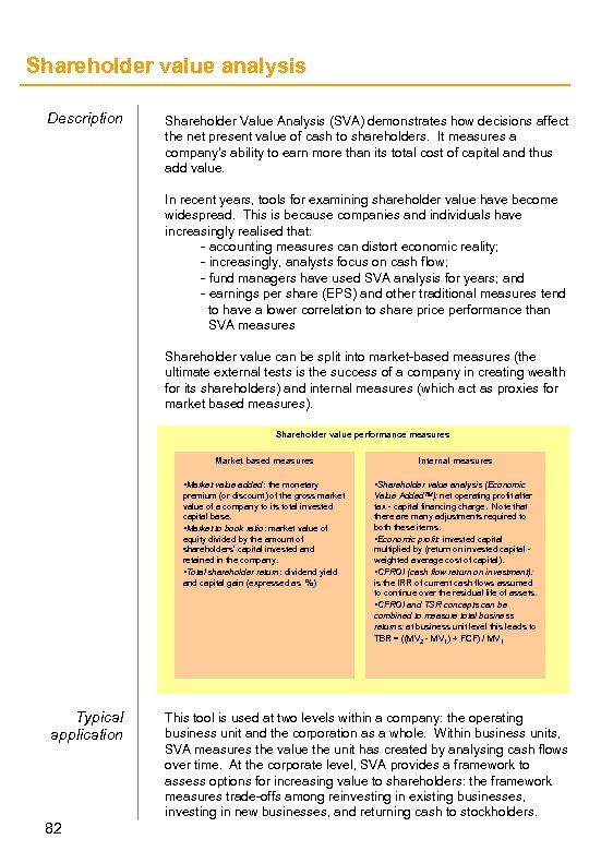 Shareholder value analysis Description Shareholder Value Analysis (SVA) demonstrates how decisions affect the net present value of cash to shareholders. It measures a company's ability to earn more than its total cost of capital and thus add value. In recent years, tools for examining shareholder value have become widespread. This is because companies and individuals have increasingly realised that: - accounting measures can distort economic reality; - increasingly, analysts focus on cash flow; - fund managers have used SVA analysis for years; and - earnings per share (EPS) and other traditional measures tend to have a lower correlation to share price performance than SVA measures Shareholder value can be split into market-based measures (the ultimate external tests is the success of a company in creating wealth for its shareholders) and internal measures (which act as proxies for market based measures). Shareholder value performance measures Market based measures Internal measures • Market value added: the monetary Typical application 82 • Shareholder value analysis (Economic premium (or discount) of the gross market value of a company to its total invested capital base. • Market to book ratio: market value of equity divided by the amount of shareholders’ capital invested and retained in the company. • Total shareholder return: dividend yield and capital gain (expressed as %) Value Added TM): net operating profit after tax - capital financing charge. Note that there are many adjustments required to both these items. • Economic profit: invested capital multiplied by (return on invested capital weighted average cost of capital). • CFROI (cash flow return on investment): is the IRR of current cash flows assumed to continue over the residual life of assets. • CFROI and TSR concepts can be combined to measure total business returns: at business unit level this leads to TBR = ((MV 2 - MV 1) + FCF) / MV 1 This tool is used at two levels within a company: the operating business unit and the corporation as a whole. Within business units, SVA measures the value the unit has created by analysing cash flows over time. At the corporate level, SVA provides a framework to assess options for increasing value to shareholders: the framework measures trade-offs among reinvesting in existing businesses, investing in new businesses, and returning cash to stockholders.
 SVA is used both as a tool to aid in one-time major decisions (such as acquisitions, large capital investments or division breakup values) and to guide everyday decision-making throughout the organisation. When used as an everyday tool by line managers, SVA can be applied in many ways to: - Assess the performance of the business or portfolio of businesses. Since SVA accounts for the cost of capital used to invest in businesses and the cash flows generated by the businesses, it provides a clear understanding of value creation or degradation over time within each business unit. This information also can be linked to management compensation plans. - Test the hypotheses behind business plans. By understanding the fundamental drivers of value in each business, management can test assumptions used in the business plans. This provides a common framework to discuss the commercial viability of each plan. - Determine priorities to meet each business's full potential. This analysis illustrates which options have the greatest impact on value creation, relative to the investments and risks associated with each option. With these options clearly understood and priorities set, management has a foundation for developing a practical plan to implement change. Typical process Before embarking on shareholder value analysis, bear in mind that it requires a thorough understanding of the business in question in order to determine the amount of investment required and the expected cash flows that investments will yield in an accurate manner. Begin by determining the actual costs of all investments in a given business, discounted to the present at the appropriate cost of capital for that business. You will need to agree this rate with the client. After you have done this, estimate the economic value of your client’s business by discounting the expected cash flows to the present at the weighted average cost of capital. The economic value added can then be worked out as the difference between the net present value of the investments and cash flows. 83
 Share momentum charts Description Share momentum charts are a way of presenting dynamics in market share amongst competitors operating across different markets. Typical application As a tool, they help you display relative market share performance of competitors across a particular market sector, or across sectors for a particular competitor. See also: Sector Charts and Growth Share Matrix. Typical process Begin by carefully defining the market or industry you are dealing with. List the competitors you are analyzing, and gather historical data from general research, company and broker reports for each component, along with overall data on the market’s size and growth. Ensure the total market data corresponds to the competitors you are looking at. Compile competitor sales data for between three and five years previously. Create an Excel table with market/industry size at period start and end, and sizes for each competitor over the same period Calculate the absolute growth between period end and start, then divide by the number of years. Plot the results on the chart so that the market or industry growth is on the horizontal, and competitor growth on the vertical axis. Add a share gain line bisecting the two axes. Players whose bubble appears above the gain line are performing relatively well, compared to competitors (i. e. they are gaining market share). Take care how you interpret the results. It is important to think about the meaning of the chart and add clear notes to your slide. Is, for example, a poor position on the chart because of underperformance, or is a player is choosing to exit the market? 84
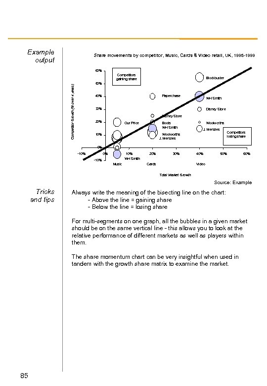 Example output Share movements by competitor, Music, Cards & Video retail, UK, 1995 -1999 60% Competitors gaining share Blockbuster Competitor Growth (% over 4 years) 50% Paperchase 40% WH Smith 30% Disney Store 20% Our Price Boots WH Smith Woolworths J. Menzies Competitors losing share Woolworths J. Menzies 10% 0% -10% 0% 10% WH Smith -10% Music 20% 30% Cards 40% 50% 60% Video Total Market Growth Source: Example Tricks and tips Always write the meaning of the bisecting line on the chart: - Above the line = gaining share - Below the line = losing share For multi-segments on one graph, all the bubbles in a given market should be on the same vertical line - this allows you to look at the relative performance of different markets as well as players within them. The share momentum chart can be very insightful when used in tandem with the growth share matrix to examine the market. 85
 Sources of value waterfall Description The sources of value waterfall is used to identify and highlight individual sources of value within a company. Typical application Value waterfalls often add value to the client by presenting data in a simplified way. The process forces you to identify key areas of value creation and/or destruction and thus focus on the big issues that determine a client’s competitive position. These could include: - reasons for change in revenue or profitability; - sources of cost savings; - sources of capital expenditure spend or savings; - description of full potential sources of value; and - aspirational description of what is achievable Two sources of value waterfalls next to each other can be used to show comparative performance over time - such as between two departments, products or competitors. Typical process Begin by obtaining the necessary data from financial statements, accounts, or market research. If data is not available, use estimates or proxy data. Decide what measure you wish to have on the vertical axis, but remember that this axis always describes the value being created or destroyed. This could be any financial or non-financial measure (such as ROI, capex, working capital, headcount, number of customers). Then decide on the elements of the horizontal axis. These represent the disaggregated categories which are causing the change. Such categories could also be time or some other incremental measure. Ensure you choose the right categories to reflect all sources of value creation and/or destruction. Where value is destroyed, stack the boxes in a downwards direction. When creating the chart in Excel, you will need to use “invisible” boxes to get the output to line up correctly. Annotate your chart, including explanatory notes, and detail of key assumptions, outputs and sensitivities. 86
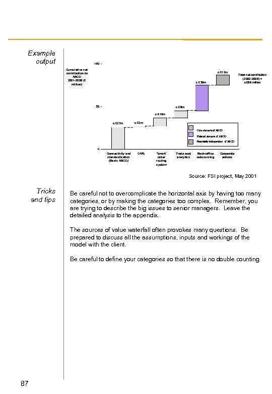 Example output Cumulative net contribution to ABCD 2001 -2006 (£ million) c. £ 12 m c. £ 30 m Total net contribution (2002 -2006) = c. £ 89 million c. £ 8 m c. £ 10 m c. £ 27 m c. £ 2 m Core element of ABCD Related element of ABCD Potentially independent of ABCD Connectivity and standardisation (Basic ABCD) OMS ‘Smart’ order routing system Trade cost analytics Back-office outsourcing Corporate actions Source: FSI project, May 2001 Tricks and tips Be careful not to overcomplicate the horizontal axis by having too many categories, or by making the categories too complex. Remember, you are trying to describe the big issues to senior managers. Leave the detailed analysis to the appendix. The sources of value waterfall often provokes many questions. Be prepared to discuss all the assumptions, inputs and workings of the model with the client. Be careful to define your categories so that there is no double counting. 87
 Strategy articulation map Description One of the key challenges in any strategy project is articulating strategic criteria in a clear and consistent manner. It is necessarily complex and multi-faceted and cannot be reduced to a glib phrase or mission statement without exploring what these criteria mean, in practical terms, for a business. The strategy articulation map is a tool designed to document and analyze a company’s strategic intent in a structured manner. However, it can also function as a quick and easy tool to quickly gather ideas from the client about where the company is and where they see it going, and demonstrate the linkage between a company’s vision, mission and values. Typical application Ideally, the strategy articulation map is a tool used at the beginning of any project. The strategy articulation map is built in close discussion with senior management in the client company, and can be a useful exercise on its own in getting senior staff members to think about the relationship between the company’s stated intent and a potentially divergent reality before communicating this across to the company. Typical process In discussion with the project team, formulate a hypothesis to take to the key client contacts for discussion. Once you have done this, arrange interviews with the main senior members of the client staff. Use these to conduct interviews on the strategic direction of the company, based around the hypothesis you have formed, following the logical flow of questions from the top to the bottom of the pyramid. Take care to challenge and evaluate the client contacts’ statements robustly, especially when they come directly from mission or vision statements. Bear in mind that competitive advantages are generally few and far between; whereas competencies may be broader. Initiatives and competencies usually flow fairly easily from the statements at the top of the pyramid, although ‘corporate politics’ may find you returning to the original statements many times. Make sure you track agreement and the reasoning behind any disagreements. 88
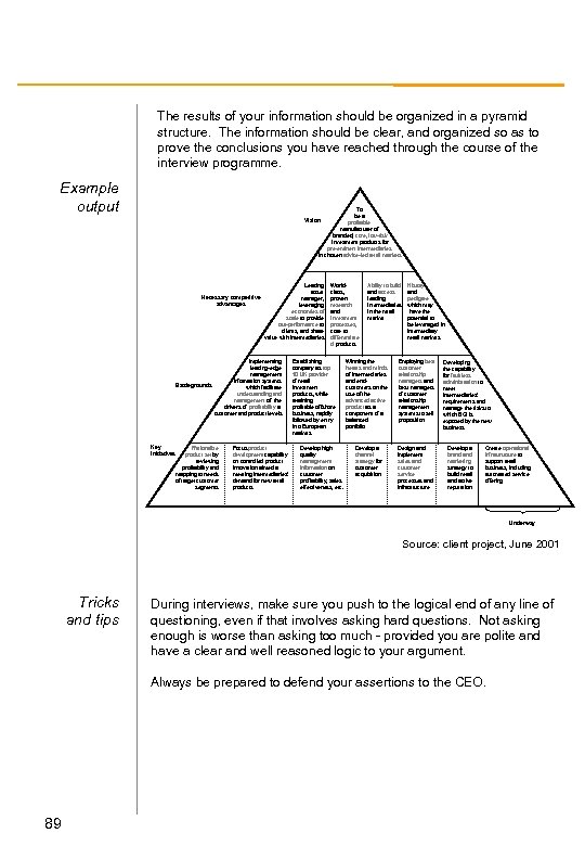 The results of your information should be organized in a pyramid structure. The information should be clear, and organized so as to prove the conclusions you have reached through the course of the interview programme. Example output To be a profitable manufacturer of branded, core, low-risk investment products for pre-eminent intermediaries in chosen advice-led retail markets Vision Necessary competitive advantages Leading asset manager, leveraging economies of scale to provide out-performance to clients, and share value with intermediaries Implementing leading-edge management information systems Battlegrounds which facilitate understanding and management of the drivers of profitability at customer and product levels Key initiatives Rationalize product set by reviewing profitability and mapping to needs of target customer segments Focus product development capability on controlled product innovation aimed at meeting intermediaries’ demand for new retail products Worldclass, proven research and investment processes, core to differentiate d products Establishing company as top 10 UK provider of retail investment products, while retaining profitable offshore business, rapidly followed by entry into European markets Develop high quality management information on customer profitability, sales effectiveness, etc. Ability to build and access leading intermediaries in the retail market Winning the hearts and minds of intermediaries and endcustomers on the use of the advanced active product as a component of a balanced portfolio Develop a channel strategy for customer acquisition History and pedigree which may have the potential to be leveraged in intermediary retail markets Employing best customer relationship managers and best managers of customer relationship management systems to sell proposition Design and implement sales and customer service processes and infrastructure Developing the capability for faultless administration to meet intermediaries’ requirements and manage the risks to which BGI is exposed by the new business Develop a brand marketing strategy to build retail and active reputation Create operational infrastructure to support retail business, including automated service offering Underway Source: client project, June 2001 Tricks and tips During interviews, make sure you push to the logical end of any line of questioning, even if that involves asking hard questions. Not asking enough is worse than asking too much - provided you are polite and have a clear and well reasoned logic to your argument. Always be prepared to defend your assertions to the CEO. 89
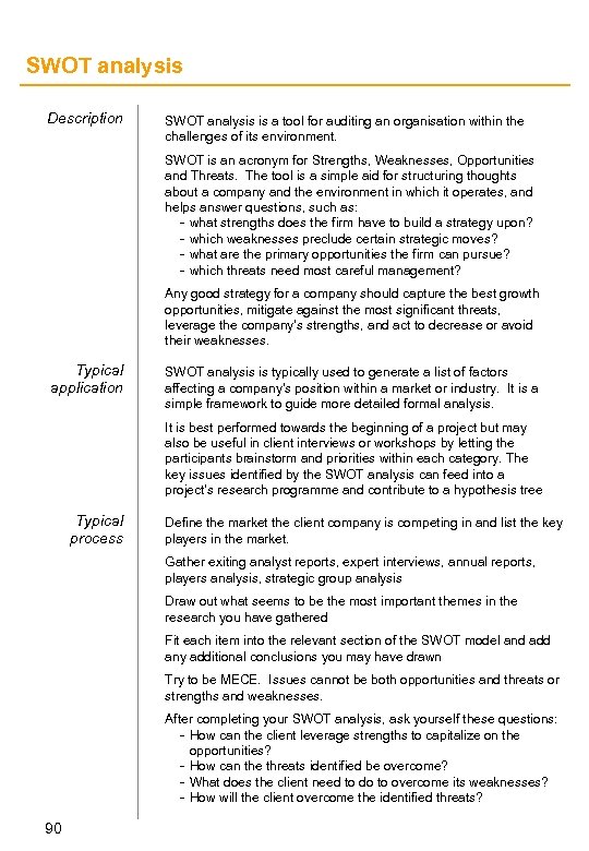 SWOT analysis Description SWOT analysis is a tool for auditing an organisation within the challenges of its environment. SWOT is an acronym for Strengths, Weaknesses, Opportunities and Threats. The tool is a simple aid for structuring thoughts about a company and the environment in which it operates, and helps answer questions, such as: - what strengths does the firm have to build a strategy upon? - which weaknesses preclude certain strategic moves? - what are the primary opportunities the firm can pursue? - which threats need most careful management? Any good strategy for a company should capture the best growth opportunities, mitigate against the most significant threats, leverage the company’s strengths, and act to decrease or avoid their weaknesses. Typical application SWOT analysis is typically used to generate a list of factors affecting a company’s position within a market or industry. It is a simple framework to guide more detailed formal analysis. It is best performed towards the beginning of a project but may also be useful in client interviews or workshops by letting the participants brainstorm and priorities within each category. The key issues identified by the SWOT analysis can feed into a project’s research programme and contribute to a hypothesis tree Typical process Define the market the client company is competing in and list the key players in the market. Gather exiting analyst reports, expert interviews, annual reports, players analysis, strategic group analysis Draw out what seems to be the most important themes in the research you have gathered Fit each item into the relevant section of the SWOT model and add any additional conclusions you may have drawn Try to be MECE. Issues cannot be both opportunities and threats or strengths and weaknesses. After completing your SWOT analysis, ask yourself these questions: - How can the client leverage strengths to capitalize on the opportunities? - How can the threats identified be overcome? - What does the client need to do to overcome its weaknesses? - How will the client overcome the identified threats? 90
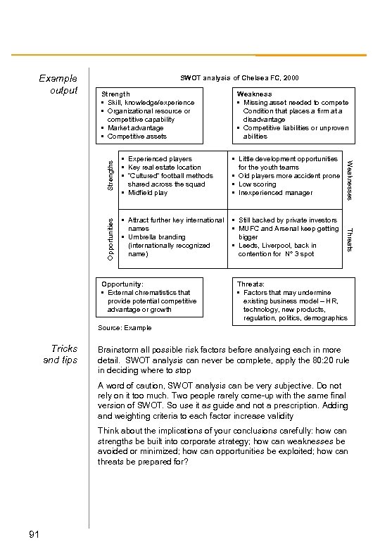 SWOT analysis of Chelsea FC, 2000 Weakness • Missing asset needed to compete Condition that places a firm at a disadvantage • Competitive liabilities or unproven abilities • Little development opportunities for the youth teams • Old players more accident prone • Low scoring • Inexperienced manager • Attract further key international names • Umbrella branding (internationally recognized name) • Still backed by private investors • MUFC and Arsenal keep getting bigger • Leeds, Liverpool, back in contention for N° 3 spot Opportunity: • External chrematistics that provide potential competitive advantage or growth Threats • Experienced players • Key real estate location • “Cultured” football methods shared across the squad • Midfield play Weaknesses Strength • Skill, knowledge/experience • Organizational resource or competitive capability • Market advantage • Competitive assets Opportunities Example output Threats: • Factors that may undermine existing business model – HR, technology, new products, regulation, politics, demographics Source: Example Tricks and tips Brainstorm all possible risk factors before analysing each in more detail. SWOT analysis can never be complete, apply the 80: 20 rule in deciding where to stop A word of caution, SWOT analysis can be very subjective. Do not rely on it too much. Two people rarely come-up with the same final version of SWOT. So use it as guide and not a prescription. Adding and weighting criteria to each factor increase validity Think about the implications of your conclusions carefully: how can strengths be built into corporate strategy; how can weaknesses be avoided or minimized; how can opportunities be exploited; how can threats be prepared for? 91
 Traffic light charts Description Traffic light charts are simple mechanism for capturing and displaying performance against a number of different criteria. Frequently used alternative names for traffic light charts are “Harvey ball charts” or Moon charts. They consist of a grid, where performance against key criteria are demonstrated as high/medium/low - displayed as colors (red, green, yellow) or shaded as new/half/full moon images. Overall performance is usually summarized across all criteria, but other strategic conclusions can be drawn from the clustering of criteria. Typical application Traffic light charts are a very versatile tool, and can be useful wherever a rigorous comparison between market players has to be made. They are often used to summaries business opportunities or competitor behavior. Typical process Do not begin to construct your traffic light chart until you are sure that you have agreement on the key criteria under assessment. Also, be sure to define the criteria very clearly. Next, set up a template for each criteria which captures the subelements and commentary that will eventually lie behind each colored circle. Complete the templates “in detail” and make sure you have tracked and logged all of your logic. Summarize all thinking into the final traffic light chart. Sanity check the answers coming out: is this sensible overall, not just as a summation of individual elements. Look at the shape, shading, and patterns that may lie in the chart. Use these observations to draw strategic assessments. 92
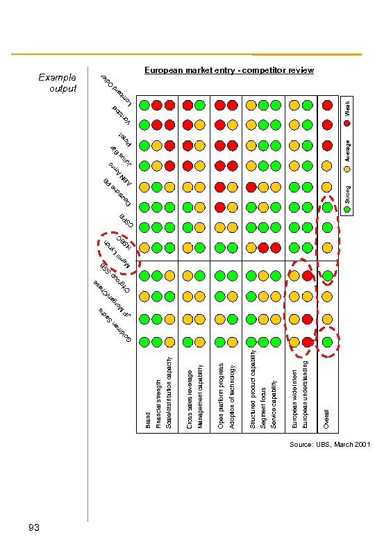 93 Overall European understanding European wide intent Service capability Segment focus Structured product capability Adoption of technology Open platform progress Management capability Cross sales leverage Scale/distribution capacity Financial strength Brand o G an m ld JP i ll ri er M SB -S p u ro tig e s ha C /C an rg o M hs ac S L S H BC h c yn S C PB e ch Strong e D s ut N AB PB Am s liu r Bä t te c Pi Average Ju ro Weak l rd be to ba n m Vo Lo er di O Example output European market entry - competitor review Source: UBS, March 2001
 Value chain analysis Description To understand the dynamics of an industry, it is helpful to analyse the entire value chain and the positioning and strengths of competitors within the same context. The value chain analysis tool shows the level of market concentration at each stage of the value chain, and the value companies create within it. A company may dominate its own market/segment of the industry value chain but be in a relatively weak position because of players further up or down the value chain. Typical application Value chain analysis assists understanding of an industry’s characteristics: the linkages between suppliers and customers, the share of value generated at each stage in a value chain, as well as the degree of vertical integration and the structures and level of company concentration. Value chain analysis also enables a greater understanding of monopoly and/or monopsony conditions. Typical process Begin by identifying the key activities in the value chain. To do this, isolate the end product you are examining, and list the “raw materials” required to produce this. Then, simply record each of the intermediate steps required to transform the raw materials into the final product. Determine the value added by each step of the chain. This can be determined by taking the selling price, less retail margin, minus the input price. Determine costs and margins within each segment for each player. After this, begin to identify the key players at each stage of the chain. Group together the players that produce equivalent or substitute products, and determine the concentration of competitors at each step. Finally, identify the relationships within or across stages of the value chain. Analyze specific relationships among players and assess the degree of vertical integration among players in the various steps. 94
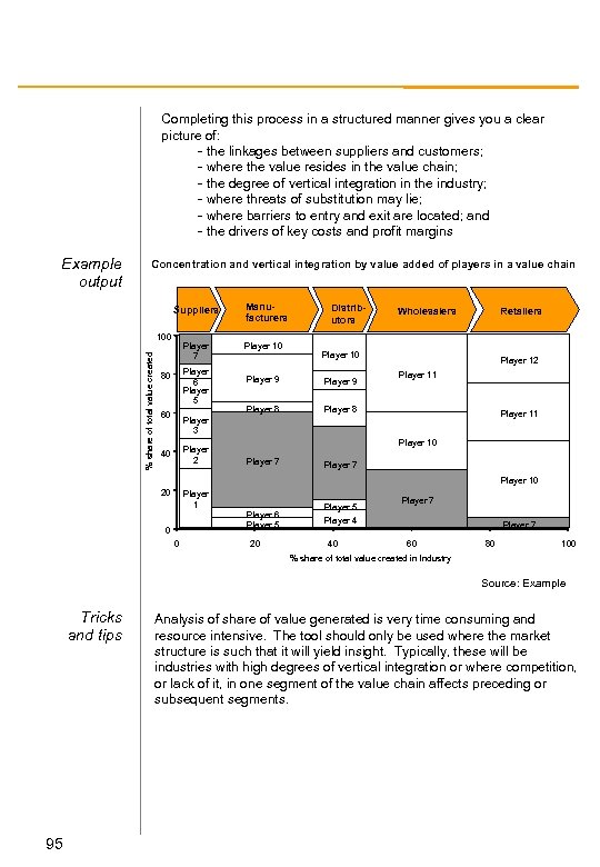 Completing this process in a structured manner gives you a clear picture of: - the linkages between suppliers and customers; - where the value resides in the value chain; - the degree of vertical integration in the industry; - where threats of substitution may lie; - where barriers to entry and exit are located; and - the drivers of key costs and profit margins Example output Concentration and vertical integration by value added of players in a value chain Suppliers % share of total value created 100 Player 7 Player 6 Player 5 80 60 Manufacturers Player 10 Distributors Wholesalers Retailers Player 10 Player 9 Player 8 Player 12 Player 11 Player 8 Player 11 Player 3 Player 2 40 Player 10 Player 7 Player 10 20 Player 1 Player 6 Player 5 0 0 20 Player 5 Player 4 40 Player 7 60 80 100 % share of total value created in Industry Source: Example Tricks and tips 95 Analysis of share of value generated is very time consuming and resource intensive. The tool should only be used where the market structure is such that it will yield insight. Typically, these will be industries with high degrees of vertical integration or where competition, or lack of it, in one segment of the value chain affects preceding or subsequent segments.
 Value disciplines Description The value discipline model helps you position competitors or industries against one another according to three generic capabilities: product leadership, operational excellence, and customer intimacy. Typical application Use the value disciplines chart to demonstrate key competitive differentiators. It is a tool designed to aid discussion and thought, whether internally or with the client, rather than in final analysis or in presentations or packs, and usually works better at a high level than in a data rich environment. Typical process Begin by carefully defining the market or industry you are assessing and identifying the competitors. Try to be open and imaginative about potential competitors: think about companies that address the same audience, or require consumers to act in a similar way (e. g. bars vs. gyms as places where only a finite and competitive period of time can be spent). Gather data on each of your competitors, in both qualitative and quantitative forms. Organize your information against the three predefined capabilities: if your information is quantitative rank against each capability; if qualitative, rank in discussion with your client. Plot the resulting data on a chart in Excel according to the rankings you have identified. You can do this using the Radar function in the Chart menu. Always remember that this is an indicative tool, not a proof of a right answer. However, it can illustrate a point, or highlight a lack of focus in certain areas. 96
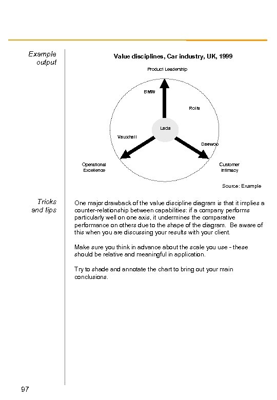 Example output Value disciplines, Car industry, UK, 1999 Product Leadership BMW Rolls Lada Vauxhall Daewoo Operational Excellence Customer Intimacy Source: Example Tricks and tips One major drawback of the value discipline diagram is that it implies a counter-relationship between capabilities: if a company performs particularly well on one axis, it undermines the comparative performance on others due to the shape of the diagram. Be aware of this when you are discussing your results with your client. Make sure you think in advance about the scale you use - these should be relative and meaningful in application. Try to shade and annotate the chart to bring out your main conclusions. 97
 Weighted column chart Description The weighted column chart is a bar chart in which the width of the columns shows a second dimension. It helps display, for example, competitor profitability and competitor share. Typical application The weighted column chart has many uses, the most common of which is to analyze the profit performance of competitors or book value and value generated relative to their market share. If the data is available, the chart can equally be used to examine: - business units within a company; or - departments within a particular business unit Typical process Begin by carefully defining the market you are looking at. List the competitors to be included in your assessment, and obtain data reports for each. The weighted column chart always takes the same format, and there is an Excel-based tool to automate its creation. Create an Excel table for last year’s sales and the profits for the last three years, and plot the results on the chart. Place the share of market along the horizontal axis and the return on sales on the vertical. Annotate competitors carefully if there is incomplete and/or misleading data. This might be due to: - less than three years of financial figures; - year of sales is not last year’s; - data does not compare like with like; or - figures include activities not directly related to the market you are looking at 98
 Example output Industry profitability, Industry X, 1995 -98 20% ROS (last 3 15 years, %) Industry average = 10. 0% 10 5 Comp 1 Comp 2 Etc 0 0 20 40 60 80 100% -5 -10% Share of market, by competitor Source: Example Tricks and tips Don’t forget to average over at least three years of data when calculating ROS. If your data is incomplete, be aware of what is missing, but start plotting your information anyway. Partial data is better than nothing at all. Don’t be afraid to call the competitor directly - after getting clearance from the manager on your project - to gain an idea of the segment profitability, but remember client confidentiality issues at all times. Plot the weighted average industry profitability line based on the information you have, but indicate what total percentage of industry sales you have profitability data for. 99


