bbc6cf3d812b8c88cf48f5b2a7c7ad04.ppt
- Количество слайдов: 29
ABC of Typography
Typography · useful art (creating typefaces, design pages, books) · science (typographic rules) · craft, work (typographer ~ printer)
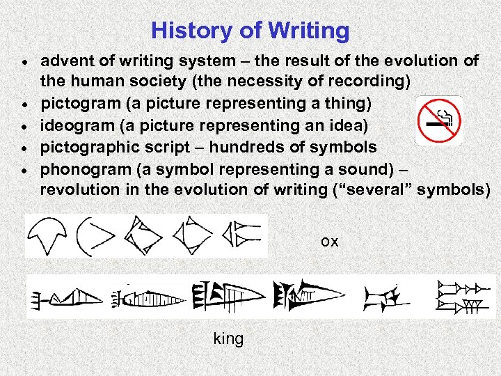
History of Writing · · · advent of writing system – the result of the evolution of the human society (the necessity of recording) pictogram (a picture representing a thing) ideogram (a picture representing an idea) pictographic script – hundreds of symbols phonogram (a symbol representing a sound) – revolution in the evolution of writing (“several” symbols) ox king
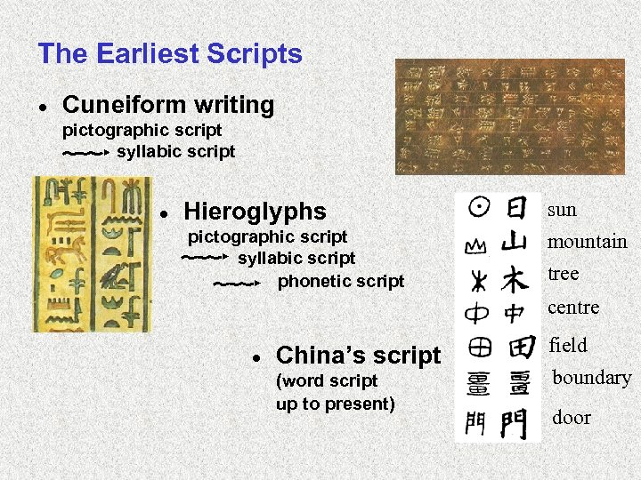
The Earliest Scripts · Cuneiform writing pictographic script syllabic script · Hieroglyphs sun pictographic script syllabic script phonetic script mountain tree centre · China’s script (word script up to present) field boundary door

History of Writing in Europe · Phoenician alphabet 22– 24 geom. symbols for consonants · Greek alphabet • signs for vowels (!) • the basis for Latin and Cyrillic · Czech alphabet • capital letters – ancient Rome • small letters ~ 800 AD (Carolingian minuscule) • accents (Jan Hus)
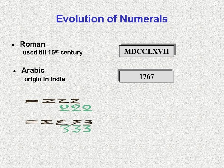
Evolution of Numerals · Roman used till 15 st century · Arabic origin in India MDCCLXVII 1767
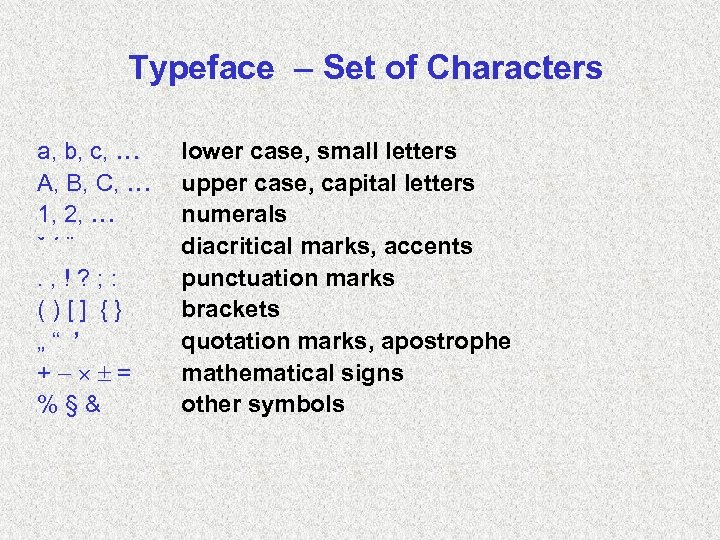
Typeface – Set of Characters a, b, c, A, B, C, 1, 2, ˇ´¨. , !? ; : ()[] {} „“ ’ + = %§& lower case, small letters upper case, capital letters numerals diacritical marks, accents punctuation marks brackets quotation marks, apostrophe mathematical signs other symbols
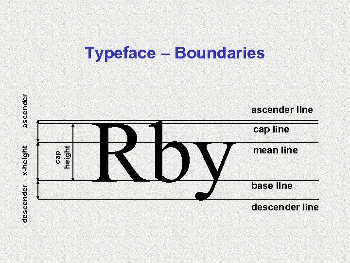
descender cap height x-height ascender Typeface – Boundaries Rby ascender line cap line mean line base line descender line
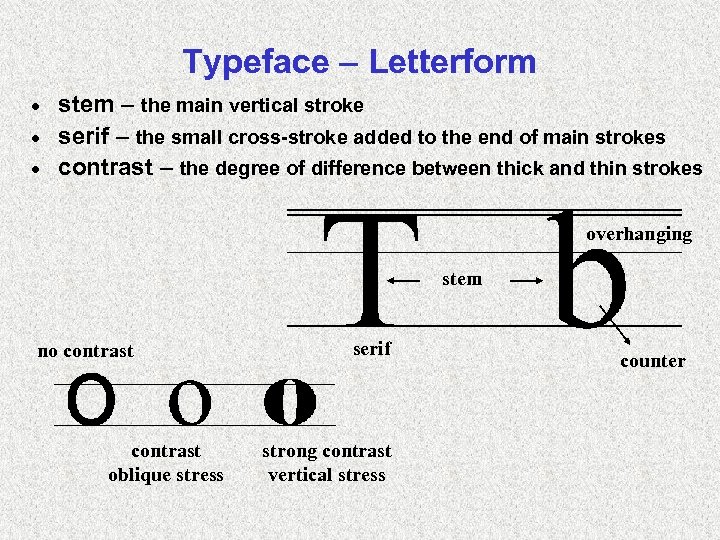
Typeface – Letterform stem – the main vertical stroke · serif – the small cross-stroke added to the end of main strokes · contrast – the degree of difference between thick and thin strokes · overhanging stem no contrast oblique stress serif strong contrast vertical stress counter
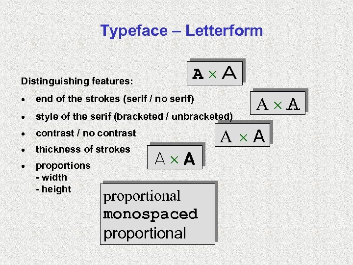
Typeface – Letterform Distinguishing features: A A · end of the strokes (serif / no serif) · style of the serif (bracketed / unbracketed) · contrast / no contrast · thickness of strokes · proportions - width - height A A A proportional monospaced proportional
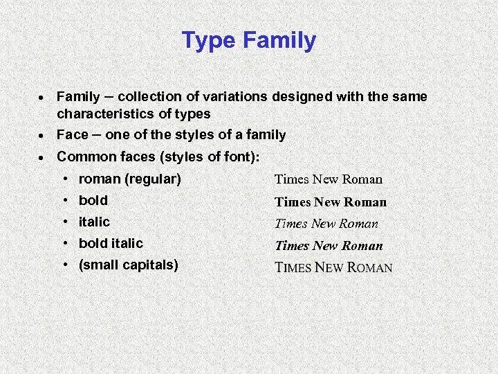
Type Family · Family – collection of variations designed with the same characteristics of types · Face – one of the styles of a family · Common faces (styles of font): • roman (regular) Times New Roman • bold Times New Roman • italic Times New Roman • bold italic Times New Roman • (small capitals)
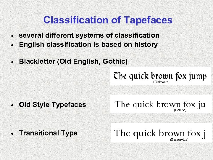
Classification of Tapefaces several different systems of classification · English classification is based on history · · Blackletter (Old English, Gothic) (Clairvaux) Marco) (San · Old Style Typefaces · Transitional Type (Garamont) (Palatino) (Bembo) (Times (Fourier) New Roman) (Baskerville)
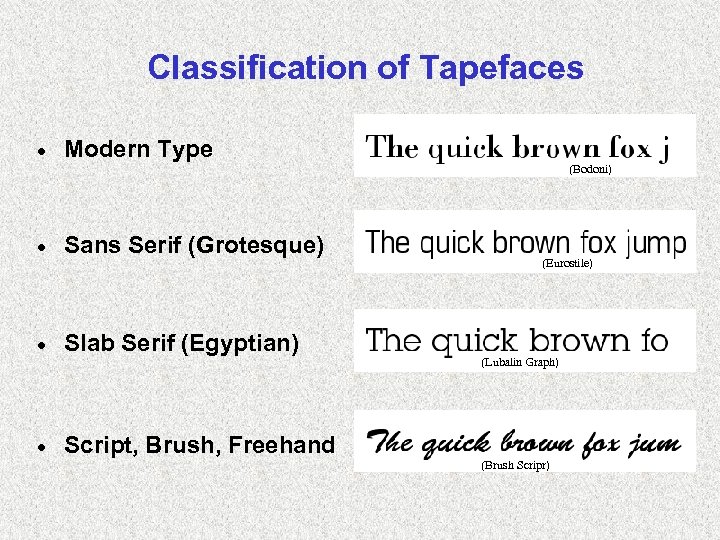
Classification of Tapefaces · Modern Type (New Century(Bodoni) Schoolbook) · Sans Serif (Grotesque) · Slab Serif (Egyptian) · Script, Brush, Freehand (Eurostile) (Helvetica) (Lubalin Graph) (Glypha) (Brush Scripr)
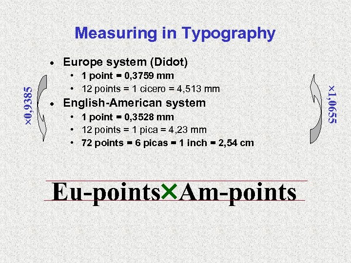
Measuring in Typography Europe system (Didot) • 1 point = 0, 3759 mm • 12 points = 1 cicero = 4, 513 mm · English-American system • 1 point = 0, 3528 mm • 12 points = 1 pica = 4, 23 mm • 72 points = 6 picas = 1 inch = 2, 54 cm Eu-points Am-points 1, 0655 0, 9385 ·
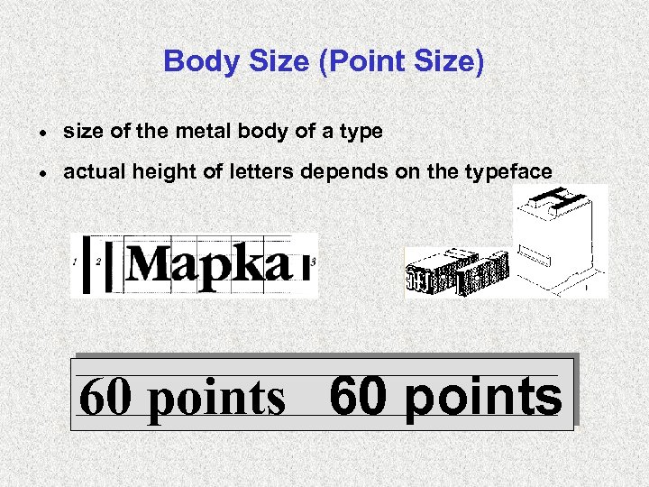
Body Size (Point Size) · size of the metal body of a type · actual height of letters depends on the typeface 60 points
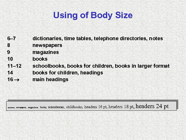
Using of Body Size 6– 7 8 9 10 11– 12 14 16 poznámka, dictionaries, time tables, telephone directories, notes newspapers magazines books schoolbooks, books for children, books in larger format books for children, headings main headings newspapers, magazines, books, schoolbooks, childbooks, headers 16 pt, headers 18 pt, headers 24 pt
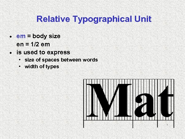
Relative Typographical Unit em = body size en = 1/2 em · is used to express · • size of spaces between words • width of types .
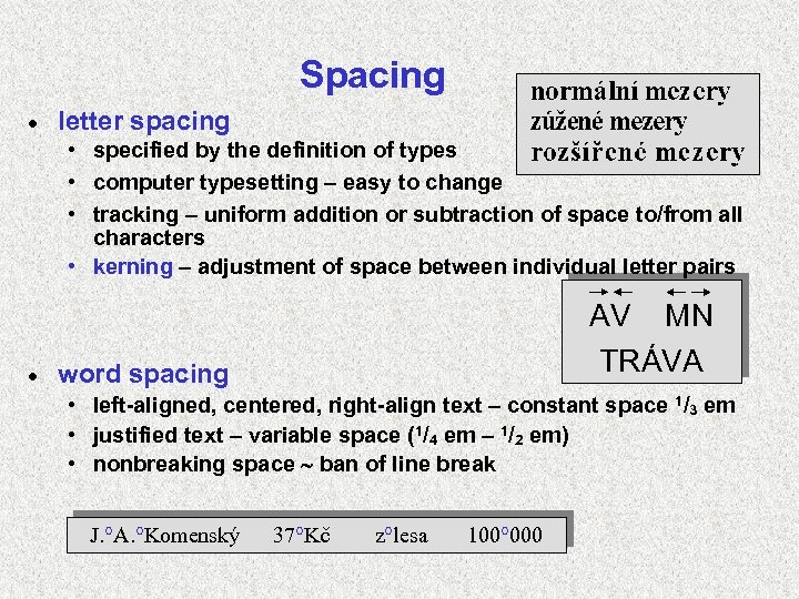
Spacing · letter spacing • specified by the definition of types • computer typesetting – easy to change • tracking – uniform addition or subtraction of space to/from all characters • kerning – adjustment of space between individual letter pairs · AV MN TRÁVA word spacing • left-aligned, centered, right-align text – constant space 1/3 em • justified text – variable space (1/4 em – 1/2 em) • nonbreaking space ban of line break J. °A. °Komenský 37°Kč z°lesa 100° 000
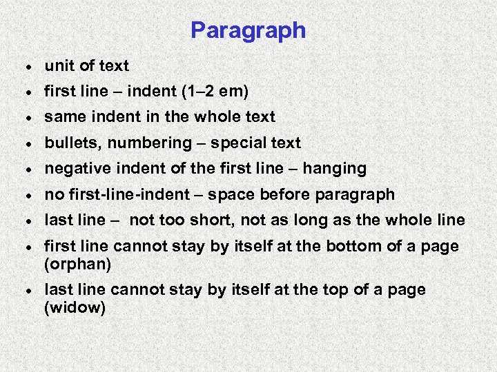
Paragraph · unit of text · first line – indent (1– 2 em) · same indent in the whole text · bullets, numbering – special text · negative indent of the first line – hanging · no first-line-indent – space before paragraph · last line – not too short, not as long as the whole line · first line cannot stay by itself at the bottom of a page (orphan) · last line cannot stay by itself at the top of a page (widow)
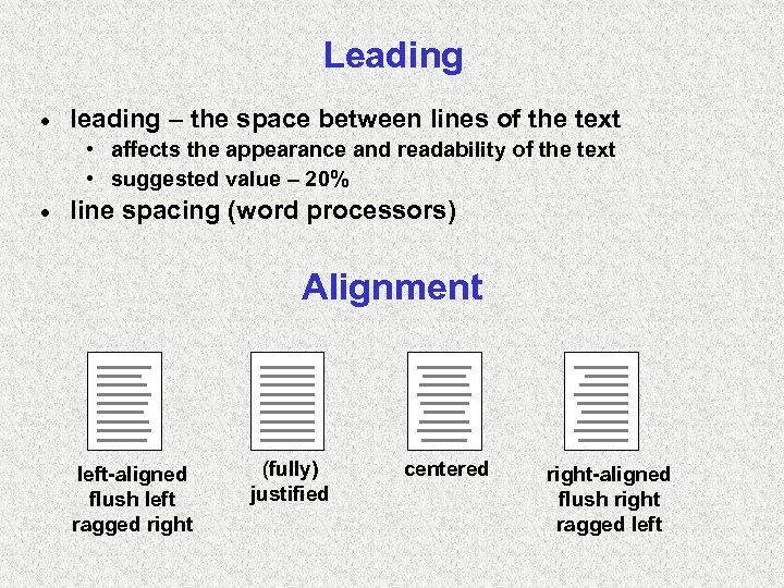
Leading · leading – the space between lines of the text • affects the appearance and readability of the text • suggested value – 20% · line spacing (word processors) Alignment left-aligned flush left ragged right (fully) justified centered right-aligned flush right ragged left
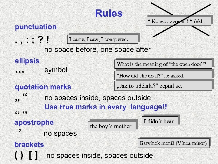
Rules punctuation . , : ; ? ! “ Konec , zvonec ! “ řekl. I came, I saw, I conquered. no space before, one space after ellipsis symbol What is the meaning of “the open door”? “How did she do it? ” he asked. „Jak to udělala? “ zeptal se. quotation marks „“ no spaces inside, spaces outside Use true marks in every language!! “” apostrophe ’ no spaces brackets () [] the boy’s mother I didn’t hear. Barvínek menší (Vinca minor) no spaces inside, spaces outside
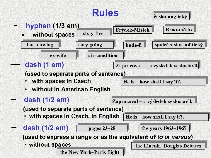
Rules - hyphen (1/3 em) · without spaces fast-moving — Frýdek-Místek bude-li sixty-five Brno-město společensko-politický easy-going ex-wife česko-anglický air-condition dash (1 em) Zapracoval — a výsledek se dostavil. (used to separate parts of sentence) • with spaces in Czech He is—how shall I say it? • without in American English dash (1/2 em) Zapracoval – a výsledek se dostavil. (used to separate parts of sentence) • with spaces in Czech, in English He is – how shall I say it? dash (1/2 em) pages 23– 28 the years 1963– 1967 (used to express a range or as the equivalent of to or versus) • without spaces the Lincoln–Douglas Debates the New York–Paris flight
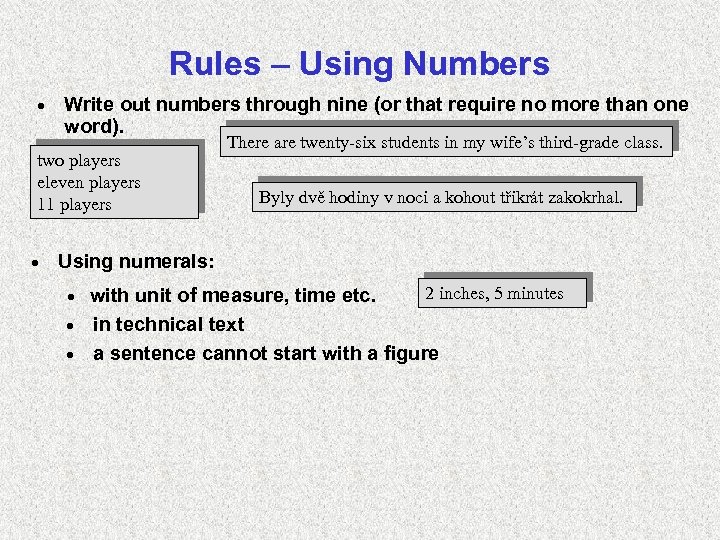
Rules – Using Numbers · Write out numbers through nine (or that require no more than one word). two players eleven players 11 players · There are twenty-six students in my wife’s third-grade class. Byly dvě hodiny v noci a kohout třikrát zakokrhal. Using numerals: 2 inches, 5 minutes with unit of measure, time etc. · in technical text · a sentence cannot start with a figure ·
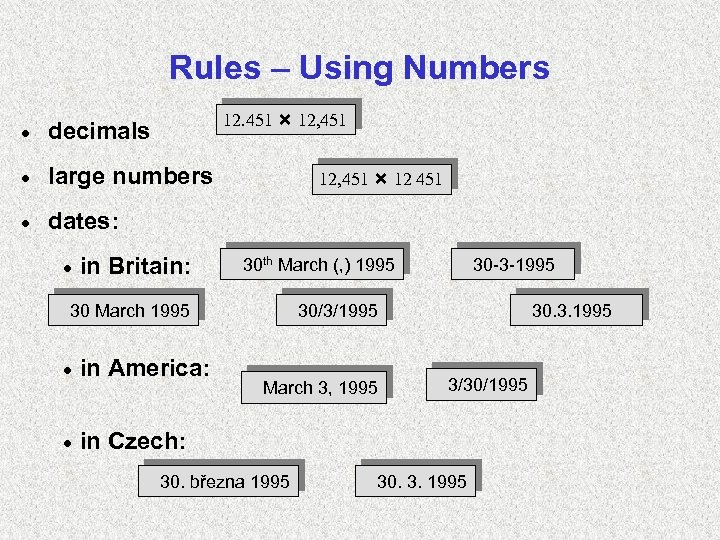
Rules – Using Numbers 12. 451 12, 451 · decimals · large numbers · dates: · in Britain: 12, 451 12 451 30 th March (, ) 1995 30 March 1995 · in America: · 30 -3 -1995 30/3/1995 30. 3. 1995 in Czech: March 3, 1995 30. března 1995 3/30/1995 30. 3. 1995
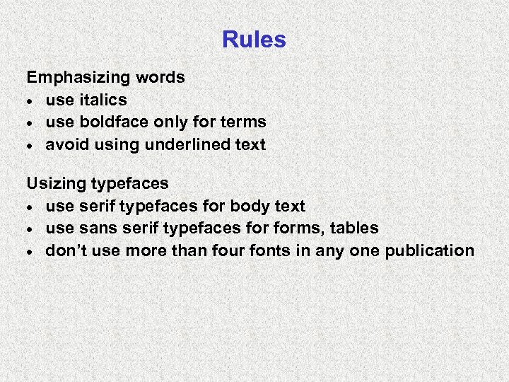
Rules Emphasizing words · use italics · use boldface only for terms · avoid using underlined text Usizing typefaces · use serif typefaces for body text · use sans serif typefaces forms, tables · don’t use more than four fonts in any one publication
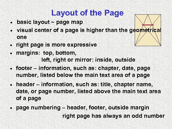
Layout of the Page · · · basic layout page map visual center of a page is higher than the geometrical one right page is more expressive margins: top, bottom, left, right or mirror: inside, outside footer – information, such as: chapter, date, page number, listed below the main text area of a page · header – information, such as: title, chapter name, date, or page number, listed above the main text area of a page · page numbering – header, footer, outside margin right page has always an odd number
Jobbing printed matters ~ occasional personal or firm printed matters visiting-card, letter paper and envelopes, weddingcard diplomas, cards of invitation, greetings-card, programs, catalogs, advertising brochures sizes needn´t to be standardized · fonts can be decorative · principles: information ability readability aesthetic standard ·
Fonts · Font a complete set of characters in a typeface a file containing the description of the shape of letters · Some fonts are installed together with programs, or we can buy them separately. · Fonts can have different sets of characters (national alphabets, special sets of characters – e. g. Symbol) · bitmap fonts • each character is stored as an array of pixels • are not easily scalable • for each size, face and resolution an extra description • used e. g. as a system font for screen (menu)
· vector (outline) fonts • each character is encoded by a higher-level description in terms of lines and areas • can be scaled to any size and otherwise transformed easy • another information in the file: hinting (instructions for representing by raster output devices), kerning pairs • wide-spread: – True Type fonts (Microsoft+Apple, belong to OS) – Adobe Type 1 (Post. Script) fonts (Adobe Systems)
bbc6cf3d812b8c88cf48f5b2a7c7ad04.ppt