
Making Power Point Slides Avoiding the Pitfalls


power_point_presentationfor_the_students.ppt
- Размер: 410.5 Кб
- Количество слайдов: 24
Описание презентации Making Power Point Slides Avoiding the Pitfalls по слайдам
Making Power Point Slides Avoiding the Pitfalls of Bad Slides
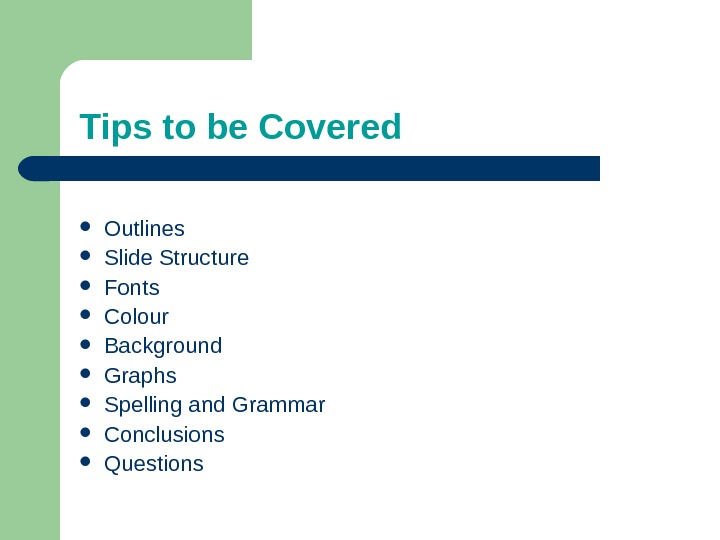
Tips to be Covered Outlines Slide Structure Fonts Colour Background Graphs Spelling and Grammar Conclusions Questions
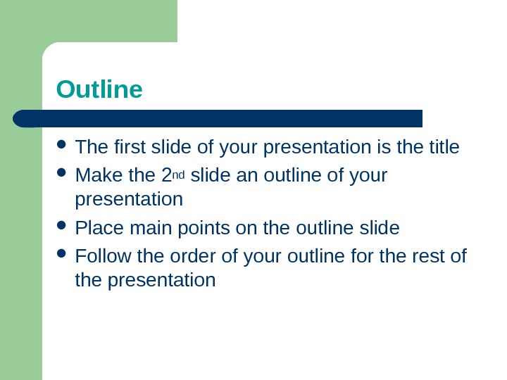
Outline The first slide of your presentation is the title Make the 2 nd slide an outline of your presentation Place main points on the outline slide Follow the order of your outline for the rest of the presentation
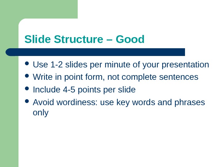
Slide Structure – Good Use 1 -2 slides per minute of your presentation Write in point form, not complete sentences Include 4 -5 points per slide Avoid wordiness: use key words and phrases only
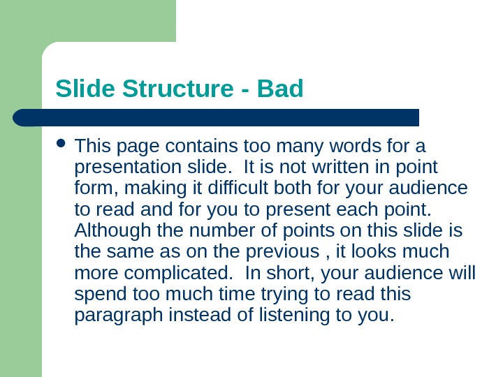
Slide Structure — Bad This page contains too many words for a presentation slide. It is not written in point form, making it difficult both for your audience to read and for you to present each point. Although the number of points on this slide is the same as on the previous , it looks much more complicated. In short, your audience will spend too much time trying to read this paragraph instead of listening to you.
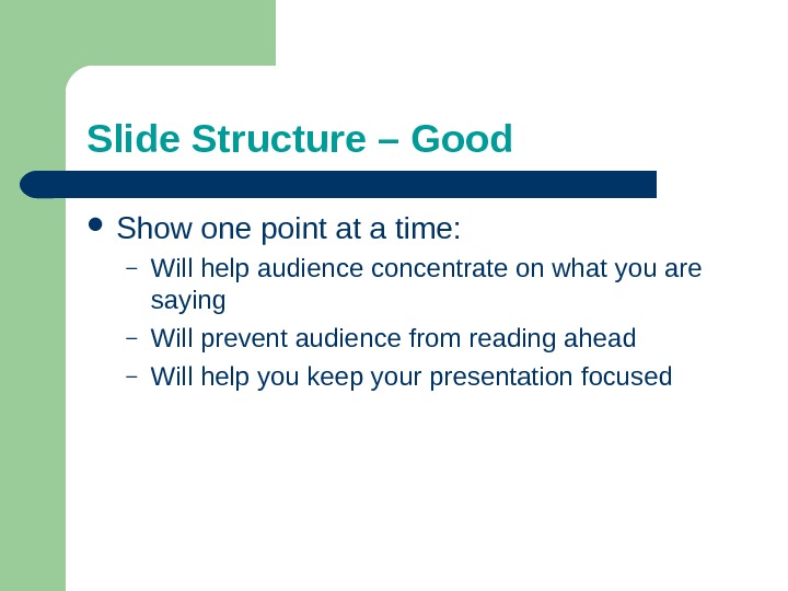
Slide Structure – Good Show one point at a time: – Will help audience concentrate on what you are saying – Will prevent audience from reading ahead – Will help you keep your presentation focused
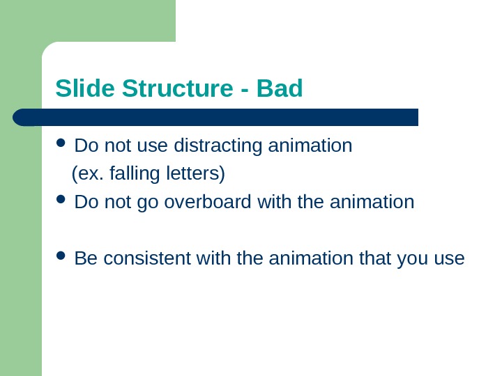
Slide Structure — Bad Do not use distracting animation (ex. falling letters) Do not go overboard with the animation Be consistent with the animation that you use
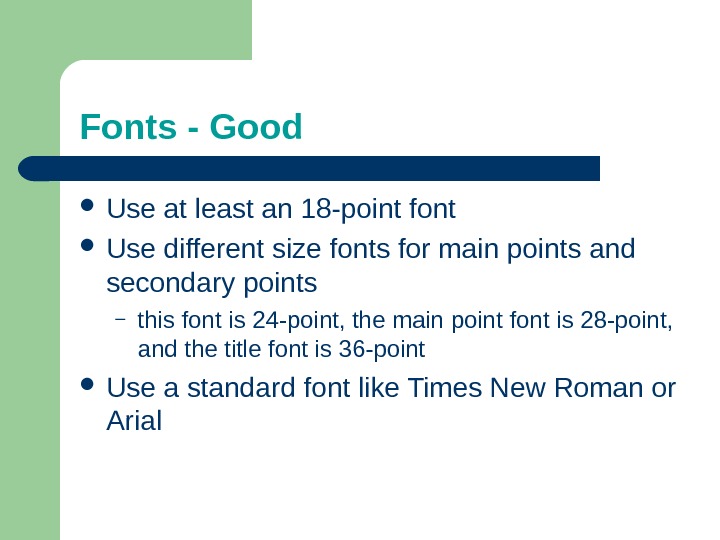
Fonts — Good Use at least an 18 -point font Use different size fonts for main points and secondary points – this font is 24 -point, the main point font is 28 -point, and the title font is 36 -point Use a standard font like Times New Roman or Arial
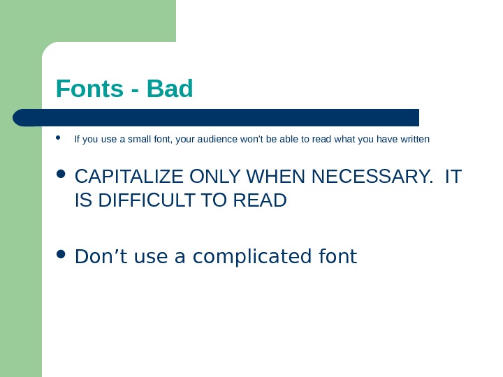
Fonts — Bad If you use a small font, your audience won’t be able to read what you have written CAPITALIZE ONLY WHEN NECESSARY. IT IS DIFFICULT TO READ Don’t use a complicated font
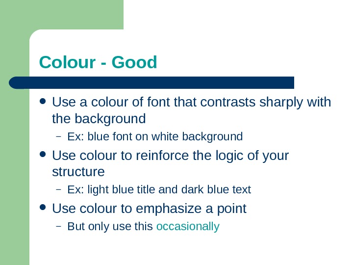
Colour — Good Use a colour of font that contrasts sharply with the background – Ex: blue font on white background Use colour to reinforce the logic of your structure – Ex: light blue title and dark blue text Use colour to emphasize a point – But only use this occasionally
Colour — Bad Using a font colour that does not contrast with the background colour is hard to read Using colour for decoration is distracting and annoying. Using a different colour for each point is unnecessary – Using a different colour for secondary points is also unnecessary T r y i n g t o b e c r e a t i v e c a n a l s o b e b a d
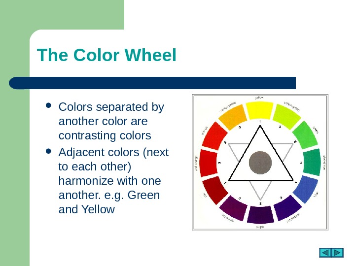
The Color Wheel Colors separated by another color are contrasting colors Adjacent colors (next to each other) harmonize with one another. e. g. Green and Yellow
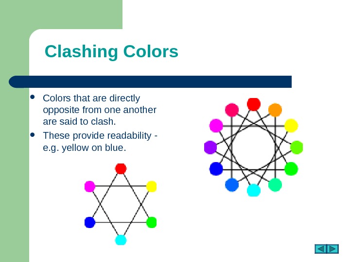
Clashing Colors that are directly opposite from one another are said to clash. These provide readability — e. g. yellow on blue.
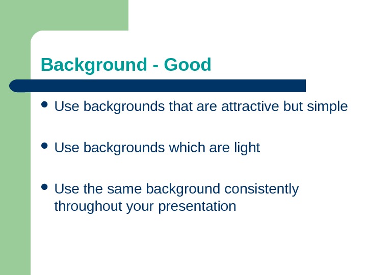
Background — Good Use backgrounds that are attractive but simple Use backgrounds which are light Use the same background consistently throughout your presentation
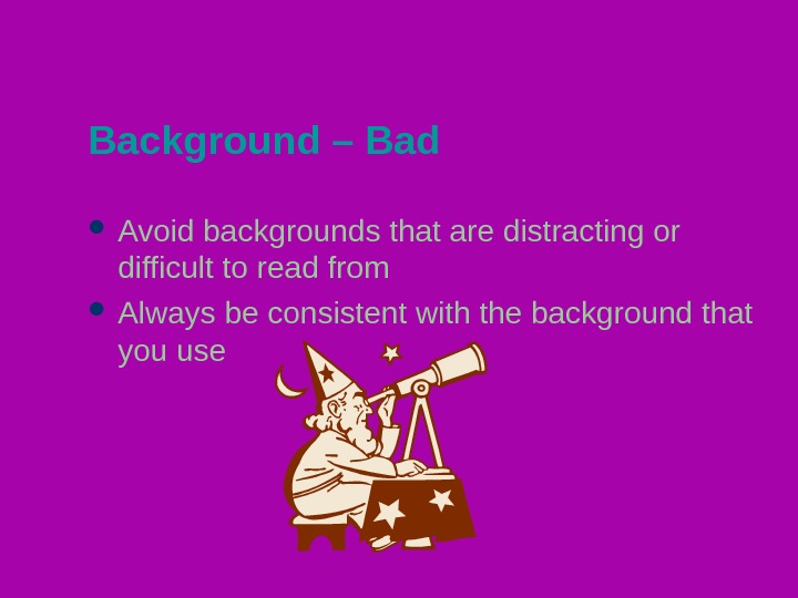
Background – Bad Avoid backgrounds that are distracting or difficult to read from Always be consistent with the background that you use
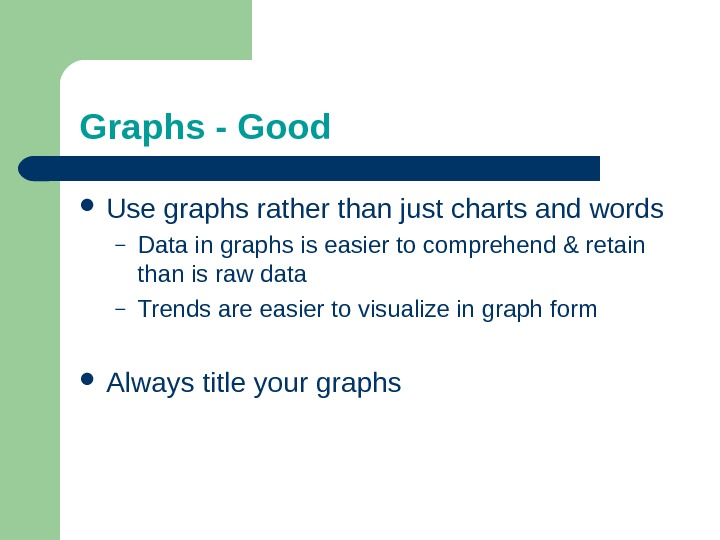
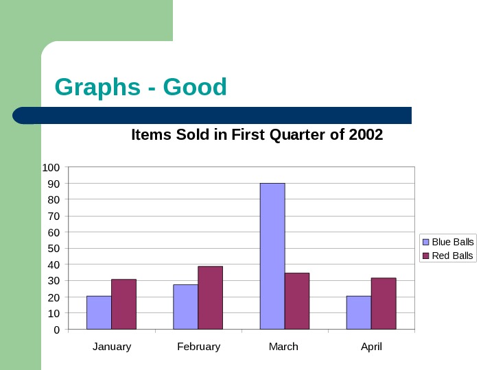
Graphs — Good Use graphs rather than just charts and words – Data in graphs is easier to comprehend & retain than is raw data – Trends are easier to visualize in graph form Always title your graphs
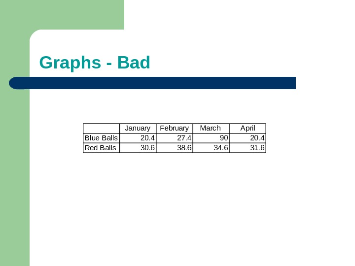
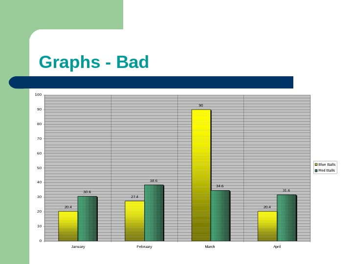
Graphs — Bad January February March April Blue Balls 20. 4 27. 4 90 20. 4 Red Balls 30. 6 38. 6 34. 6 31.
Graphs — Good Items Sold in First Quarter of 2002 0102030405060708090100 January February March April. Blue Balls Red Balls
Graphs — Bad 20. 4 27. 4 90 20. 430. 6 38. 6 34. 6 31. 6 0102030405060708090100 January February March April Blue Balls Red Balls
Graphs — Bad Minor gridlines are unnecessary Font is too small Colours are illogical Title is missing Shading is distracting
Spelling and Grammar Proof your slides for: – spelling mistakes – the use of repeated words – grammatical errors you might have made English is not your first language, please ask someone else to check your presentation!
Conclusion Use an effective and strong closing – Your audience is likely to remember your last words Use a conclusion slide to: – Summarize the main points of your presentation
Questions? ? End your presentation with a simple question slide to: – Invite your audience to ask questions – Provide a visual aid during question period – Avoid ending a presentation abruptly
YOU Do not use the media to hide you The media should enhance the presentation, not BE the presentation If all you are going to do is read from the slides, then just send them to the listeners Remember, only you can prevent “ Death by Power. Point ””