
Guidelines for Making PowerPoint Slides Golden Rule No


40612-guidelines_for_making_pp.ppt
- Количество слайдов: 20
Guidelines for Making PowerPoint Slides
Golden Rule No More Than One Topic Per Slide
Keep Unity of Design Use a master slide. Same font or set of fonts Same background, same colors Consistent bullet style All titles: same color, font, size, and position Use contrasting background and type. A dark background with light type (ideal) A light background with dark type
Use Readable Typeface and Font Use serif for titles. Use san serif (no curly feet) for body text. This is serif (Garamond) at 24 point. This is serif (Times NR) at 24 point. This is san serif (Helvetica) at 24 point.
Select Readable Font Size The title above is 44 point. This is 40 point. 36 point is the minimum for titles. This is 32 point. This is 24 point, no bold.
Adjust Lettering to Emphasize This can be done using color. This can be done using size. Or this can be done using bold or italic.
Choose Complementary Colors Colors should not clash. Colors should be complementary (easy on the eyes!). Colors should be consistent throughout the presentation.
Avoid Using “Text Boxes” Use slide template for all standard text and bulleted and numbered lists Use text boxes for specially placed text; for example, to label a figure. Diagram of nuclear power plant
Avoid Fancy Animation Effects
Consider the 6 x 6 Rule Slides should have no more than 6 lines of text. Slides should have no more than 6-10 words per line. This is a guideline, not really a rule. 6 6
Use Bullets, Not Numbers Bullets do not imply a specific order. Use numbers only to show rank or sequence.
Use Parallel Structure All parallel bullets on a slide should have the same grammatical structure. All noun phrases or all verb phrases, e.g. All complete sentences or all phrases or all clauses
Use Simple Tables to Present Numbers
Use Solids, Not Patterns, in Charts Use labels large enough to read from a distance.
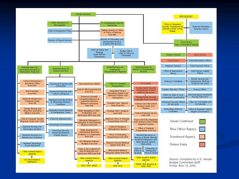
Avoid Overwhelming Detail in Charts and Graphs Break up organizational charts into large, easy-to-read chunks. For a large, complicated chart, think about providing a handout. Ensure that all text in a chart is readable from the back of the room.
Use Readable Figure Size Enlarge figures to make detail readable.
Photos and Illustrations Allow plenty of room for borders and around illustrations. Try not to crowd your illustration with text.
Speaking of Slides… Avoid Reading Your Slides Your slides are an outline of your talk. Help audience focus Point out what is important Your slides are not your presentation. Clues to help you remember Plan on 1 slide per minute; no more than 3 slides per minute.
Thank you for attention