
Describing Graphs 03/21/16 task 1 -writing graphs 1


- Размер: 759 Кб
- Количество слайдов: 21
Описание презентации Describing Graphs 03/21/16 task 1 -writing graphs 1 по слайдам
Describing Graphs 03/21/16 task 1 -writing graphs
Grammar & Vocabulary • Describing trends Trends are changes or movements. These changes are normally expressed in numeric items, for example, population, production volumes or unemployment. There are three basic trends: 03/21/16 task 1 -writing graphs
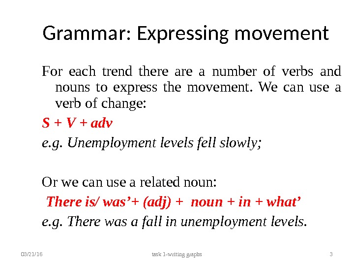
Grammar: Expressing movement For each trend there a number of verbs and nouns to express the movement. We can use a verb of change: S + V + adv e. g. Unemployment levels fell slowly; Or we can use a related noun: There is/ was’+ (adj) + noun + in + what’ e. g. There was a fall in unemployment levels. 03/21/16 task 1 -writing graphs
Expressing movement • Describe the first trend 03/21/16 task 1 -writing graphs 4 Direction Verbs Nouns Rose (to) Increased (to) Went up (to) Climbed (to) Boomed A rise An increase Growth An upward trend A boom (a dramatic rise)
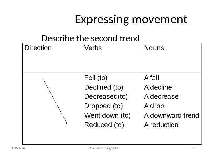
Expressing movement Describe the second trend 03/21/16 task 1 -writing graphs 5 Direction Verbs Nouns Fell (to) Declined (to) Decreased(to) Dropped (to) Went down (to) Reduced (to) A fall A decline A decrease A drop A downward trend A reduction
Expressing movement • Describe the 3 rd trend 03/21/16 task 1 -writing graphs 6 Direction Verbs Nouns Leveled out (at) Did not change Remained stable (at) Remained steady (at) Stayed constant (at) Maintained the same level A leveling out No change
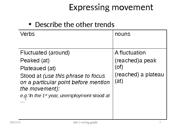
Expressing movement • Describe the other trends 03/21/16 task 1 -writing graphs 7 Verbs nouns Fluctuated (around) Peaked (at) Plateaued (at) Stood at (use this phrase to focus on a particular point before mention the movement): e. g. ‘In the 1 st year, unemployment stood at …’ A fluctuation (reached)a peak (of) (reached) a plateau (at)
Describing Movement: Adjectives and Adverbs Sometimes we need to give more information about a trend as follows: e. g. There has been a slight increase in the value of the dollar (degree of change); e. g. Unemployment fell rapidly last year (the speed of change). NB: we modify a noun with an adjective (a slight increase) and a verb with an adverb (to increase slightly). 03/21/16 task 1 -writing graphs
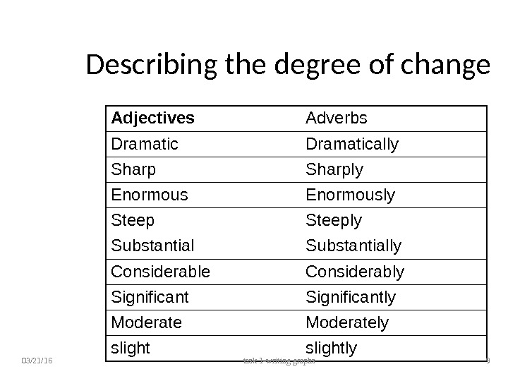
Describing the degree of change Adjectives Adverbs Dramatically Sharply Enormously Steeply Substantially Considerable Considerably Significantly Moderately slightly 03/21/16 task 1 -writing graphs
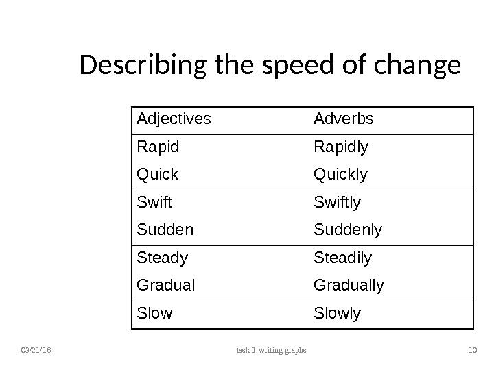
Describing the speed of change Adjectives Adverbs Rapidly Quickly Swiftly Suddenly Steadily Gradually Slowly 03/21/16 task 1 -writing graphs
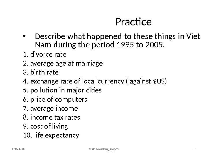
Practice • Describe what happened to these things in Viet Nam during the period 1995 to 2005. 1. divorce rate 2. average at marriage 3. birth rate 4. exchange rate of local currency ( against $US) 5. pollution in major cities 6. price of computers 7. average income 8. income tax rates 9. cost of living 10. life expectancy 03/21/16 task 1 -writing graphs
sample answer 1. The divorce rate rose steadily from 1995 to 2000 and five years later it went up sharply. 2. The average at marriage increased slightly. 3. The birth rate fell sharply. 4. The exchange rate against the US dollar remained constant during five years from 1995 but then it rose gradually. 5. The population went up gradually. 6. Pollution levels grew dramatically. 7. The price of computers fell sharply. 8. Income tax rates rose gradually. 9. The cost of living went up significantly. 10. Average income went up slightly. 11. Life expectancy increased slightly 03/21/16 task 1 -writing graphs
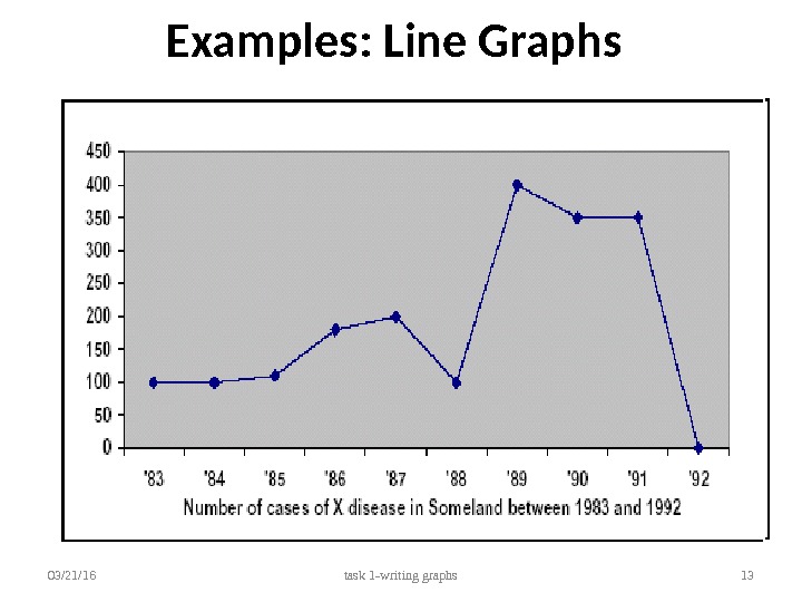
Examples: Line Graphs 03/21/16 task 1 -writing graphs
Examples: Bar Graphs 03/21/16 task 1 -writing graphs
Examples: Bar Graphs (2) 03/21/16 task 1 -writing graphs
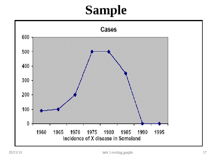
Sample Task • You should spend about 20 minutes on this task. Write a report for a university lecturer describing the information in the graph below. You should write at least 150 words. 03/21/16 task 1 -writing graphs
03/21/16 task 1 -writing graphs 17 Sample
Guidelines for writing task • Selecting information =>summarizing the graph by dividing it into its main parts by describing the trends. In the Sample Task, the graph shows four main trends : . first, a gradual increase from 1960 to 1968. second, a steeper increase from 1968 to 1977. third, a drop from 1983 to 1988. fourth, a plateau from 1977 to 1983 The structure of the report must show these four main trends clearly. • Report structure : => introduction, body and conclusion. Tenses should be used appropriately. 03/21/16 task 1 -writing graphs
Introduction Use two standard opening sentences to describe your graph. Sentence one should define what the graph is about: the date, location, what is being described in the graph etc. e. g. The graph shows the number of cases of X disease in Someland between the years 1960 and 1995 … Sentence two might sum up the overall trend: e. g. ‘It can be clearly seen that X disease increased rapidly to 500 cases around the 1980 s and then dropped to zero before 1999, while Y disease fell consistently from a high point of nearly 600 cases in 1960 to less than 100 cases in 1995. ’ => Tenses should be used appropriately. =>Notice the tense used. 03/21/16 task 1 -writing graphs
Body & conclusion • Describing the graph in detail Decide on the most clear and logical order to present the material. Line graphs generally present information in chronological order and so the most logical order for you to write up the information would, most probably be from earliest to latest. • Concluding sentences You may end with one or two sentences which summarise your description to draw a relevant conclusion. • Avoiding repetition 03/21/16 task 1 -writing graphs
Sample answer The graph shows the number of cases of X disease in Someland between the years 1960 and 1995. As an overall trend, it is clear that the number of cases of the disease increased fairly rapidly until the mid seventies, remained constant for around a decade at 500 cases before dropping to zero in the late 80 s. In 1960, the number of cases stood at approximately 100. That number rose steadily to 200 by 1969 and then more sharply to 500 in 1977. At this point the number of cases remained stable until 1984 before plummeting to zero by 1988. From 1988 to 1995 Someland was free of the disease. In conclusion, the graph shows that the disease was increasingly prevalent until the 1980 s when it was eradicated from Someland. 03/21/16 task 1 -writing graphs