
By learning to use three key elements of


how_to_create_infographics_in_power_point_by_hub_spot.ppt
- Размер: 16.6 Mегабайта
- Количество слайдов: 10
Описание презентации By learning to use three key elements of по слайдам
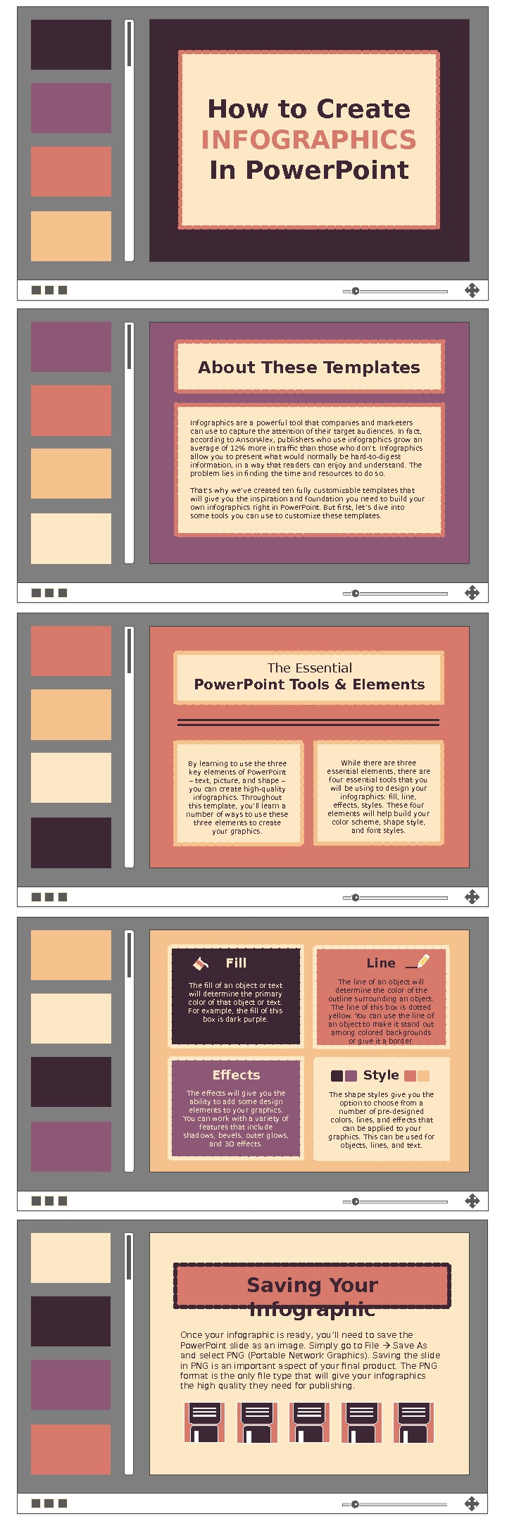
By learning to use three key elements of Power. Point – text, picture, and shape – you can create high-quality infographics. Throughout this template, you’ ll learn a number of ways to use these three elements to create your graphics. While there are three essential elements, there are four essential tools that you will be using to design your infographics: fill, line, effects, styles. These four elements will help build your color scheme, shape style, and font styles. Fill Effects Line Style. The fill of an object or text will determine the primary color of that object or text. For example, the fill of this box is dark purple. The line of an object will determine the color of the outline surrounding an object. The line of this box is dotted yellow. You can use the line of an object to make it stand out among colored backgrounds or give it a border. The shape styles give you the option to choose from a number of pre-designed colors, lines, and effects that can be applied to your graphics. This can be used for objects, lines, and text. The effects will give you the ability to add some design elements to your graphics. You can work with a variety of features that include shadows, bevels, outer glows, and 3 D effects. The Essential Power. Point Tools & Elements How to Create INFOGRAPHICS In Power. Point Infographics are a powerful tool that companies and marketers can use to capture the attention of their target audiences. In fact, according to Anson. Alex, publishers who use infographics grow an average of 12% more in traffic than those who don’ t. Infographics allow you to present what would normally be hard-to-digest information, in a way that readers can enjoy and understand. The problem lies in finding the time and resources to do so. That’ s why we’ve created ten fully customizable templates that will give you the inspiration and foundation you need to build your own infographics right in Power. Point. But first, let ’ s dive into some tools you can use to customize these templates. About These Templates Saving Your Infographic Once your infographic is ready, you’ ll need to save the Power. Point slide as an image. Simply go to File Save As and select PNG (Portable Network Graphics). Saving the slide in PNG is an important aspect of your final product. The PNG format is the only file type that will give your infographics the high quality they need for publishing.
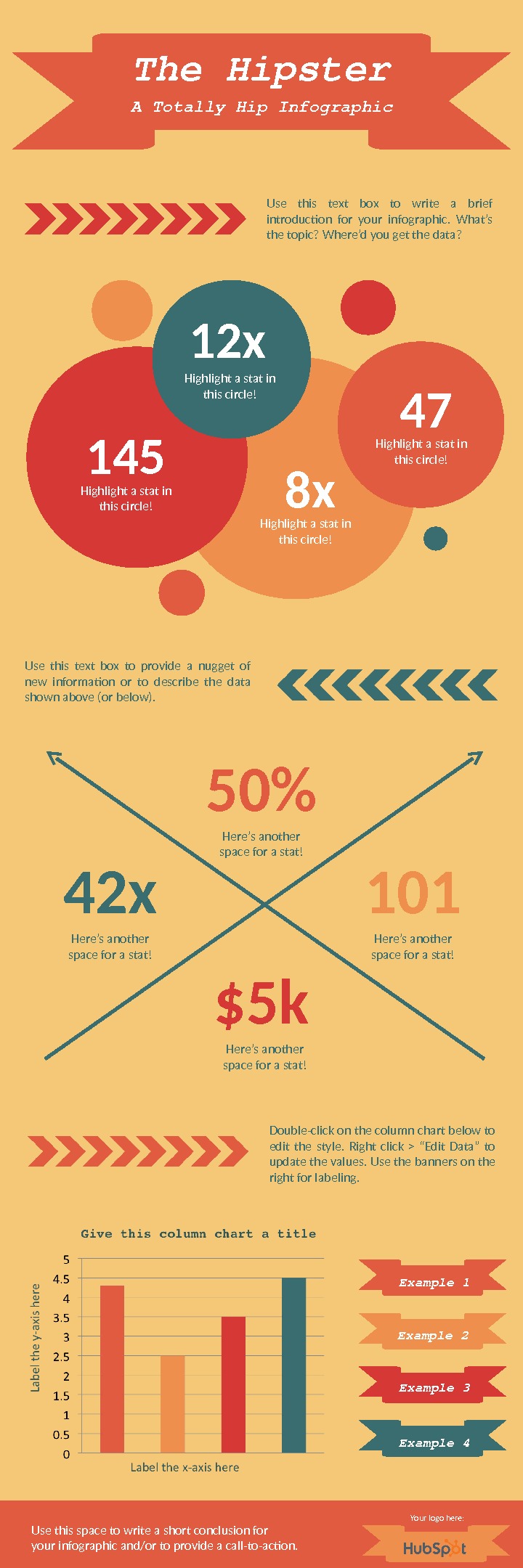
The. Hipster Use this text box to write a brief introduction for your infographic. What’s the topic? Where’d you get the data? 50% Here’s another space for a stat! 101 Here’s another space for a stat!42 x Here’s another space for a stat! $5 k Here’s another space for a stat!Use this text box to provide a nugget of new information or to describe the data shown above (or below). ATotally. Hip. Infographic 12 x Highlight a stat in this circle! 145 Highlight a stat in this circle! 47 Highlight a stat in this circle! 8 x Highlight a stat in this circle! Double-click on the column chart below to edit the style. Right click > “Edit Data” to update the values. Use the banners on the right for labeling. Example 1 Example 2 Example 3 Example 4 Use this space to write a short conclusion for your infographic and/or to provide a call-to-action. Your logo here:
Does your infographic idea require a lot of writing? Use this template to ft in all the important information you need to convey. Simply replace the lorem ipsum placeholder text with your own fabulous copy, customize the colors, and maybe add in a few graphics or stats to complete your masterpiece!SO MUCH TO SAY WRITE A SECTION HEADER HERE Use this space to write a short conclusion for your infographic and/or to provide a call-to-action. WRITE A SECTION HEADER HERE Lorem ipsum dolor sit amet, consectetur adipiscing elit, sed do eiusmod tempor incididunt ut labore et dolore magna aliqua. Ut enim ad minim veniam, quis nostrud exercitation ullamco laboris nisi ut aliquip ex ea commodo consequat. Duis aute irure dolor in reprehenderit in voluptate velit esse cillum dolore eu fugiat nulla pariatur. Your logo here:
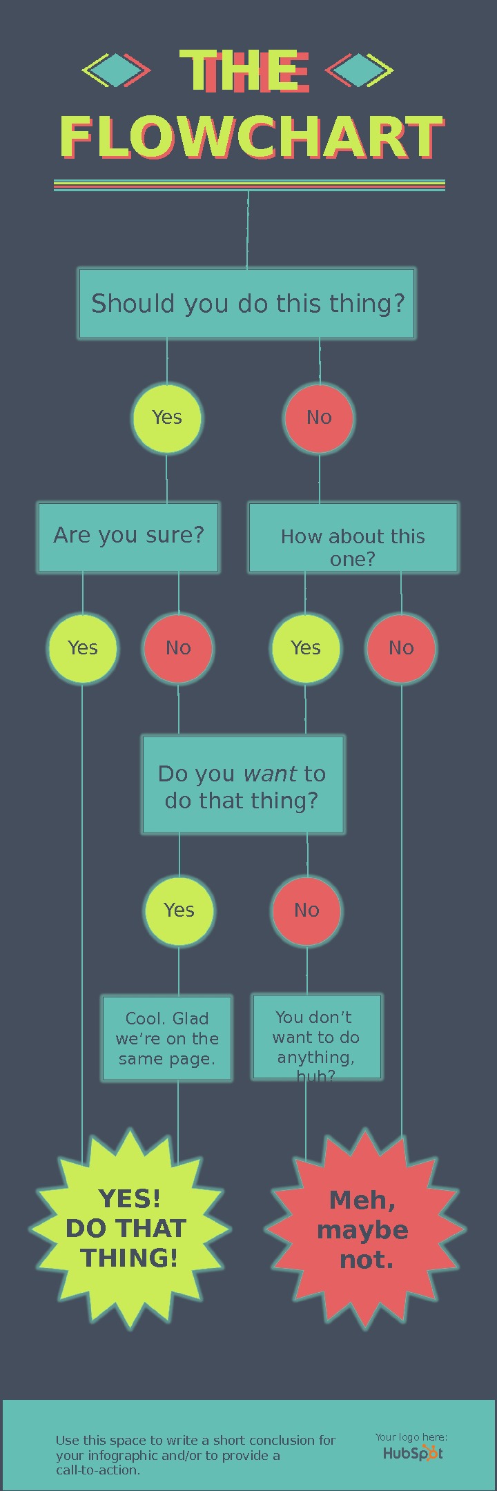
THE FLOWCHART Should you do this thing? Yes Use this space to write a short conclusion for your infographic and/or to provide a call-to-action. No How about this one? Are you sure? Yes No. THE FLOWCHART YES! DO THAT THING! Meh, maybe not. Do you want to do that thing? Yes No Cool. Glad we’re on the same page. You don’t want to do anything, huh? Your logo here:
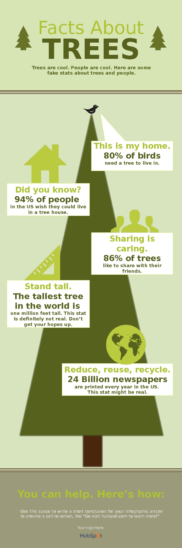
Facts About TREES Did you know? 94% of people in the US wish they could live in a tree house. Sharing is caring. 86% of trees like to share with their friends. Trees are cool. People are cool. Here are some fake stats about trees and people. Stand tall. The tallest tree in the world is one million feet tall. This stat is definitely not real. Don’t get your hopes up. Use this space to write a short conclusion for your infographic and/or to provide a call-to-action, like “Go visit hubspot. com to learn more!” Reduce, reuse, recycle. 24 Billion newspapers are printed every year in the US. This stat might be real. You can help. Here’s how: This is my home. 80% of birds need a tree to live in. Your logo here:
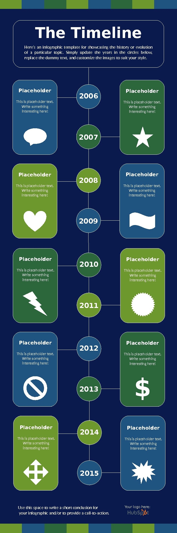
The Timeline Here’s an infographic template for showcasing the history or evolution of a particular topic. Simply update the years in the circles below, replace the dummy text, and customize the images to suit your style. 2006 2007 2008 2009 2010 2011 2012 2013 Use this space to write a short conclusion for your infographic and/or to provide a call-to-action. 2014 2015 This is placeholder text. Write something interesting here!Placeholder This is placeholder text. Write something interesting here!Placeholder $ This is placeholder text. Write something interesting here!Placeholder Your logo here:
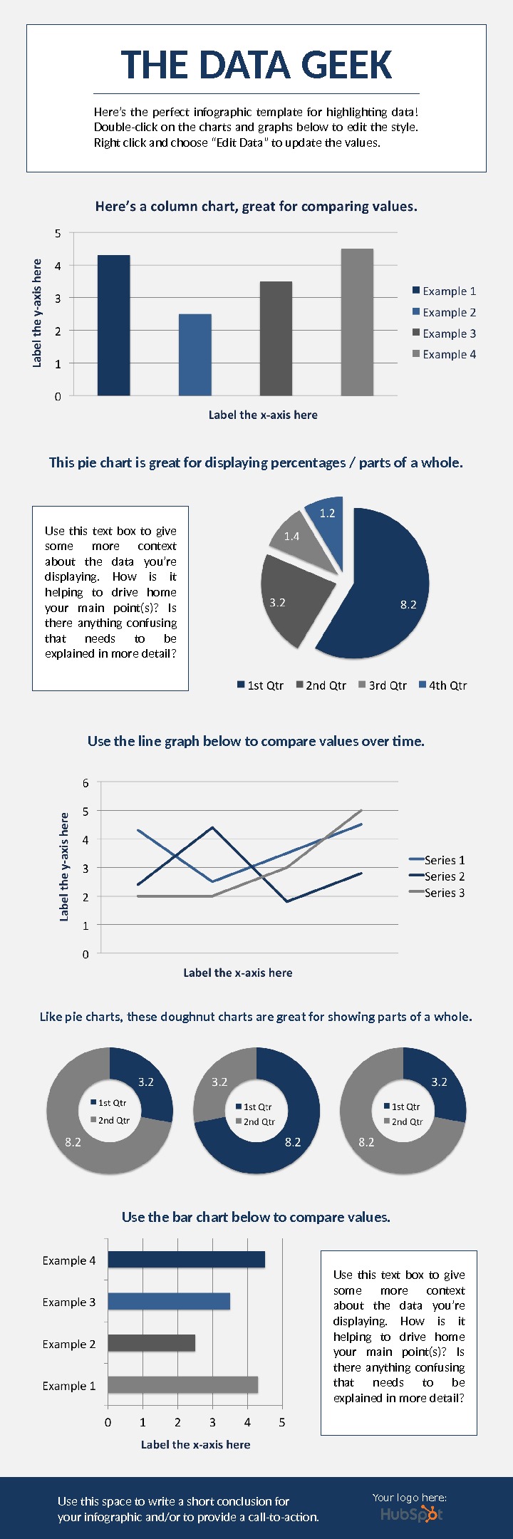
THE DATA GEEK Here’s the perfect infographic template for highlighting data! Double-click on the charts and graphs below to edit the style. Right click and choose “Edit Data” to update the values. This pie chart is great for displaying percentages / parts of a whole. Use the line graph below to compare values over time. Like pie charts, these doughnut charts are great for showing parts of a whole. Use the bar chart below to compare values. Use this space to write a short conclusion for your infographic and/or to provide a call-to-action. Use this text box to give some more context about the data you’re displaying. How is it helping to drive home your main point(s)? Is there anything confusing that needs to be explained in more detail? Your logo here:
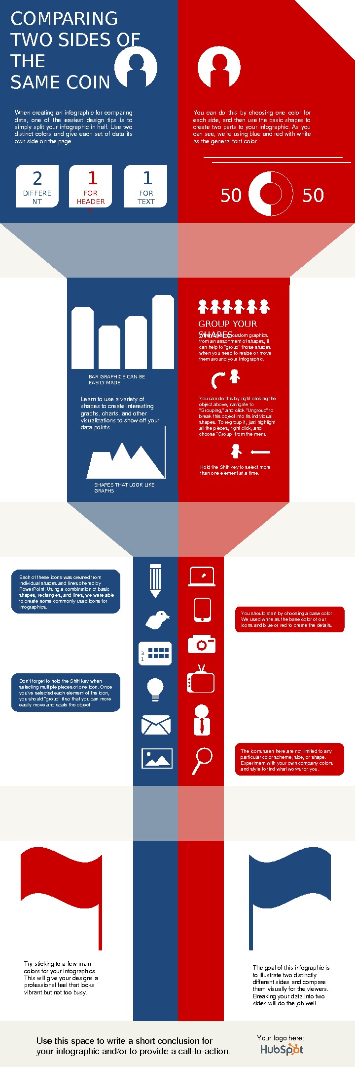
COMPARING TWO SIDES OF THE SAME COIN When creating an infographic for comparing data, one of the easiest design tips is to simply split your infographic in half. Use two distinct colors and give each set of data its ownsideonthepage. You can do this by choosing one color for eachside, andthenusethebasicshapesto create two parts to your infographic. As you cansee, we ’reusingblueandredwithwhite asthegeneralfontcolor. 2 DIFFERE NT FONTS 1 1 FOR HEADER S FOR TEXT 50 50 GROUP YOUR SHAPES Whencreatingcustomgraphics fromanassortmentofshapes, it canhelpto “group”thoseshapes whenyouneedtoresizeormove themaroundyourinfographic. Youcandothisbyrightclickingthe objectabove, navigateto “Grouping, ”andclick“Ungroup”to breakthisobjectintoitsindividual shapes. Toregroupit, justhighlight allthepieces, rightclick, and choose“Group”fromthemenu. Holdthe. Shiftkeytoselectmore thanoneelementatatime. SHAPES THAT LOOK LIKE GRAPHSBAR GRAPHICS CAN BE EASILY MADE Learntouseavarietyof shapestocreateinteresting graphs, charts, andother visualizationstoshowoffyour datapoints. 3 1 Eachoftheseiconswascreatedfrom individualshapesandlinesofferedby Power. Point. Usingacombinationofbasic shapes, rectangles, andlines, wewereable tocreatesomecommonlyusediconsfor infographics. Youshouldstartbychoosingabasecolor. Weusedwhiteasthebasecolorofour iconsandblueorredtocreatethedetails. Don’ tforgettoholdthe. Shiftkeywhen selectingmultiplepiecesofoneicon. Once you’veselectedeachelementoftheicon, youshould“group”itsothatyoucanmore easilymoveandscaletheobject. Theiconsseenherearenotlimitedtoany particularcolorscheme, size, orshape. Experimentwithyourowncompanycolors andstyletofindwhatworksforyou. Trystickingtoafewmain colorsforyourinfographics. Thiswillgiveyourdesignsa professionalfeelthatlooks vibrantbutnottoobusy. Thegoalofthisinfographicis toillustratetwodistinctly differentsidesandcompare themvisuallyfortheviewers. Breakingyourdataintotwo sideswilldothejobwell. Usethisspacetowriteashortconclusionfor yourinfographicand/ortoprovideacalltoaction. Yourlogohere:
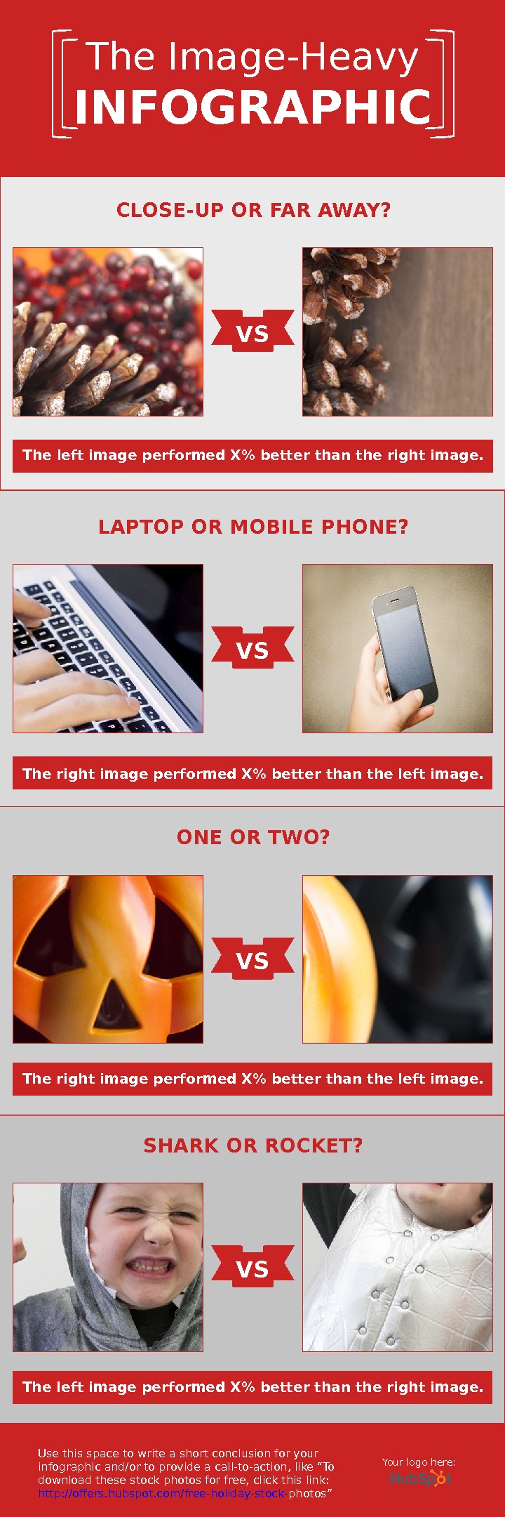
The Image-Heavy INFOGRAPHIC Use this space to write a short conclusion for your infographic and/or to provide a call-to-action, like “To download these stock photos for free, click this link: http: //offers. hubspot. com/free-holiday-stock- photos ”VSCLOSE-UP OR FAR AWAY? The left image performed X% better than the right image. VSLAPTOP OR MOBILE PHONE? The right image performed X% better than the left image. VSONE OR TWO? The right image performed X% better than the left image. VSSHARK OR ROCKET? The left image performed X% better than the right image. Your logo here:
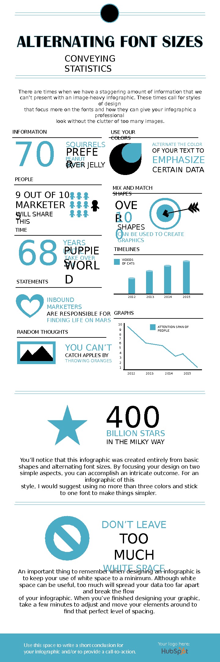
Use this space to write a short conclusion for your infographic and/or to provide a call-to-action. CONVEYING STATISTICS There are times when we have a staggering amount of information that we can’ t present with an image-heavy infographic. These times call for styles of design that focus more on the fonts and how they can give your infographic a professional look without the clutter of too many images. INFORMATION 70 SQUIRRELS PREFE RPEANUT BUTTER OVER JELLY TIME 68 YEARS UNTIL PUPPIE S TAKE OVER THE WORL DPEOPLE 9 OUT OF 10 MARKETER S WILL SHARE THIS STATEMENTS INBOUND MARKETERS ARE RESPONSIBLE FOR FINDING LIFE ON MARS USE YOUR COLORS ALTERNATE THE COLOR OF YOUR TEXT TO EMPHASIZE CERTAIN DATA MIX AND MATCH SHAPES OVE R 10 0 SHAPES CAN BE USED TO CREATE GRAPHICS TIMELINES 2012 2013 2014 2015 VIDEOS OF CATS GRAPHS 10 9 8 7 6 5 4 3 2 1 2012 2013 2014 2015 ATTENTION SPAN OF PEOPLE RANDOM THOUGHTS YOU CAN’ T CATCH APPLES BY THROWING ORANGES 400 BILLION STARS IN THE MILKY WAY You’ ll notice that this infographic was created entirely from basic shapes and alternating font sizes. By focusing your design on two simple aspects, you can accomplish an intricate outcome. For an infographic of this style, I would suggest using no more than three colors and stick to one font to make things simpler. DON’ T LEAVE TOO MUCH WHITE SPACE An important thing to remember when designing an infographic is to keep your use of white space to a minimum. Although white space can be useful, too much will spread your data too far apart and break the flow of your infographic. When you’ ve finished designing your graphic, take a few minutes to adjust and move your elements around to find that perfect level of spacing. Your logo here: